This is Athens
This is Athens is the City of Athens’ official destination brand. Its touchscreens stand at airports, at the This is Athens hub and across the centre of the city, where visitors with a few days and a whole city to discover decide what to do next.
We created the complete platform for those screens: the experience concept, the information architecture, the touchscreen interface and the software, giving the city’s own words and photographs a form that anyone can use unaided.

A screen that explains itself
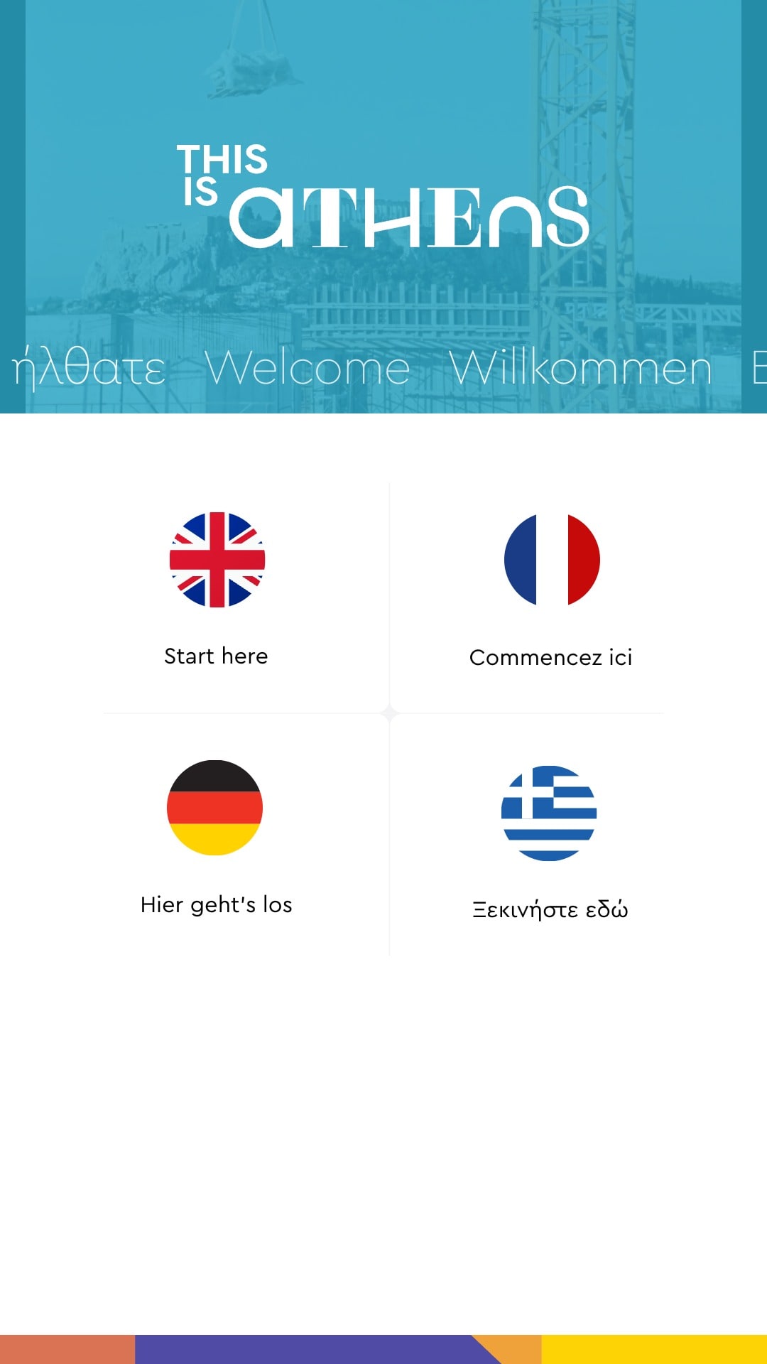
A public touchscreen gets no introduction. Most people who use it are seeing it for the first time, standing, often with luggage in hand, and nobody is there to explain it. So the screen does the explaining: it asks one question first, which language, then opens the city through eight large doors, the season’s highlights above seven tiles of their own colour, titled to be read from a step away and sized for a hand.

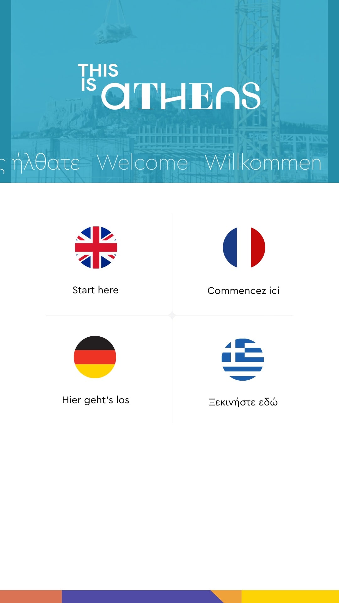
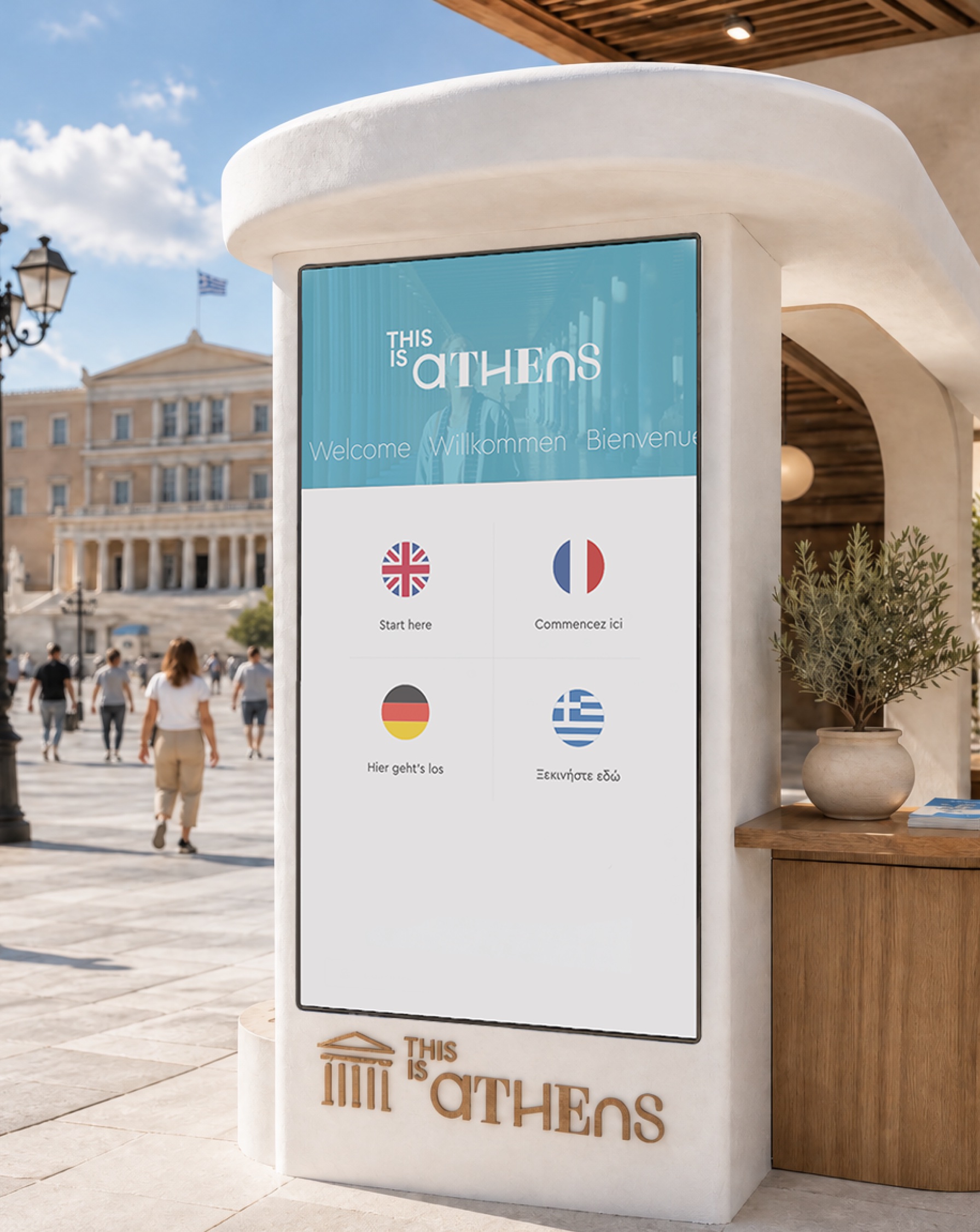
No English needed to find French
Public screens often open in the local language and tuck the switch into a corner. The kiosk makes the choice its whole opening screen and writes each invitation in its own language, so a visitor is welcomed in theirs before touching anything. One touch and the doors, the lists and the pages answer in French or German, and Start over, its label turning through all four languages, hands the screen back to whoever steps up next.
Learn one page, read them all
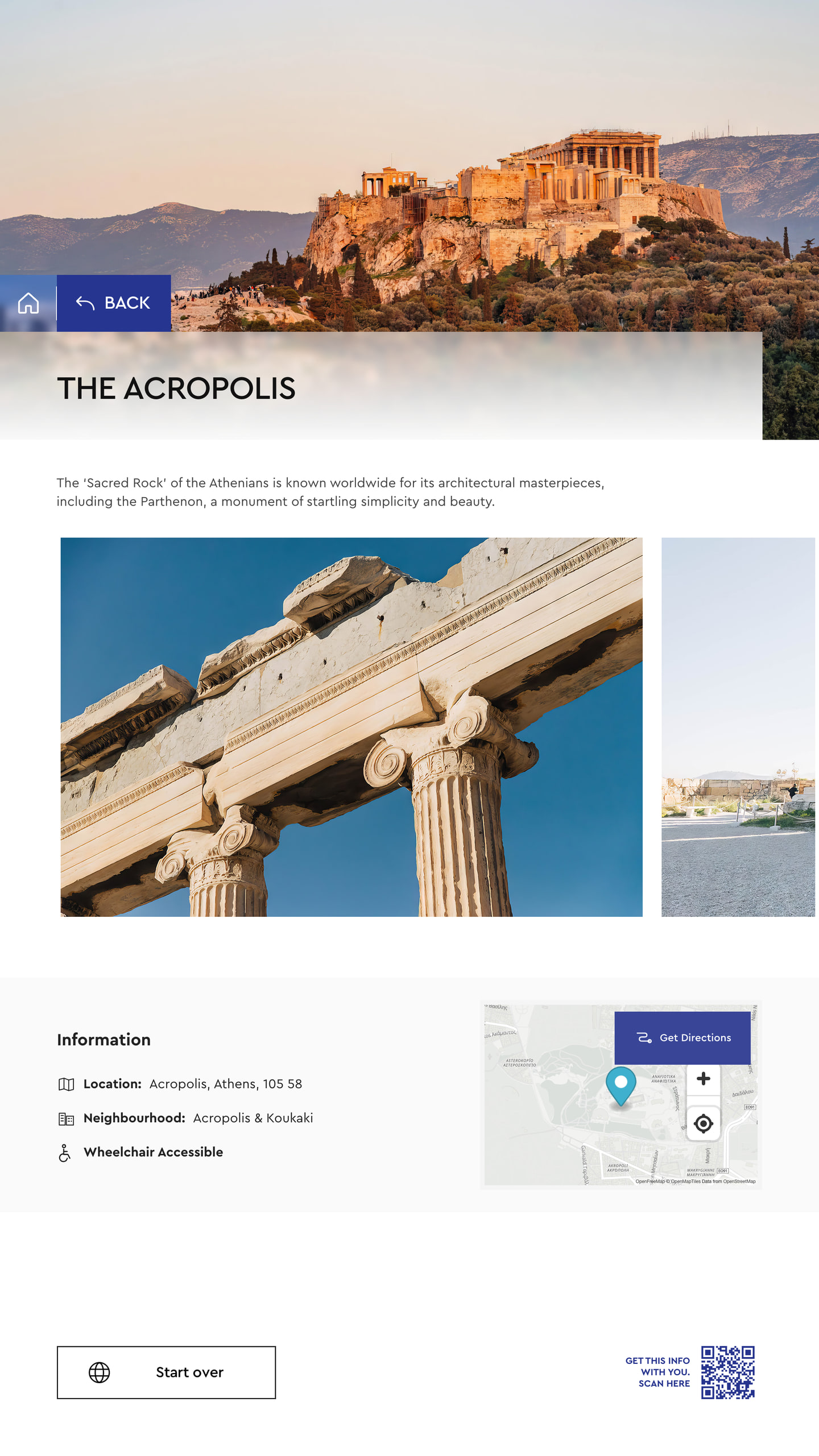
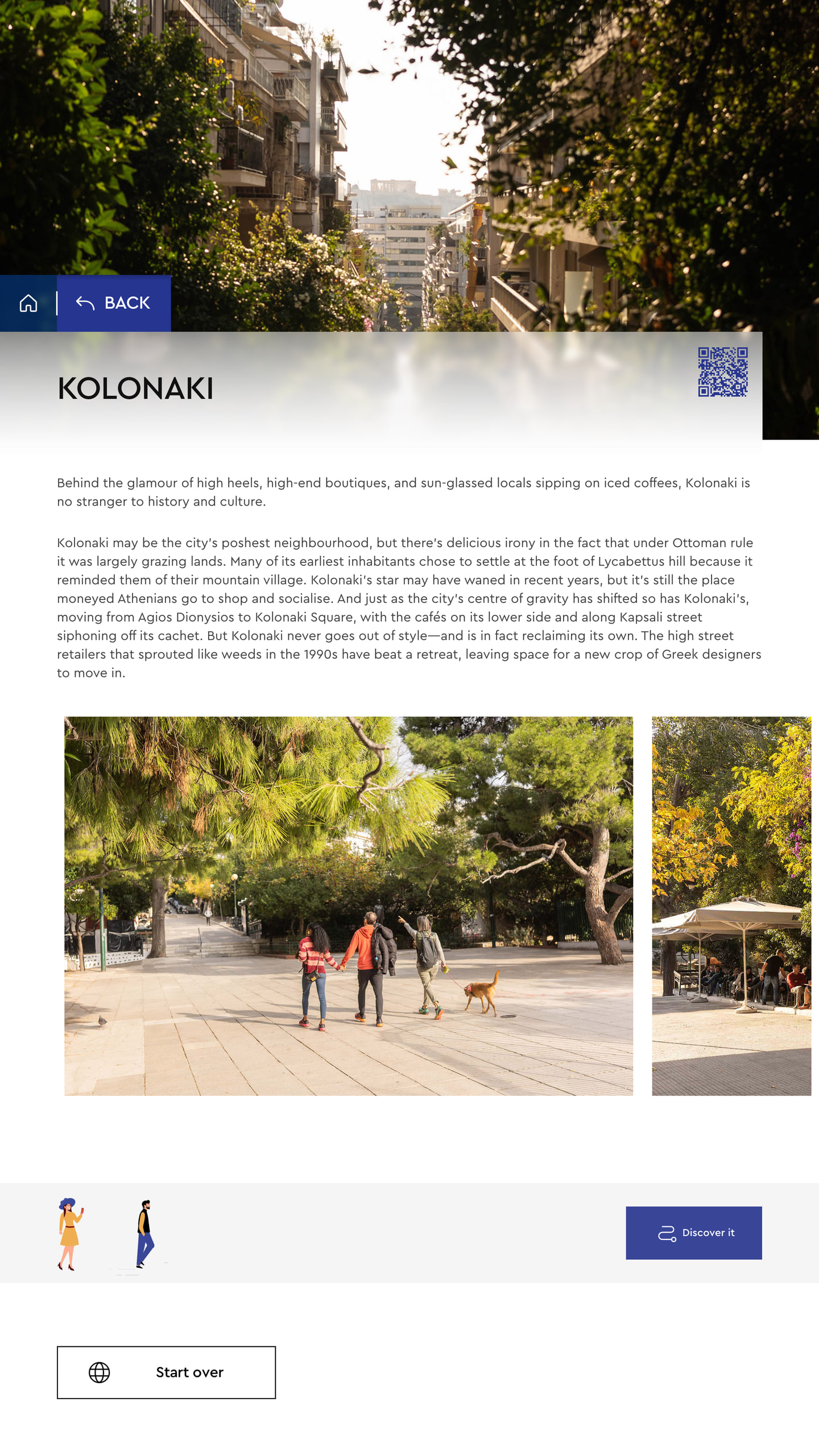
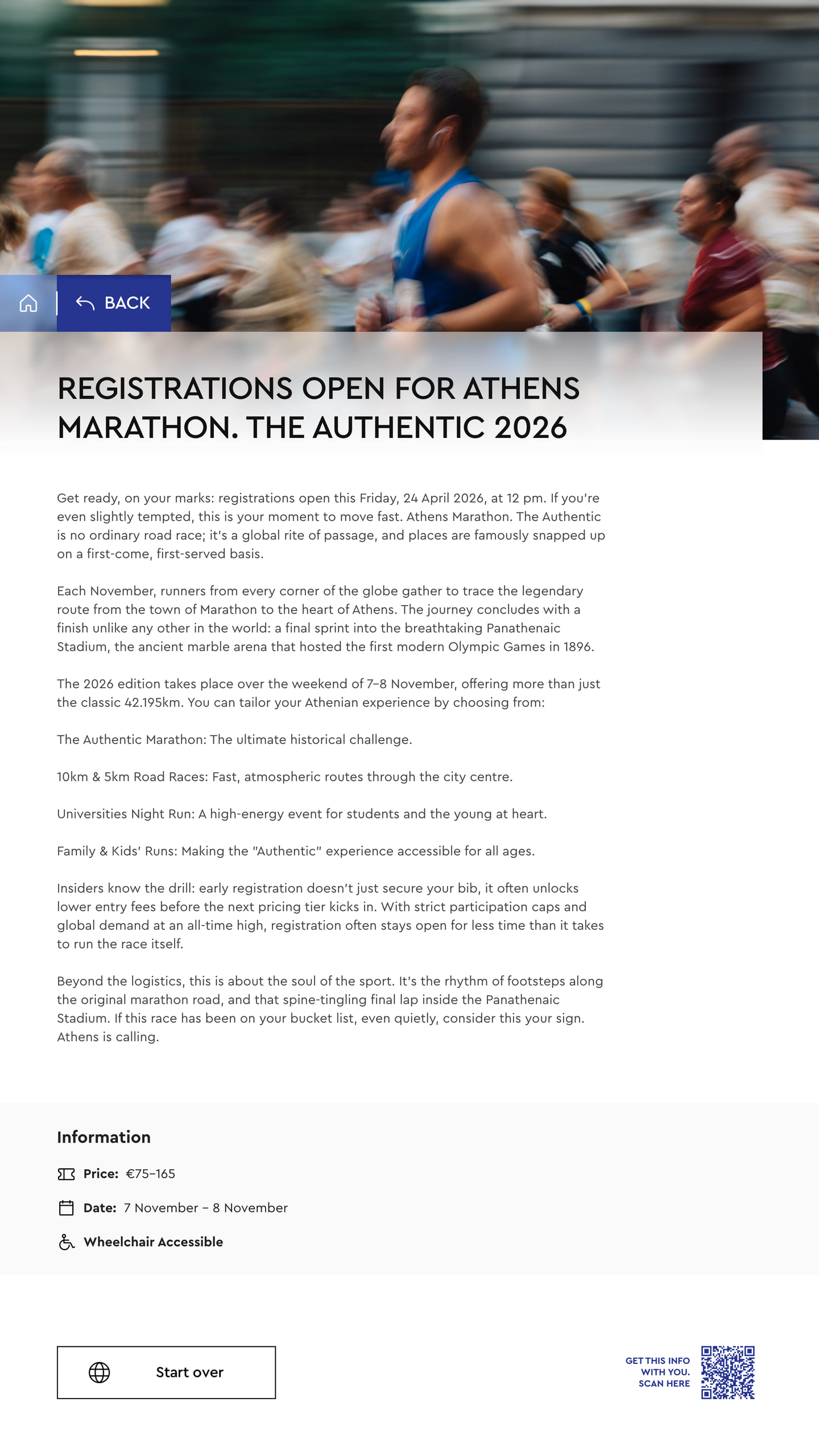
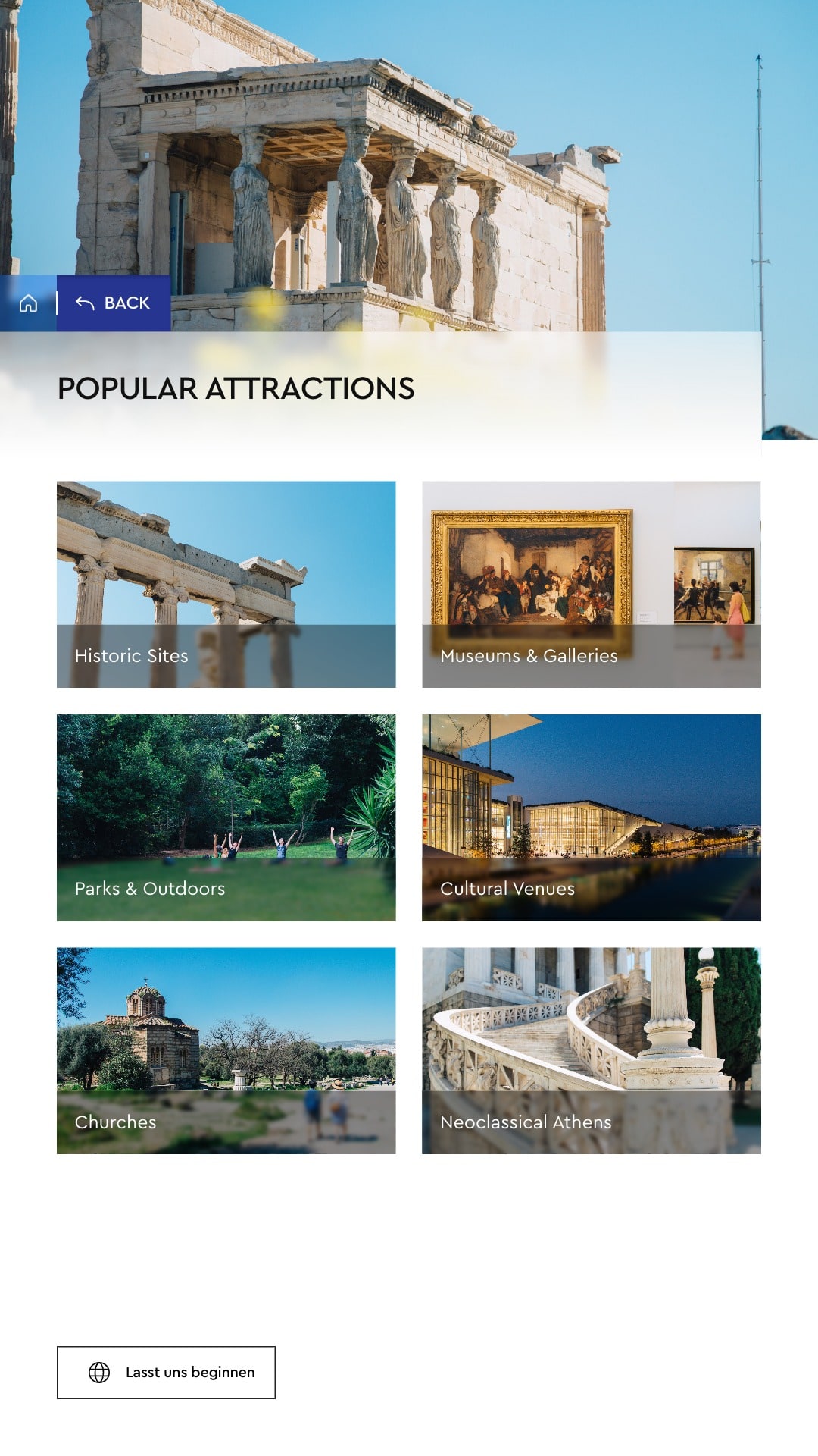
A monument, a neighbourhood and a marathon have little in common, yet on the kiosk they share one frame: the photograph, Home and Back at its edge, the title on its frosted strip, the story beneath and a code that takes the page along. Facts such as price, dates and wheelchair access sit in the same panel wherever they apply, and Start over keeps its corner, so nothing on a new page has to be learned twice.

Place explains what a name cannot
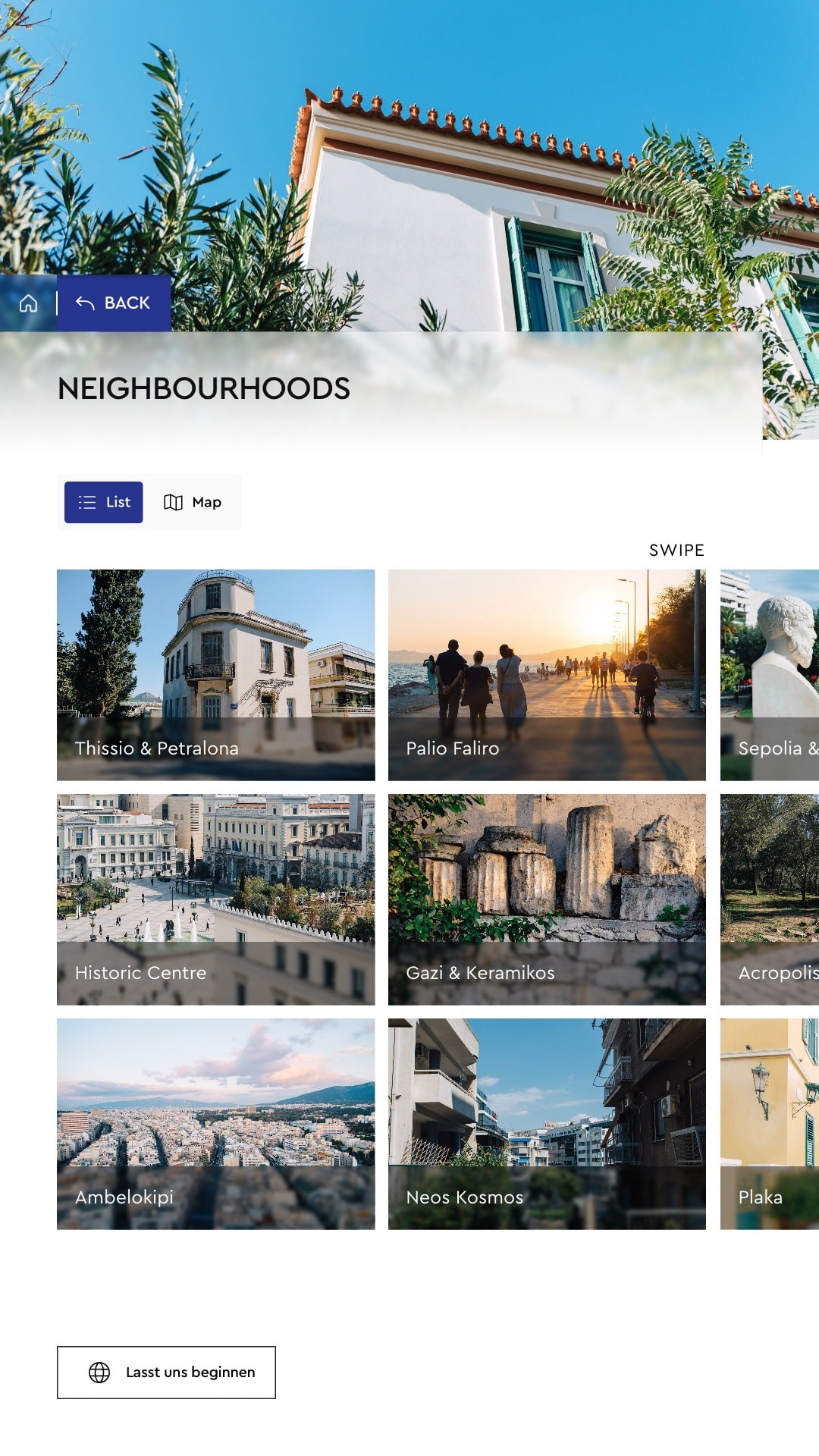
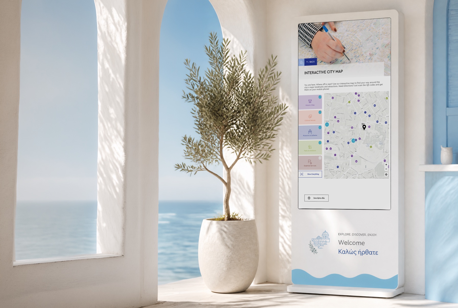
To someone new to Athens, Koukaki or Kypseli is just a word. Placed where they really are, around names a visitor already knows, the fourteen districts make sense at a glance, and a touch on any of them opens its page. The map leaves out every street, since it answers whether to go rather than how to get there, and the interface draws it itself, so it never waits on a map service.

Access is the itinerary
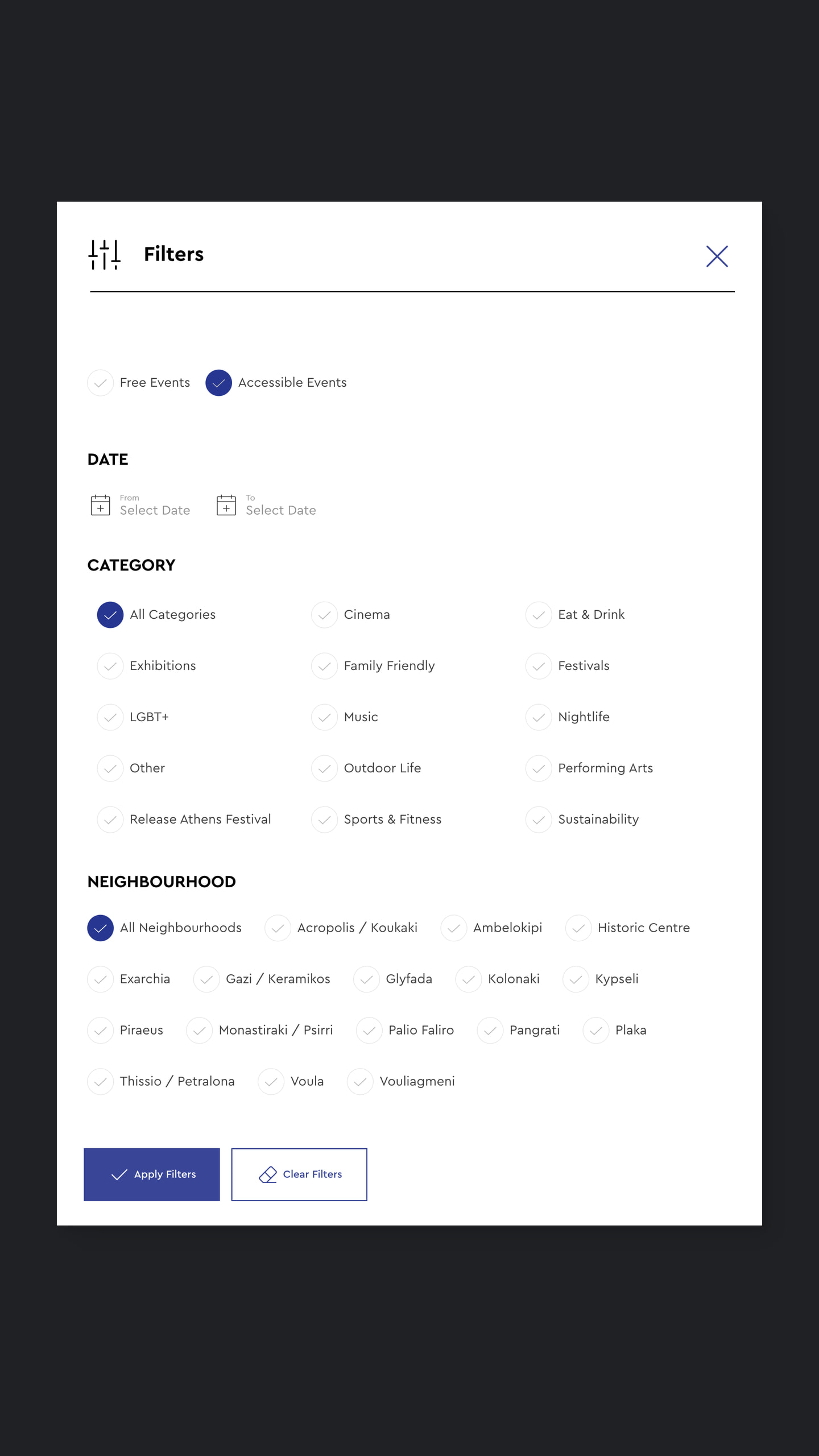
A visitor in a wheelchair needs to know what can be reached before deciding what to see. Every attraction list carries a switch that keeps the sites with wheelchair access and lets the rest fall away, so the plan takes one touch rather than a second search. The same fact travels with places and events: a line on destination pages, Accessible Events among the filters of what is on, and a guide of its own.
The route leaves in a pocket
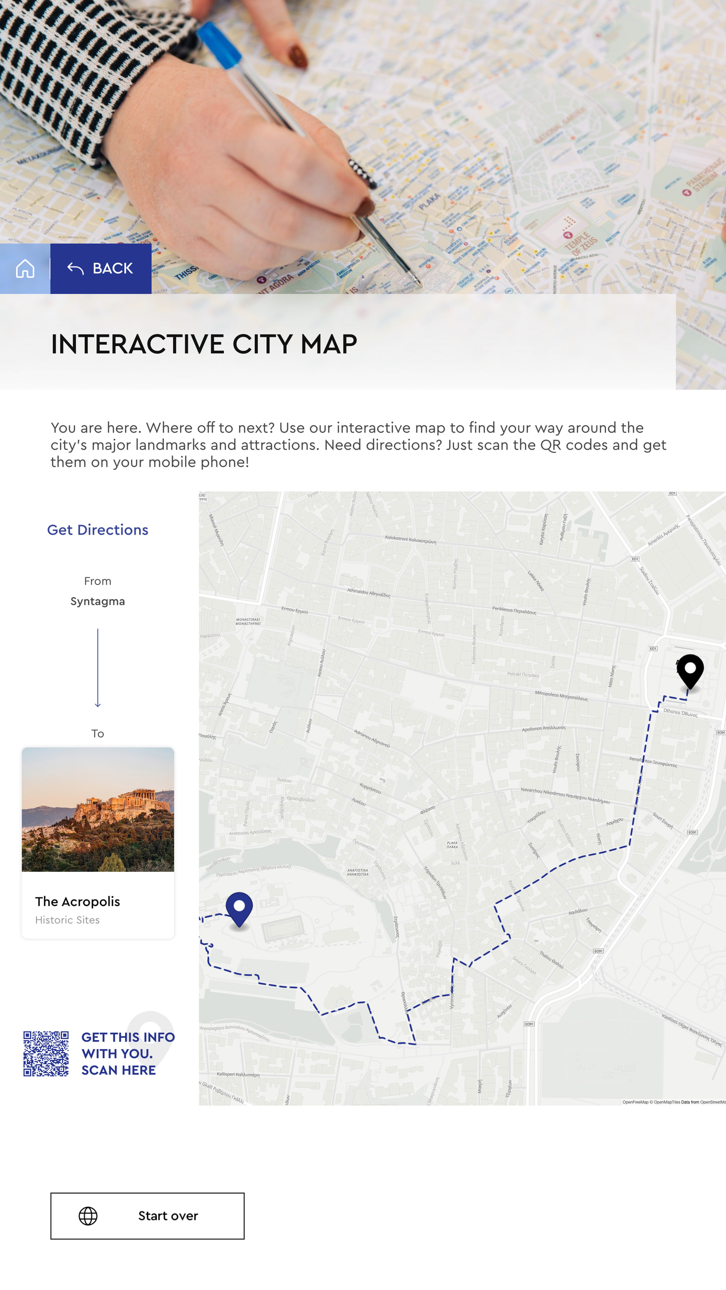
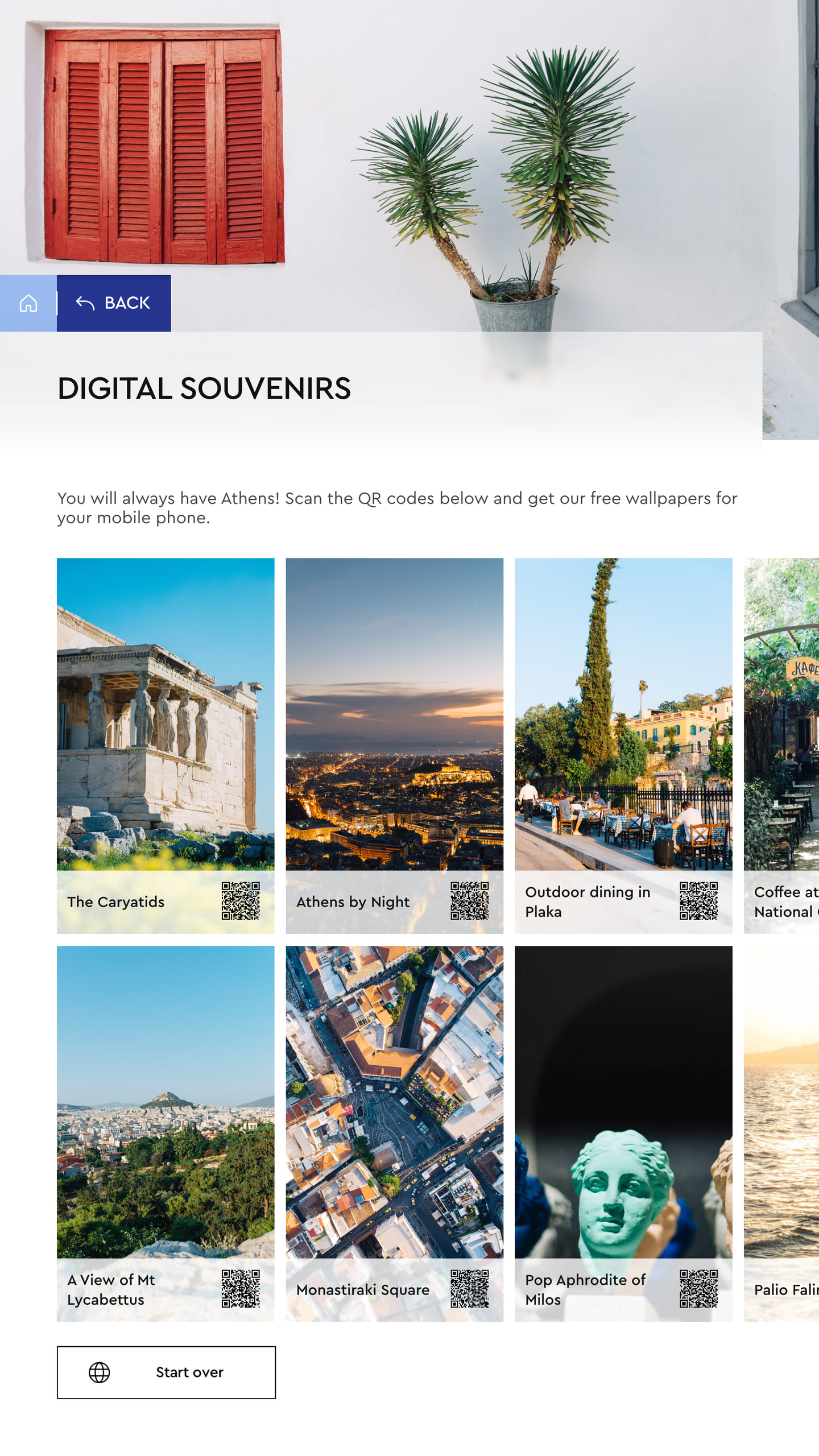
No kiosk can walk anyone to the Acropolis, so it hands the way over. Get Directions draws the walk from Syntagma, and one scan puts it on the visitor’s own phone with nothing asked in return: no account, no email address, no typing. Digital Souvenirs travels the same road, photographs of Athens to keep as wallpapers, each behind its own code, so the city goes home on a lock screen.

Colour does the sorting
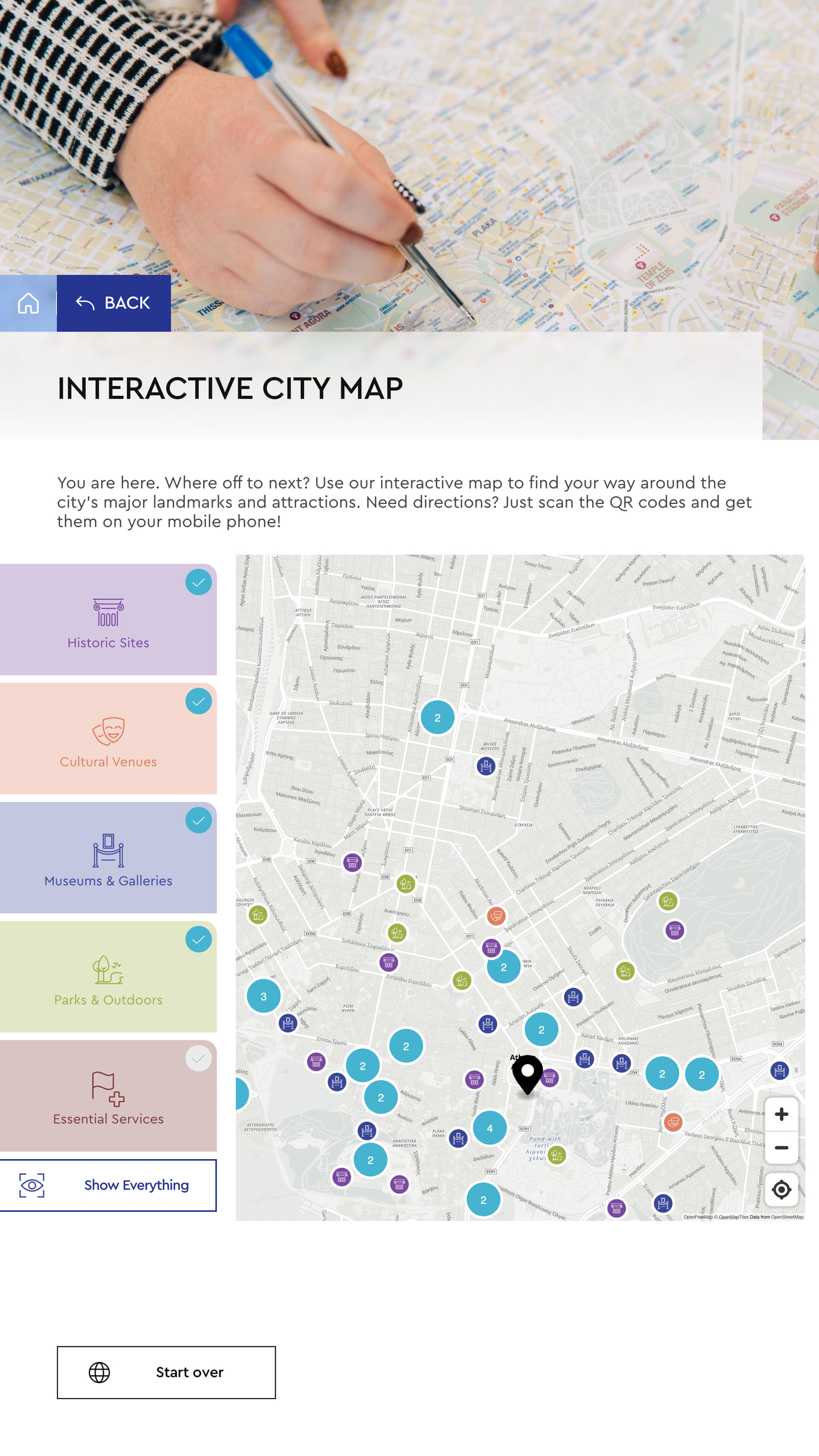
A map with every pin in one colour is a puzzle. On the city map each category keeps its colour from the filter to the marker, so historic sites, cultural venues, museums, parks and essential services can be told apart before a single label is read. The last filter left on will not switch off, so a stray touch can never leave someone looking for their way on an empty map.
Always waiting for the next stranger
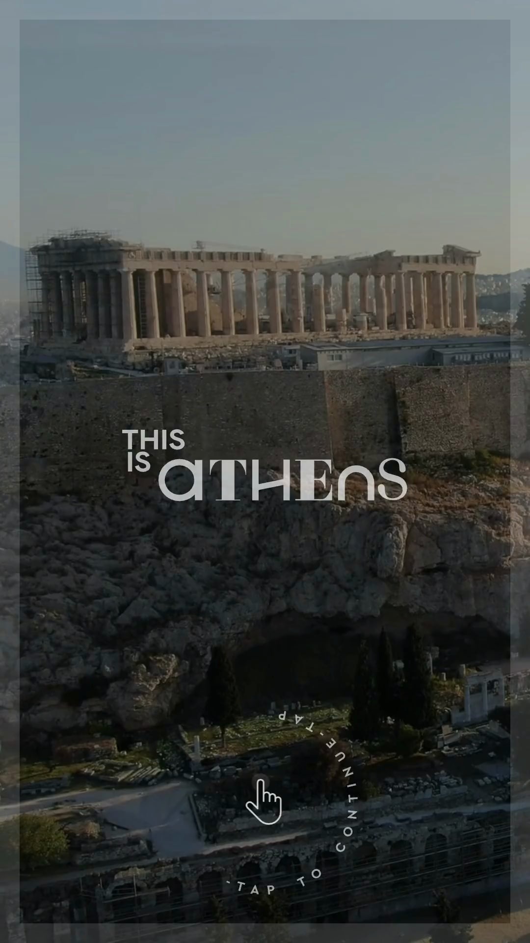
The kiosks stand where trips begin and turn: at airports, at the This is Athens hub and in the centre of the city. Nobody stands beside them to greet the next visitor, so the screen does it: after ten minutes untouched it returns to its film of Athens and a ring that reads Tap to continue, and a touch anywhere opens the choice of language again.
The result
A public touchscreen platform, from the first concept to the working software, installed at airports, at the This is Athens hub and across central Athens. The city’s own words and photographs meet visitors in English, French and German, on screens that explain themselves to whoever walks up.
Building something like this?
Start a project.