EV Infrastructure & Energy · 2024
Hyperinso
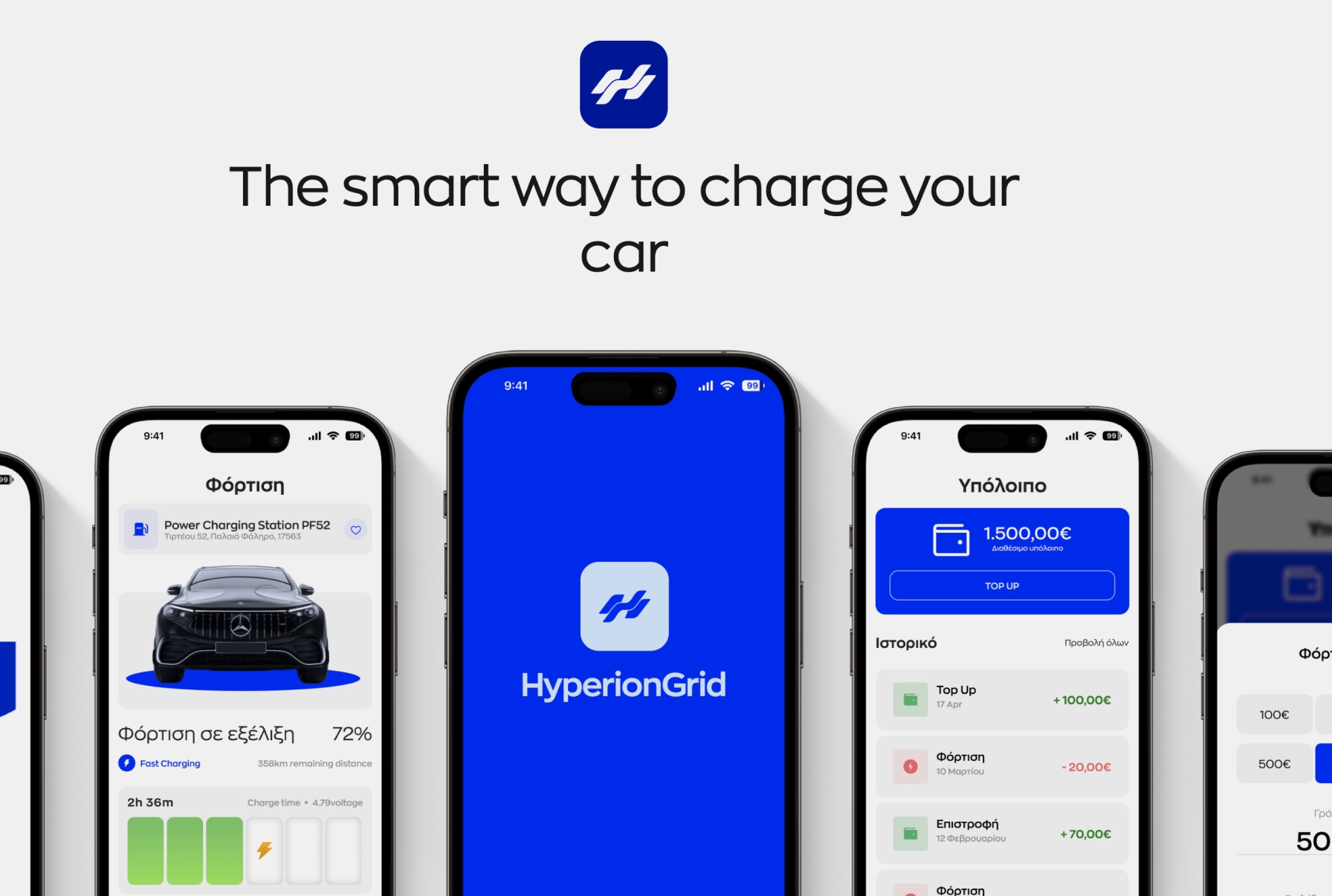
People meet a charging company in many forms: a name on a charger, a product page, an app on their phone. For Hyperinso, a Greek EV charging company, we created the name and the identity, designed and built the website, designed its proprietary app and produced every render and image.
A charger in a car park and an app on a phone ask very different things of a brand. Hyperinso needed one identity that works at both scales, and across everything in between.
- Services
- Naming & Branding
- Website
- App Design
- 3D & Imagery

Give the energy a signature
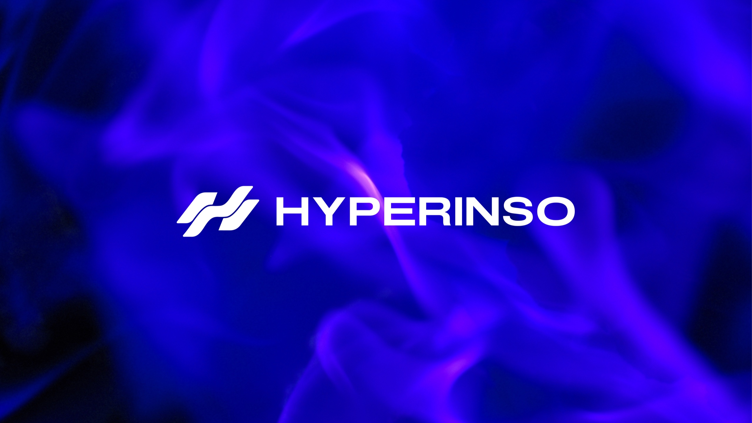
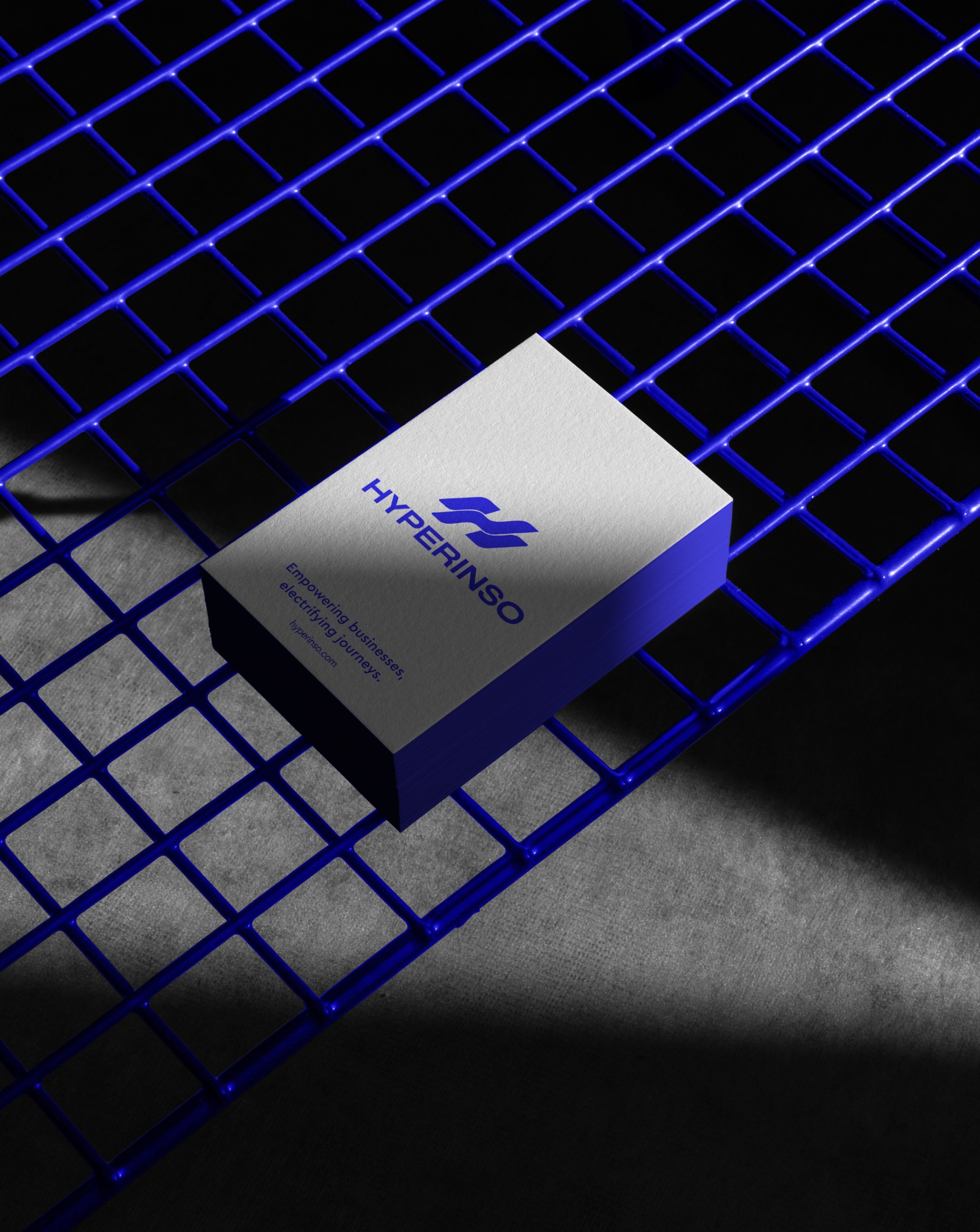
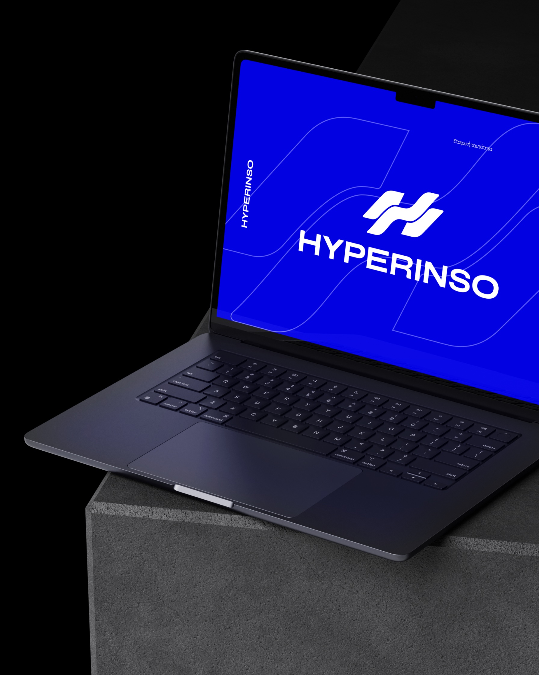
We named the company Hyperinso and built its identity around a flowing geometric mark. Electric blue and violet give it presence, and the symbol stays legible from a small interface detail to a large product application. That range matters for a brand that lives on hardware, on screens and in the spaces around them.

Carry the brand into use
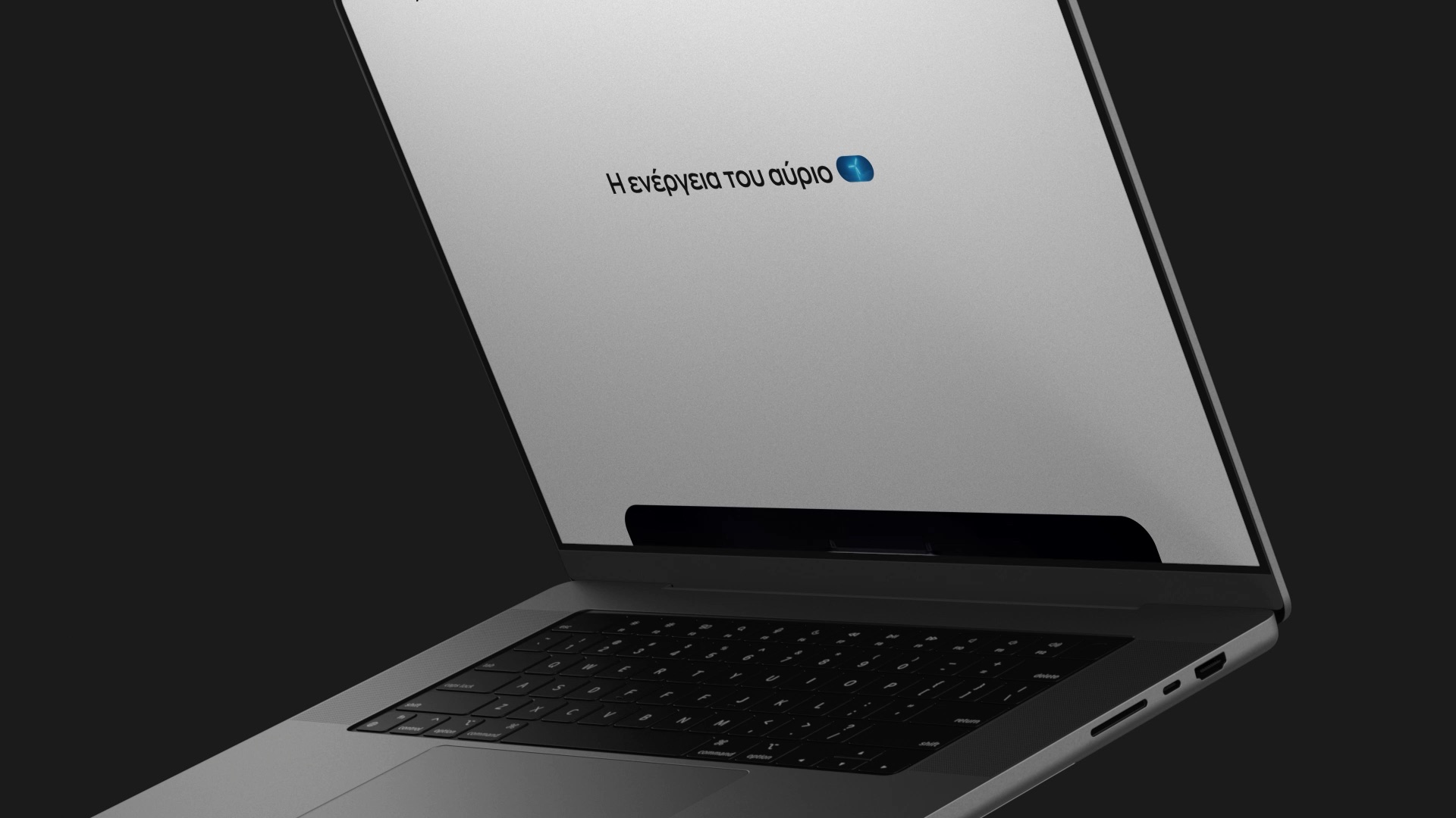
The website introduces Hyperinso’s charging range; the app is where the brand gets used. We designed both and built the website, keeping typography, colour and controls related across every screen. The app has its own interface language, with the character of the brand and the practicality of a tool used on the move.
Make every image belong
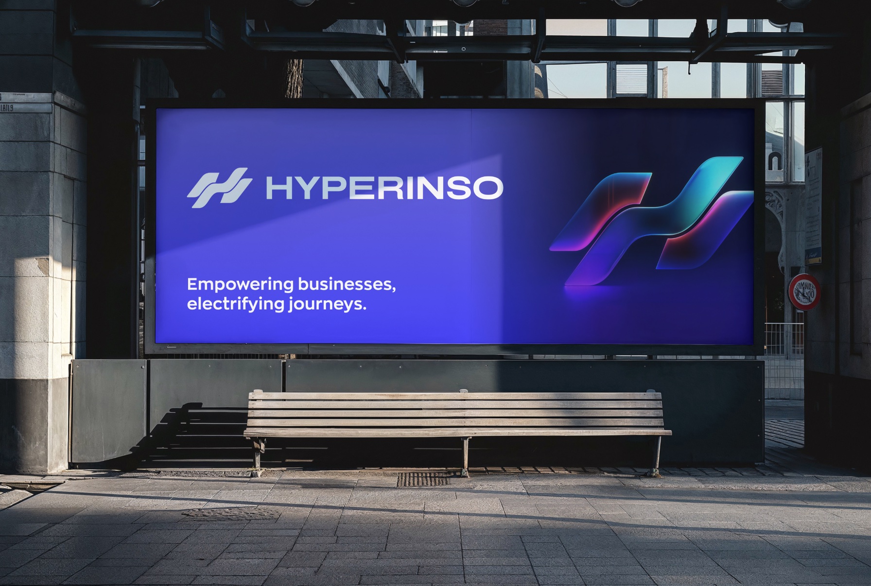
Every render and image was made by us. Product compositions, dimensional versions of the mark and digital presentations share one approach to light, material and colour. Because the imagery was produced alongside the identity and the website, each scene was composed for the message it carries.
Name, identity, website, app design and every image, from one studio. Hyperinso looks like the same company on its products, its screens and its campaigns.