Apikonistiki
Diagnostiki
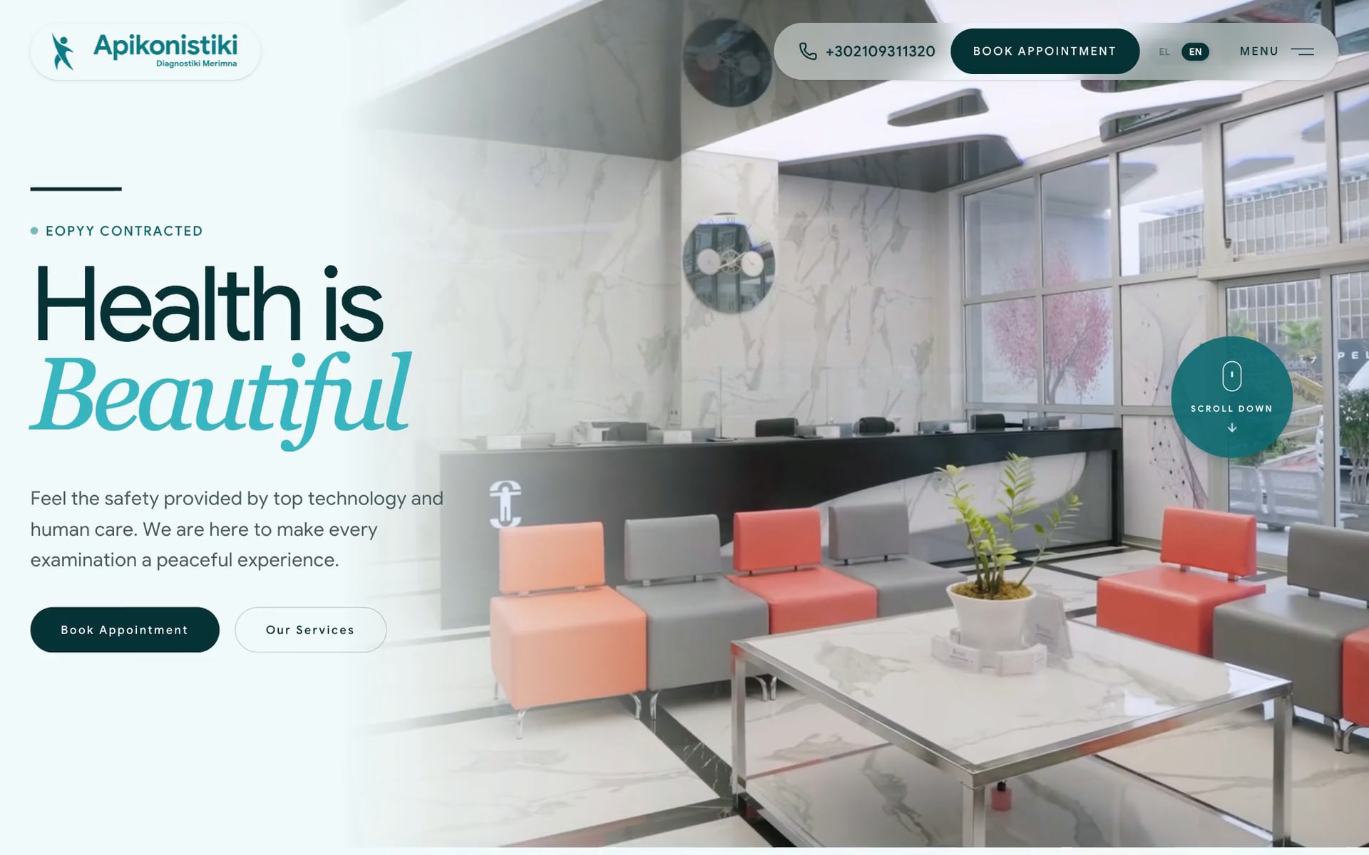
Apikonistiki Diagnostiki is a diagnostic imaging centre in Nea Smyrni, Athens, with MRI, CT, ultrasound, mammography and five more services. People arrive with unfamiliar words, unfamiliar machines and, often, some anxiety, and most come for the one examination their doctor asked for.
We rebranded the centre, designed its UI system, wrote and built its website, and photographed and filmed the centre on location, so that a patient knows the place, and the people, before the first examination.

Health, drawn as a person
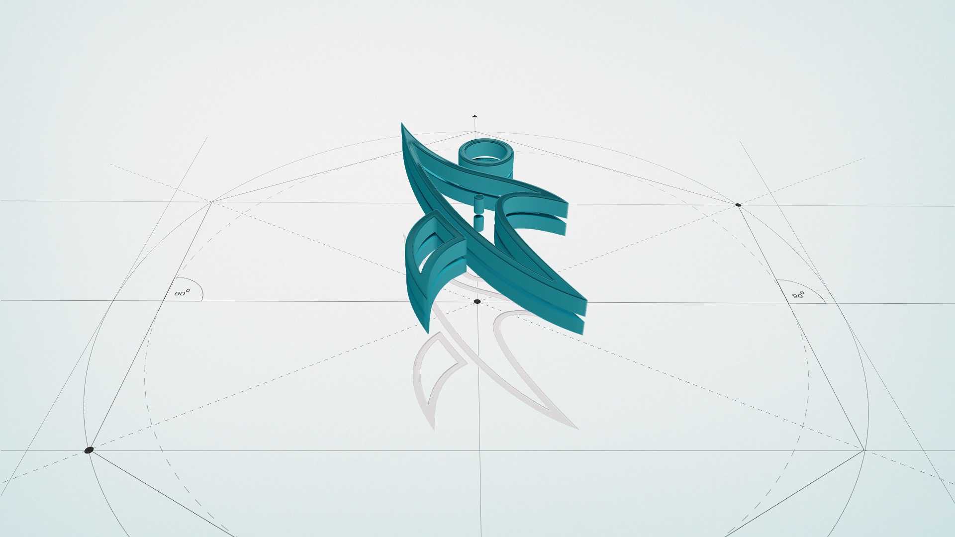
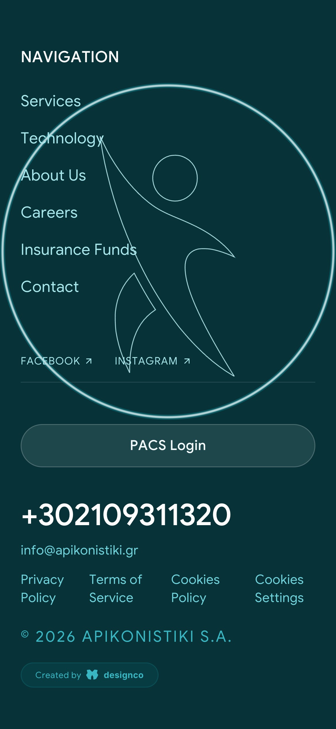
An imaging centre often meets people on an uneasy day. The mark answers with a figure caught in movement, arm raised, the picture of someone well, and it is built from arcs of fixed circles, so its warmth is measured rather than improvised. The palette stays within one family of teals, from the deepest shade to mist, with nothing in it that reads as alarm. On the site the figure closes every page, assembling as a scan line passes.
Plain facts, italic feeling
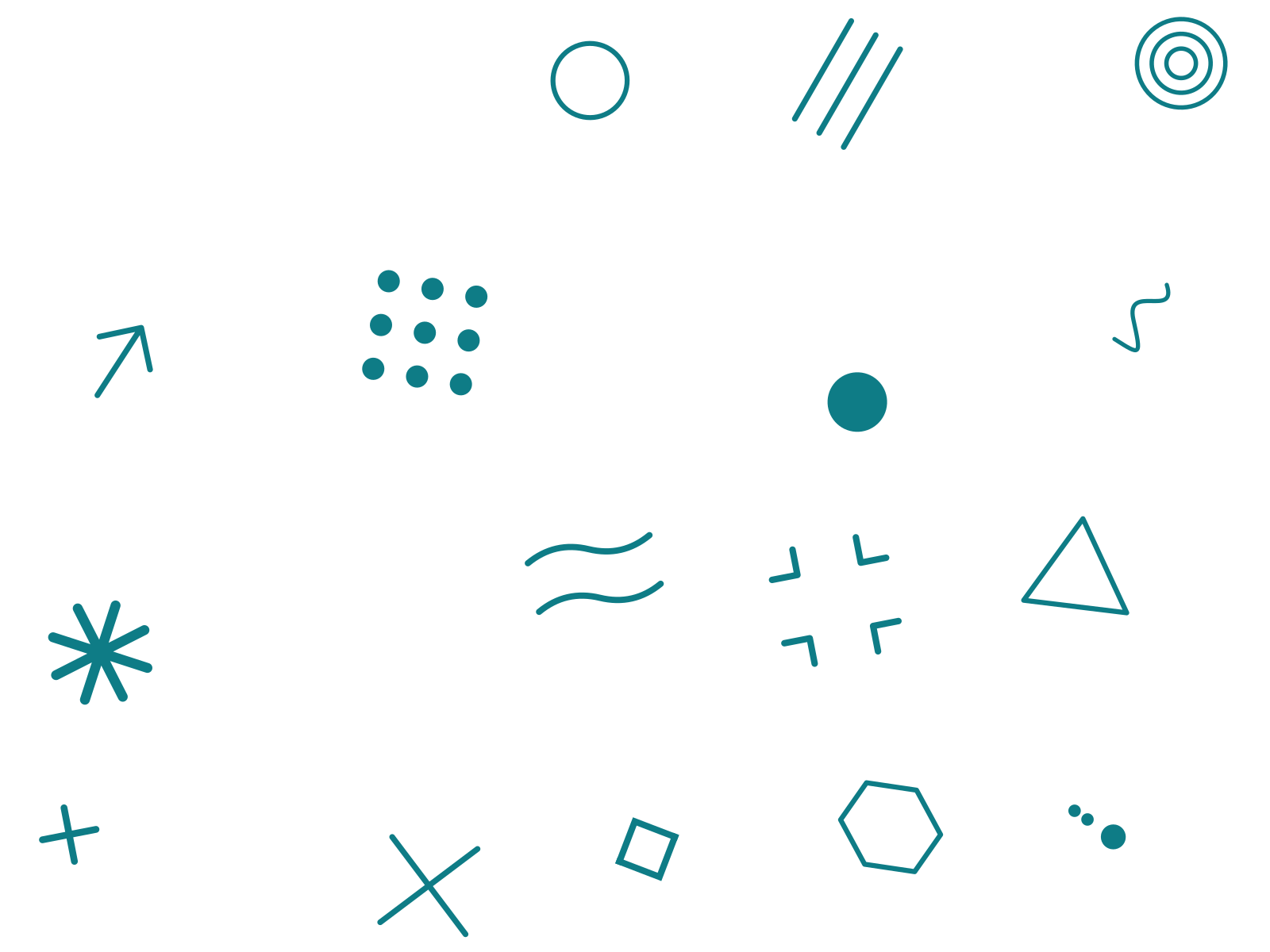
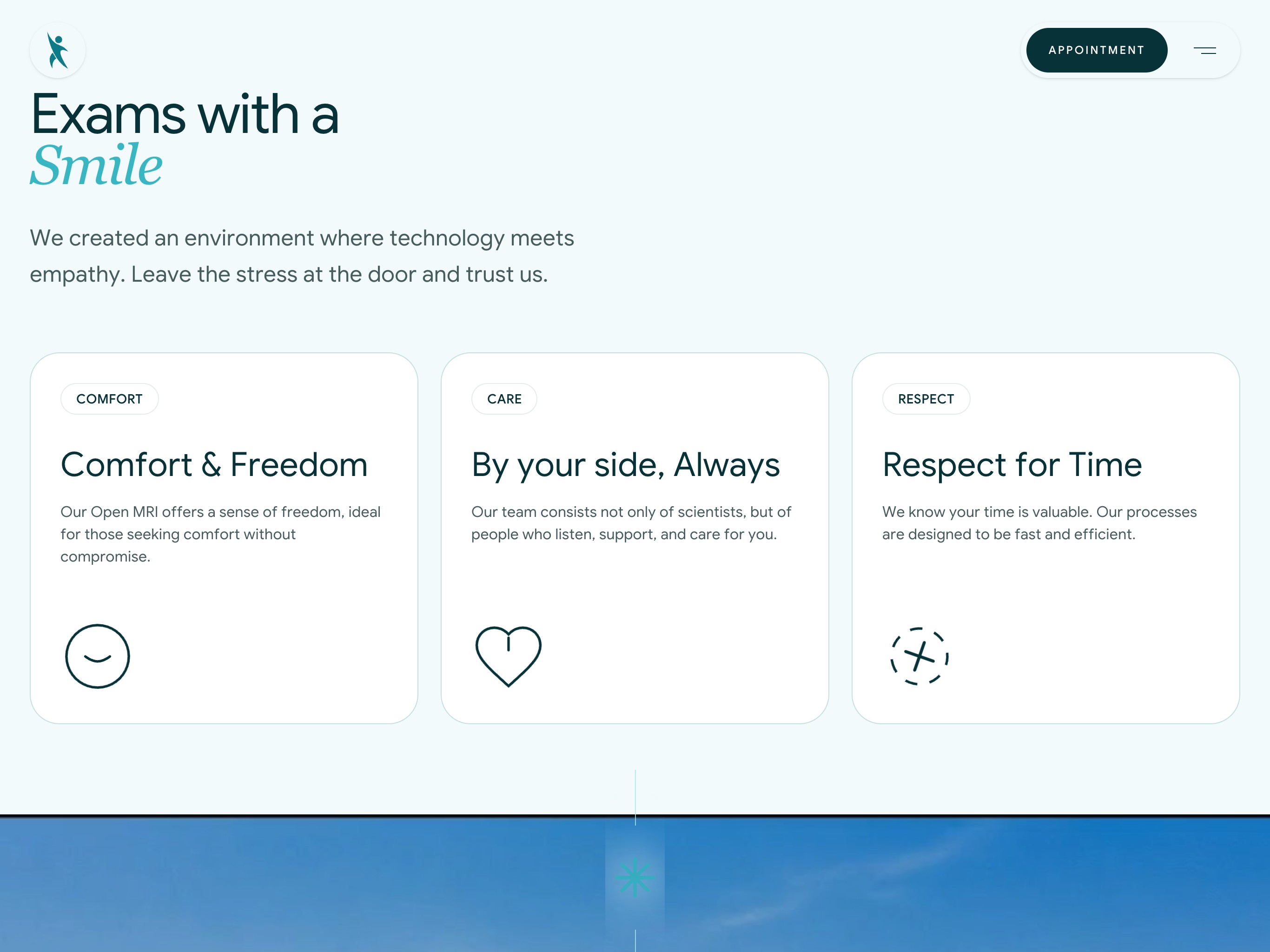
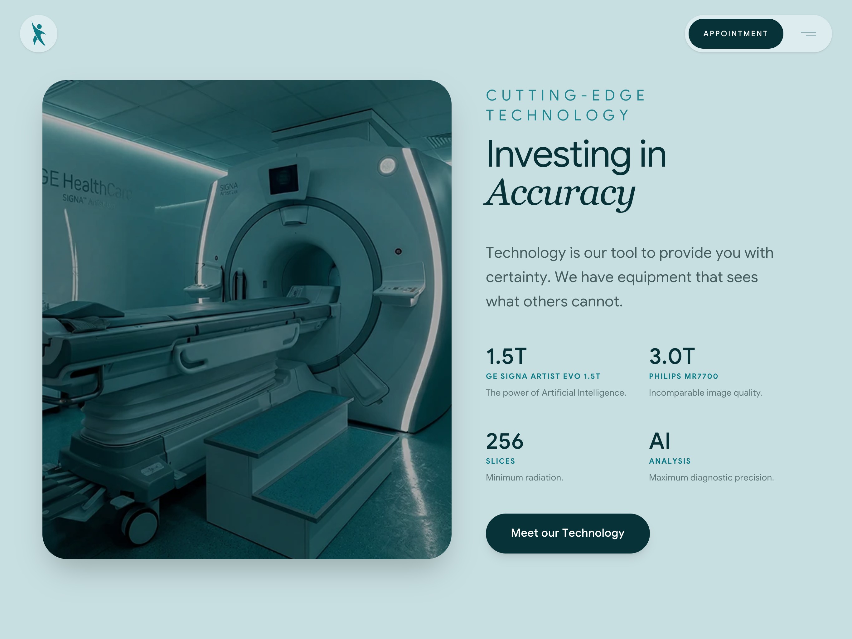
Warmth that blurs the facts would not help anyone preparing for a scan. So the type keeps them apart: a plain sans states what happens, how strong the magnet is and how long it takes, and an italic serif carries the feeling, from Beautiful to Smile and Accuracy. Line glyphs drawn for the system keep one meaning each. Three hold the centre's promises of comfort, care and respect; the rest mark the turns between sections.

A visit you can picture
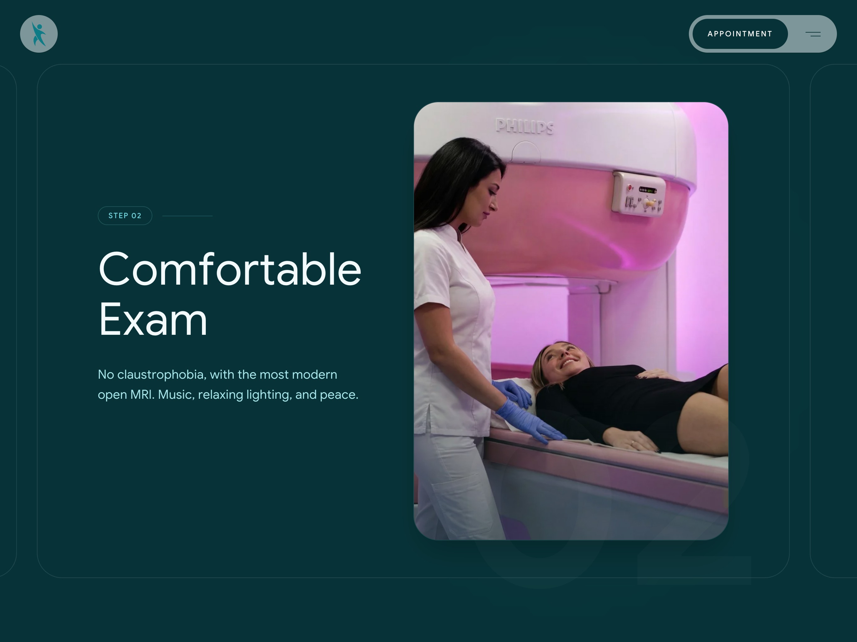
Not knowing what comes next weighs on people before an examination. The home page lays a visit out in four steps, from the desk to the scan, the reading of the images and the results. Each step is shown through the centre's own staff rather than empty rooms and gleaming machines, because the question people bring is less about the scanner than about who will be with them.

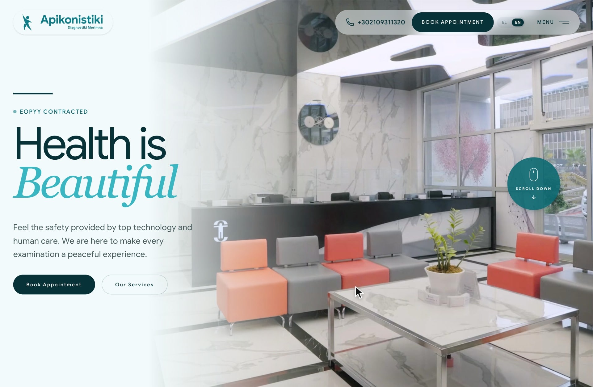
The menu answers the next question
A visit raises practical questions as well as medical ones: is my insurance fund accepted, where exactly are you, when do you open. The menu answers them on the same screen as the nine examinations and the twelve machines, with the insurance funds, the address, the phone, the hours from six in the morning and the login to the image archive, so nobody has to hunt through pages before they call.

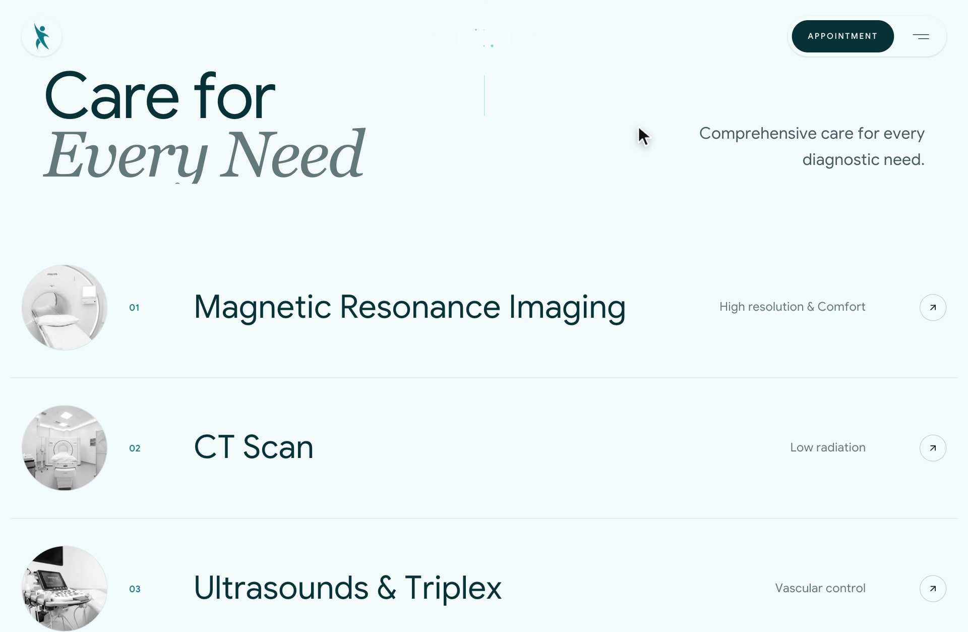
One list, then the answers
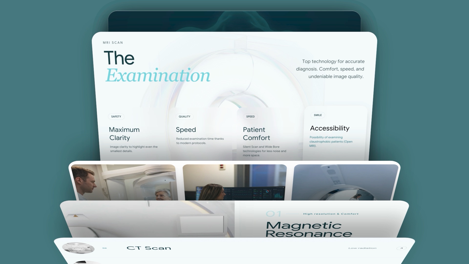
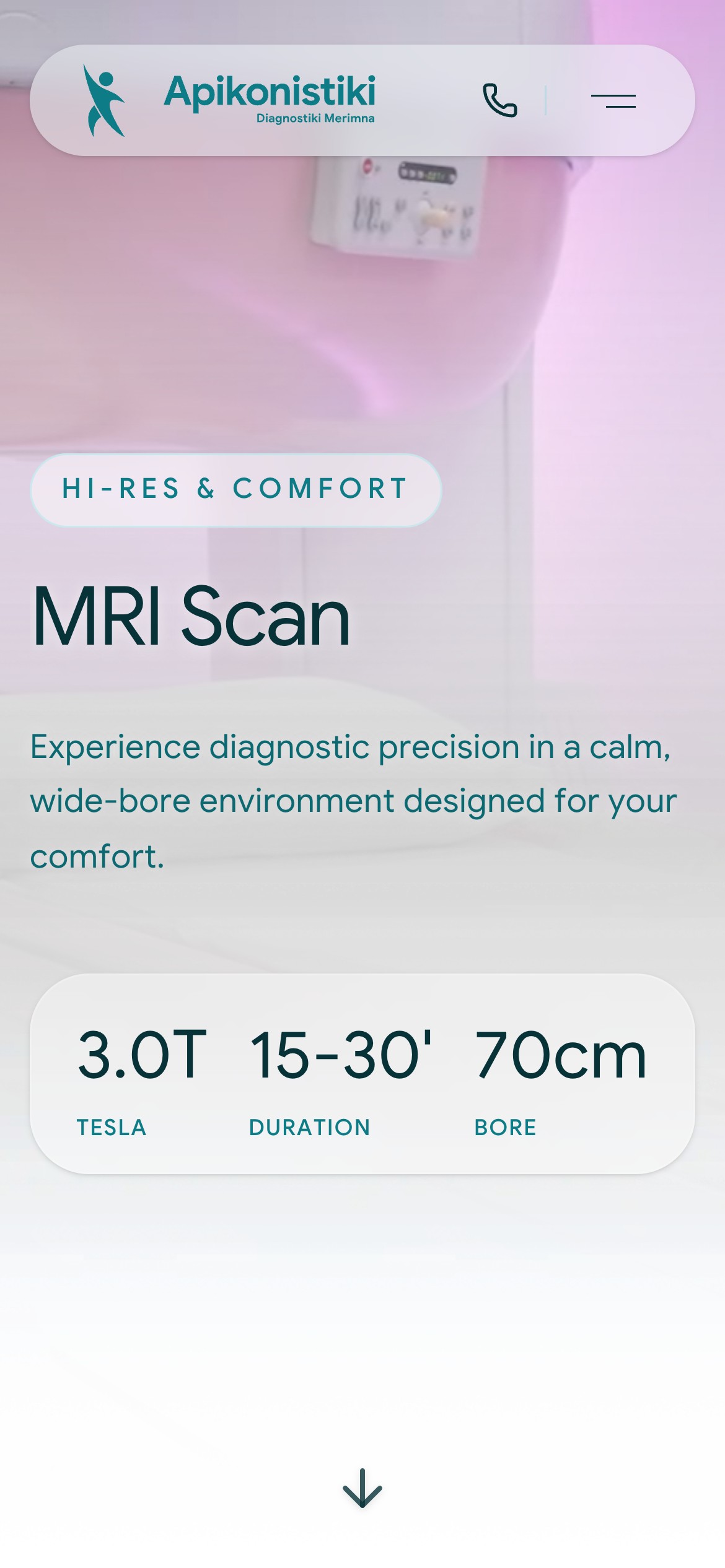
Most people come in for one examination, the one their doctor asked for. Services read as a single list of full names, each row warming to colour under the pointer, so nobody has to decode a grid of icons to find theirs. The examination page then opens on what a patient actually asks: the field strength, fifteen to thirty minutes, a seventy centimetre bore. All eight examination pages share the layout, so each answer sits where the last one did.

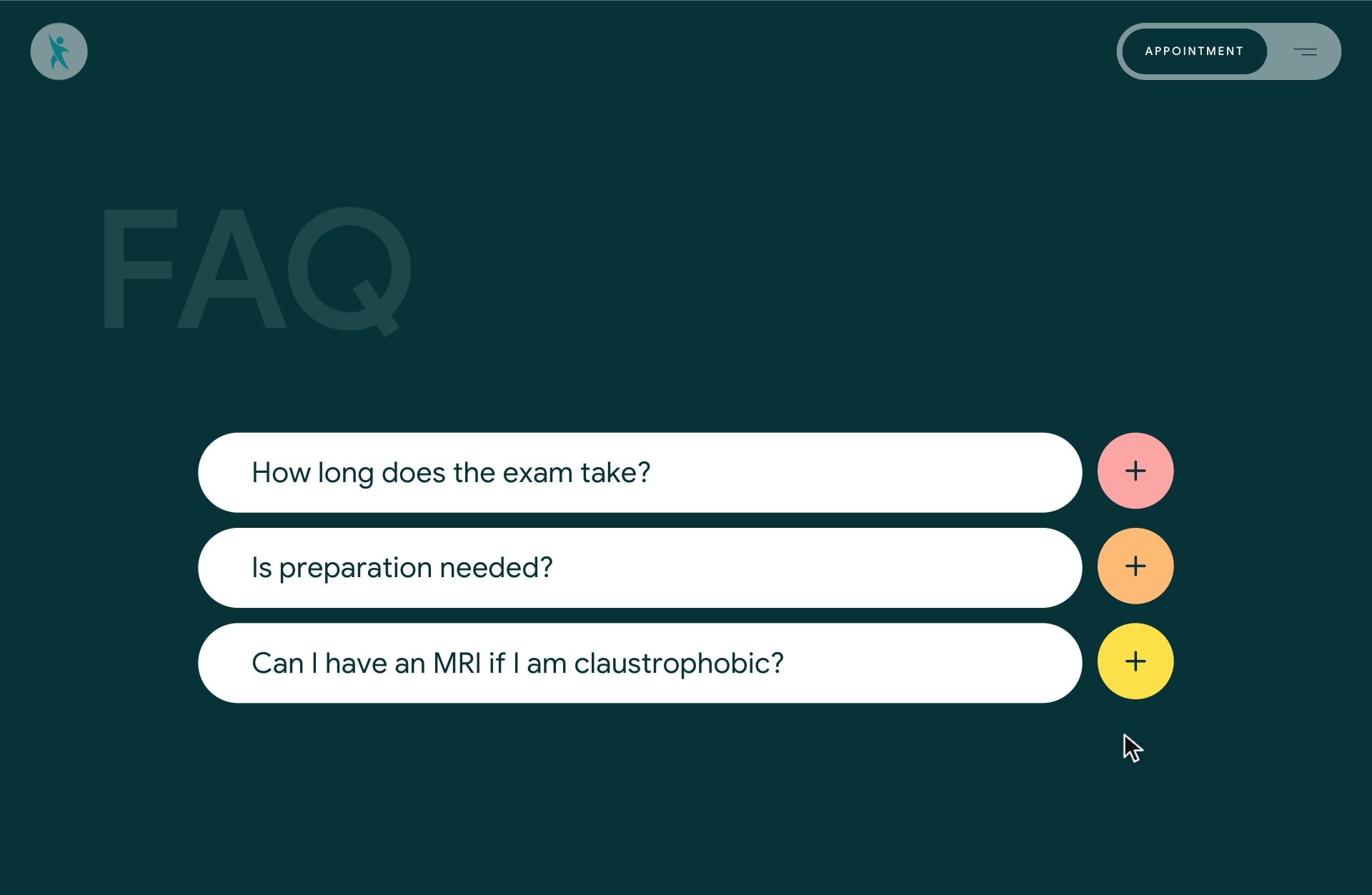
A public page for private worries
Some worries are hard to say out loud, claustrophobia among them. The MRI page asks it for the reader, in their own words, and answers by naming the open MRI and the wide bore systems, so a fear can be put to rest before anyone picks up the phone. One question opens at a time, at display size beside its answer, and the colours of the buttons beside them are the only bright notes on the site.
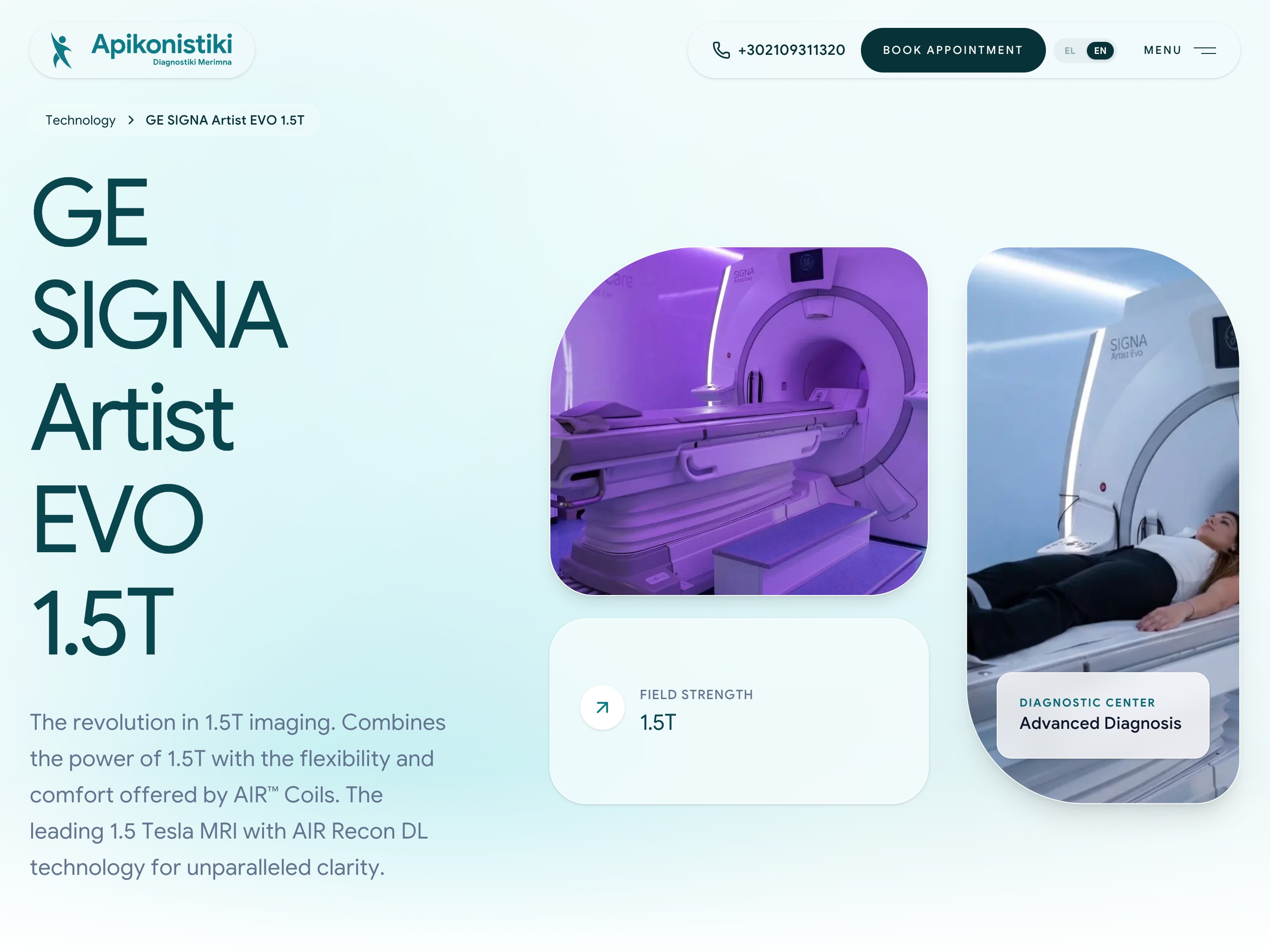
Model numbers instead of adjectives
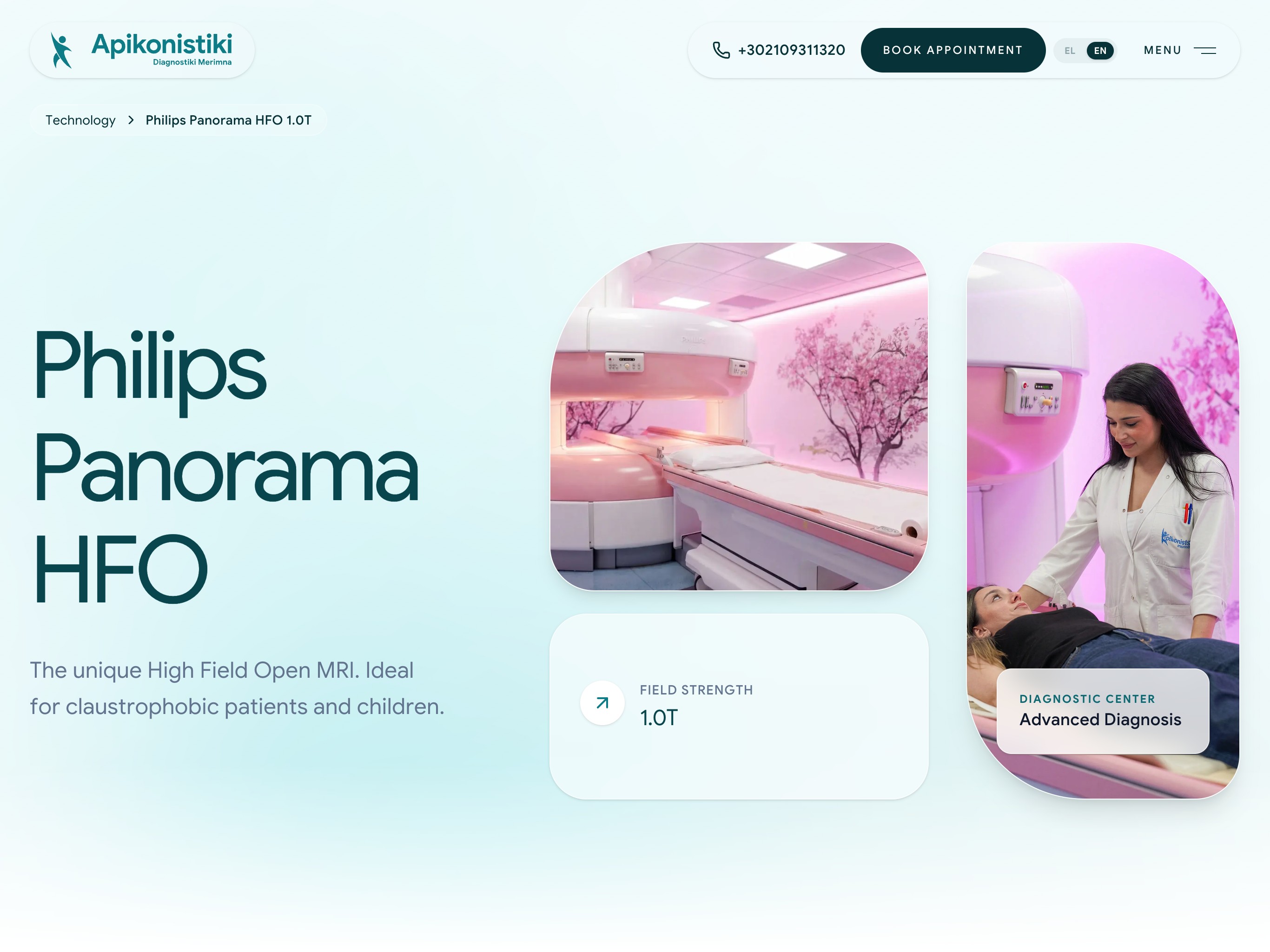
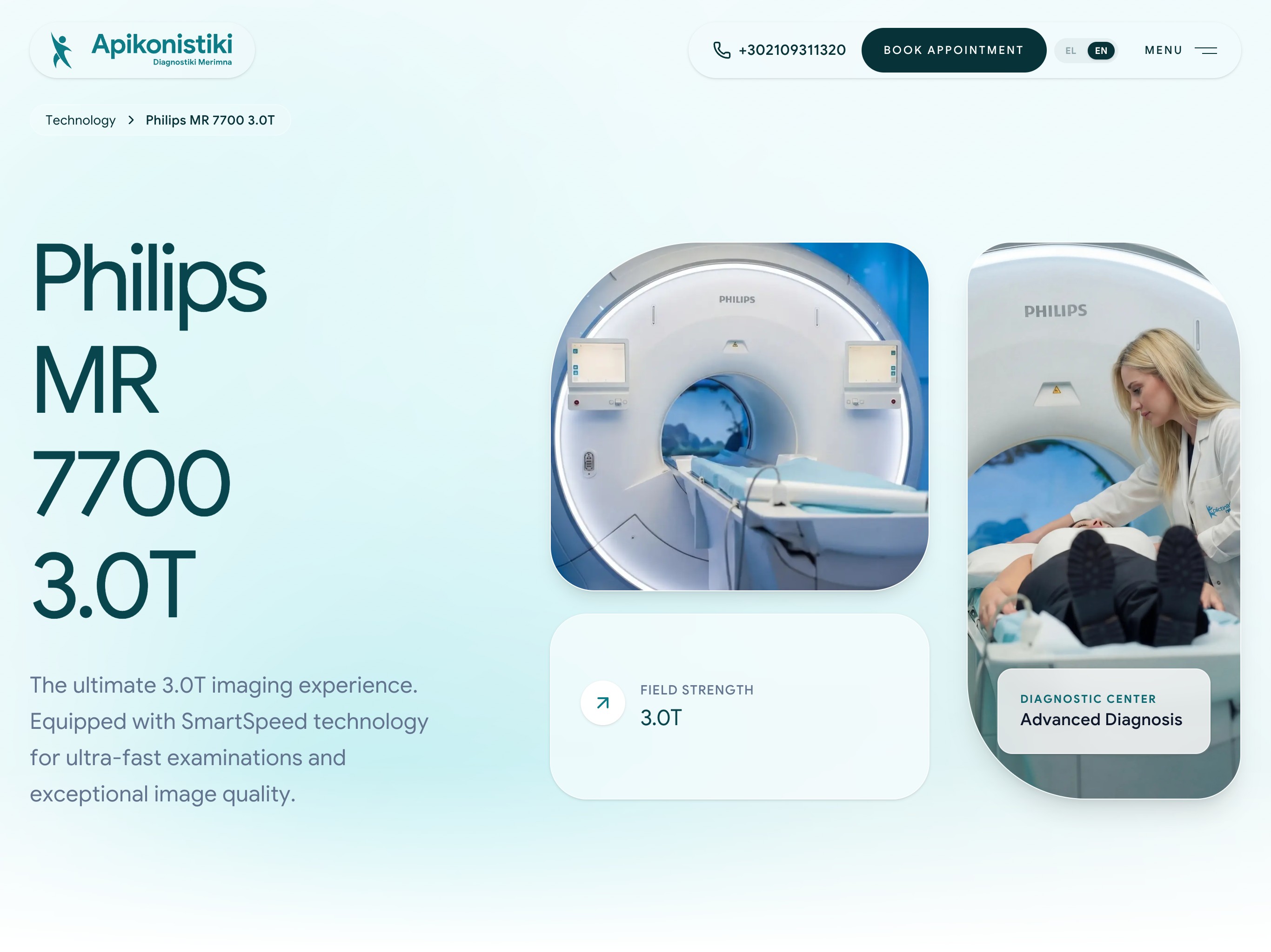
Clinics often promise modern equipment without naming it. Here every machine has a page of its own, opening on its maker, its model and its field strength beside photographs of the room it stands in, so accuracy becomes something a patient, or the doctor who referred them, can look up. The open Panorama says plainly who it is for: claustrophobic patients and children.

For the thumb that will call
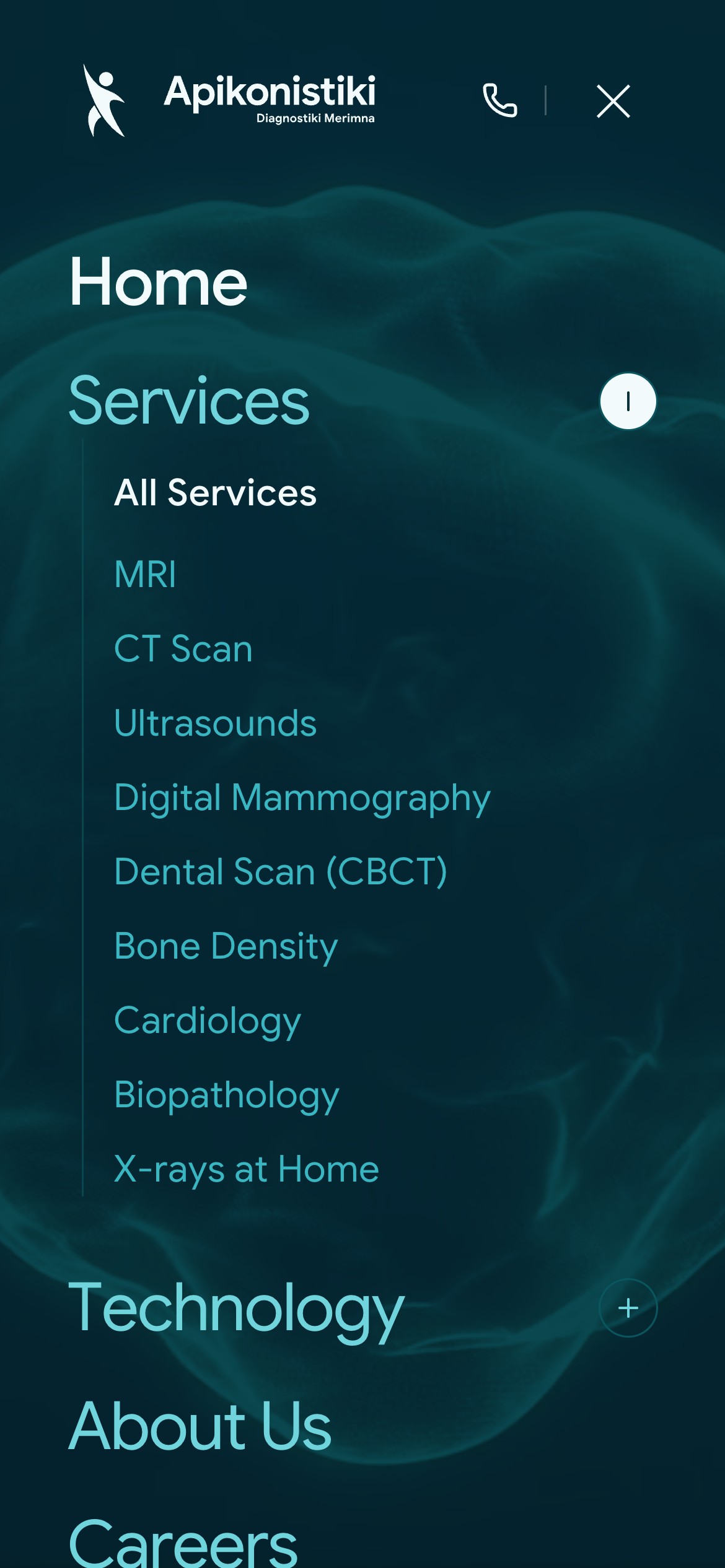
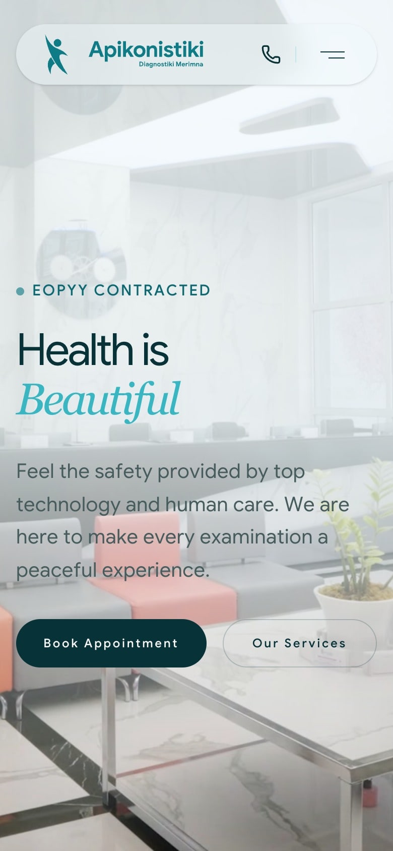
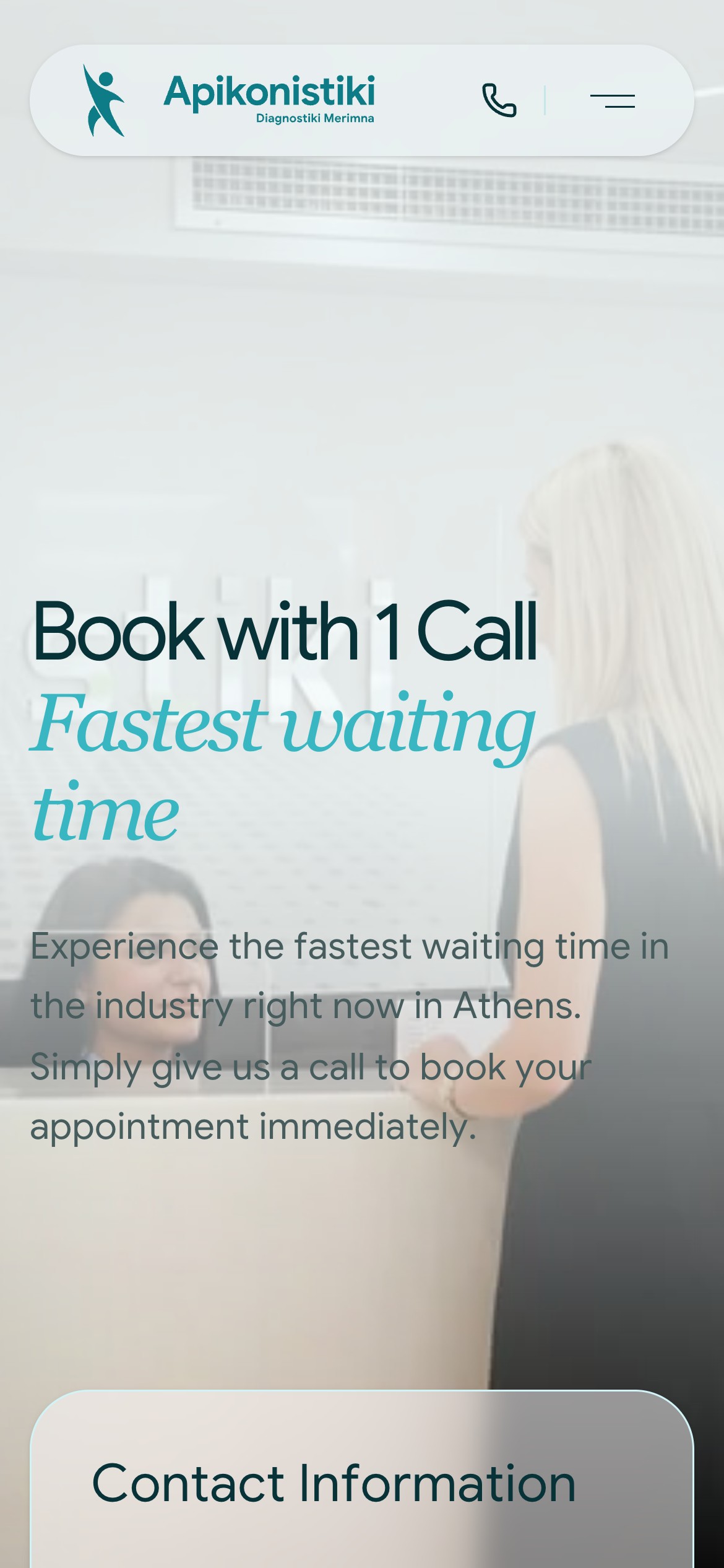
People tend to read about an examination on the phone they will ring from. The call button stays in the top bar of every page, the contact page opens on a single call rather than a form, and every page ends on the number at display size. The layout is recomposed for the small screen rather than shrunk: the menu folds the examinations into accordions, and the opening card keeps its three answers in a row.
The result
A new identity, a UI system, a website written and built around the person preparing for a scan, and photography and film of the centre itself, all made by one team. Apikonistiki now introduces itself the way good clinicians do: precisely, and with the patient in mind.
Building something like this?
Start a project.