ETTH
ETTH is a tanker management and operations group, founded in Athens in 2026, with product and crude tankers from 110,000 to more than 157,000 DWT. Shipping judges a company on its record, and a new company has to earn that trust before it has one.
We created the brand, from the strategy and the voice to the mark and its guidelines, then designed and built the website, so that an owner, a charterer, a financial institution and a seafarer all meet a serious operator on the first screen.


The mark stands in the sea
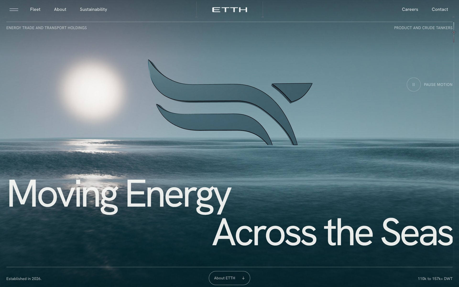
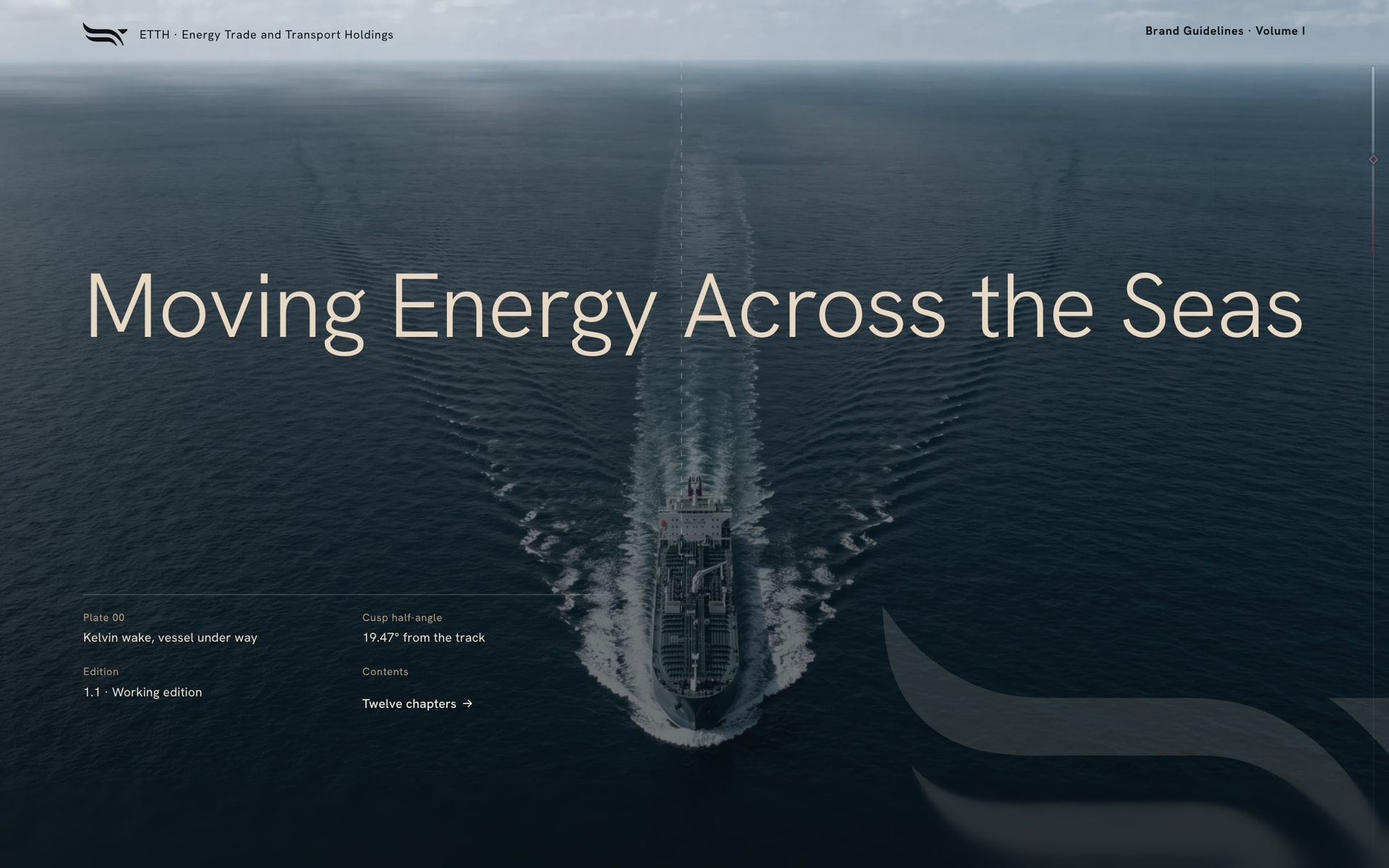
A company founded this year cannot open on its history, so the site opens on its bearing instead. The mark, three sweeping strokes, stands in a calm sea under a low sun, built live in three.js from the logo's own paths, and scrolling carries the visitor through it to the company. One motto holds the screen: Moving Energy Across the Seas. Nothing else competes for the first impression, and a control beside it stills the water for anyone who prefers it still.


Ornament that is solved, not drawn
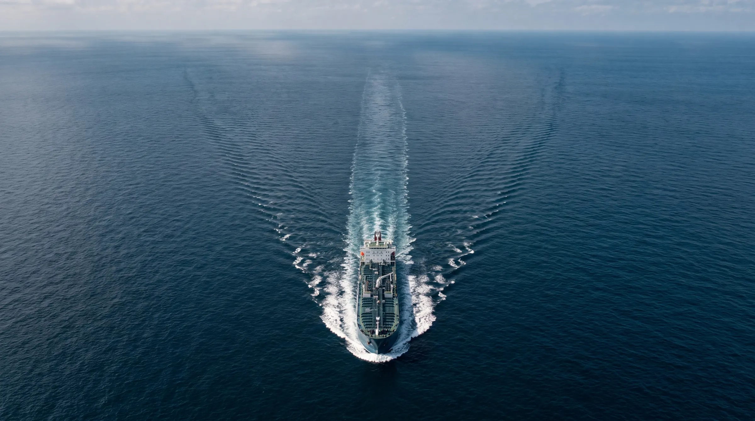
A house style can be argued with; a result cannot. Behind any vessel on open water the wake opens at 19.47 degrees from the track, whatever the hull and however fast she goes. So the signature pattern of the identity is that wake, plotted: an angle the company did not invent and cannot lose. Seven more follow the same rule, from the swell to the contours of a seabed, each generated from a law and none drawn by hand, so the system can cover a hull, a page or a screen without a designer redrawing it.



A palette read from the sea
Shipping brands tend to reach for the same navy and add a bright accent. ETTH's colours come from one observation instead: Deep Petroleum is what Ocean Blue becomes at depth, so the two belong together by nature rather than by taste. Petroleum carries most of every view, Warm Sand opens it, Ocean Blue does the work, and Burgundy is allowed one note at a time.

Business card to hull
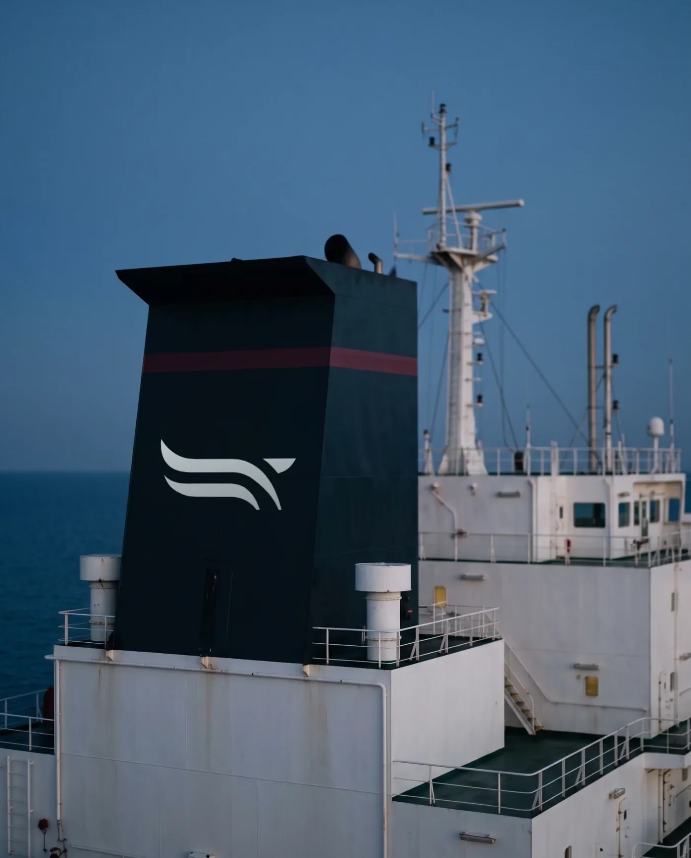
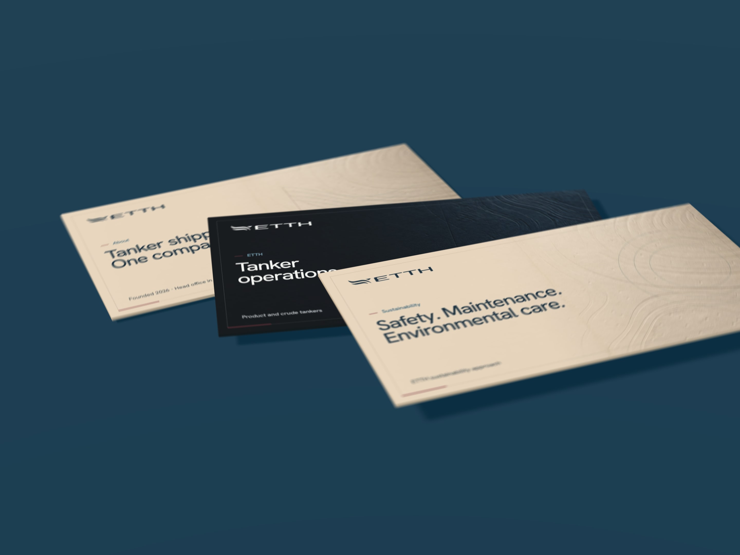
A tanker's identity has to hold at two sizes most brands never meet: a card in the hand and a funnel read across a harbour. One geometry does both duties, crisp at the size of a card and dignified painted across a hull, and the lockup has a stacked form for squarer spaces such as a funnel side. All of it is written down in twelve chapters, so a yard, a printer and a developer build the same company.

A vessel is her particulars
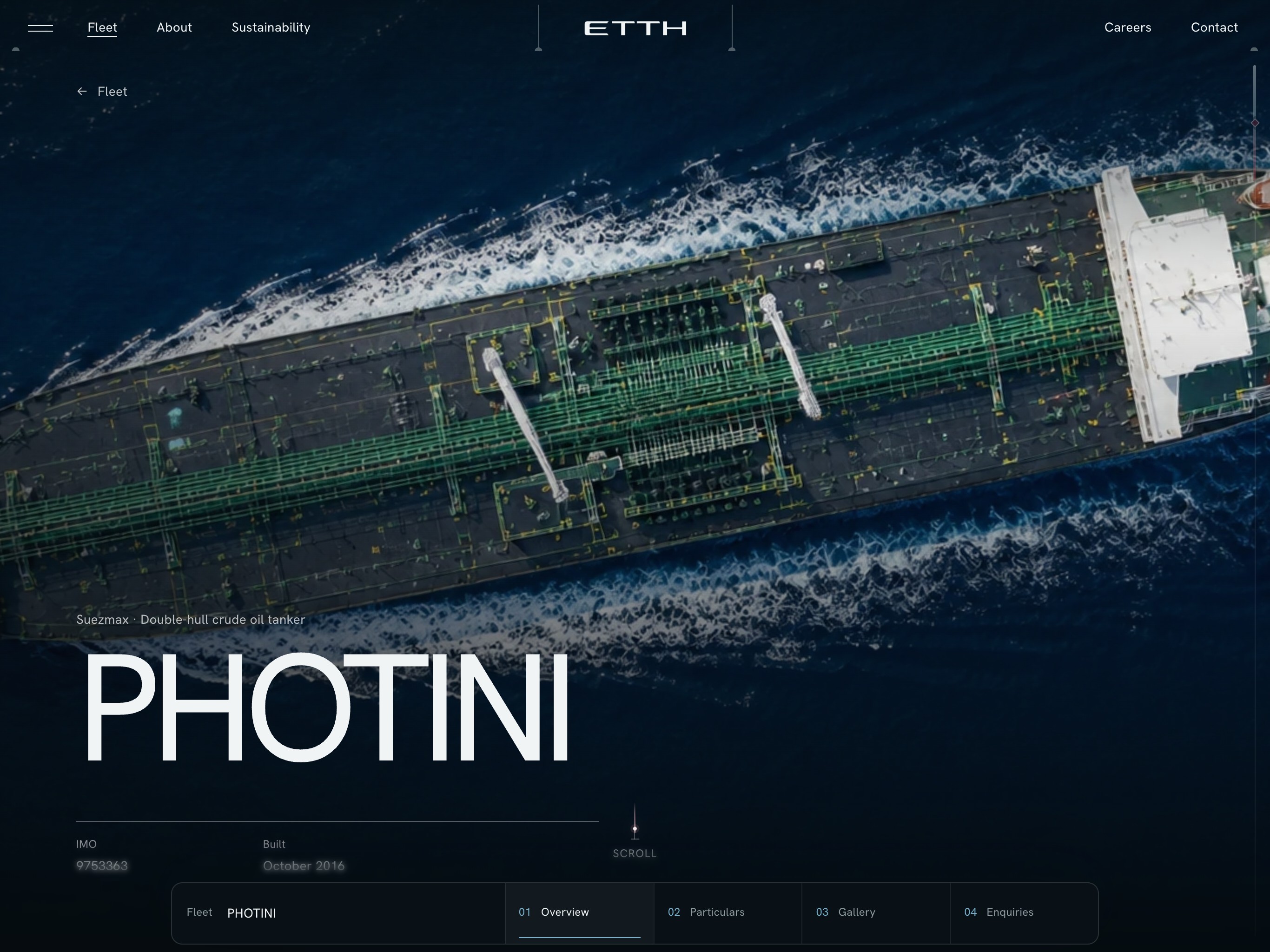
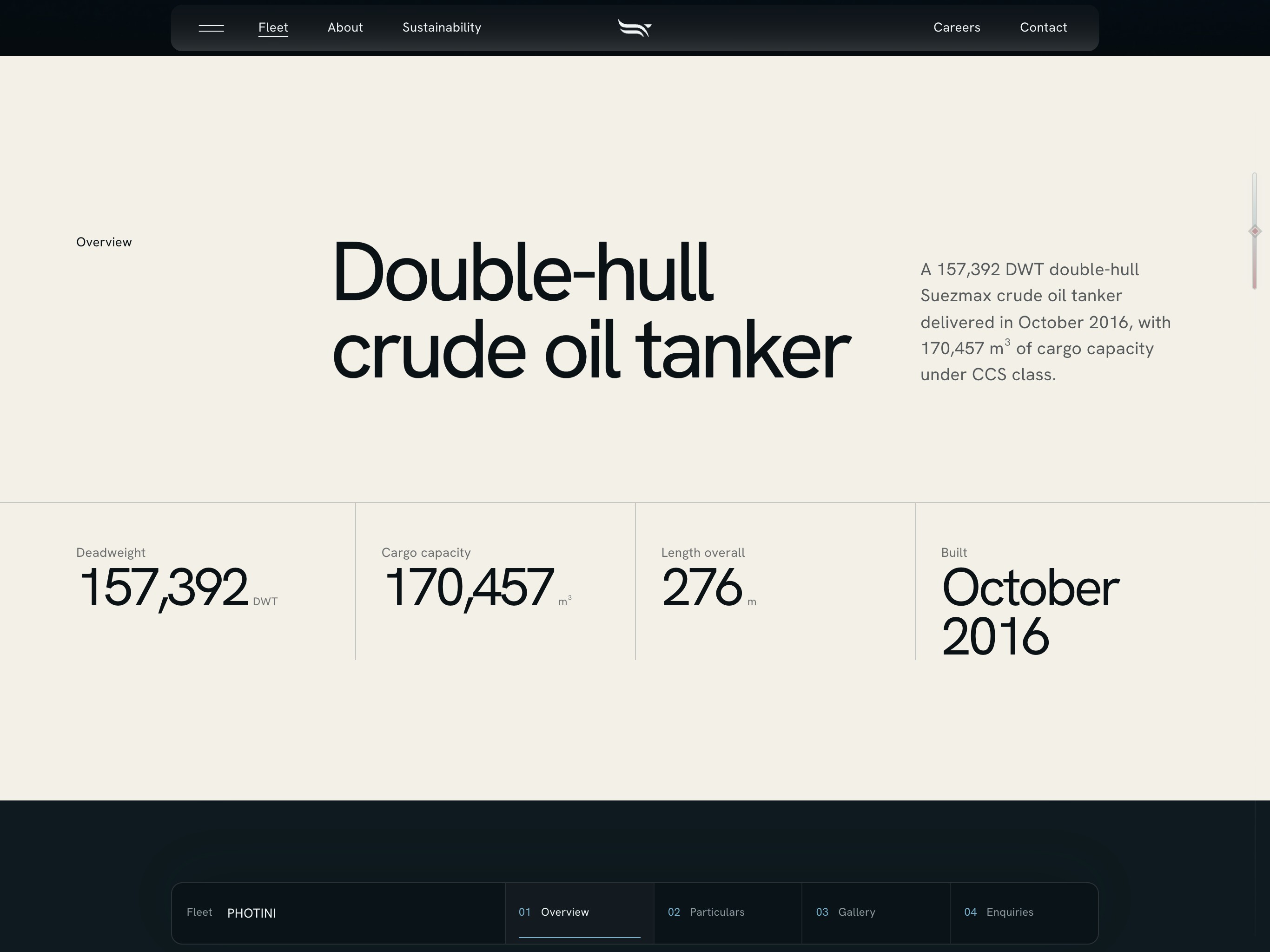
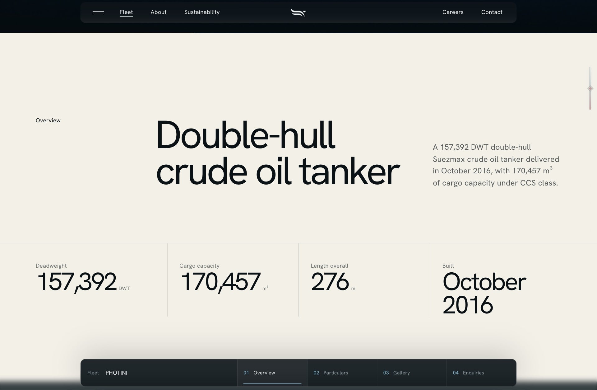
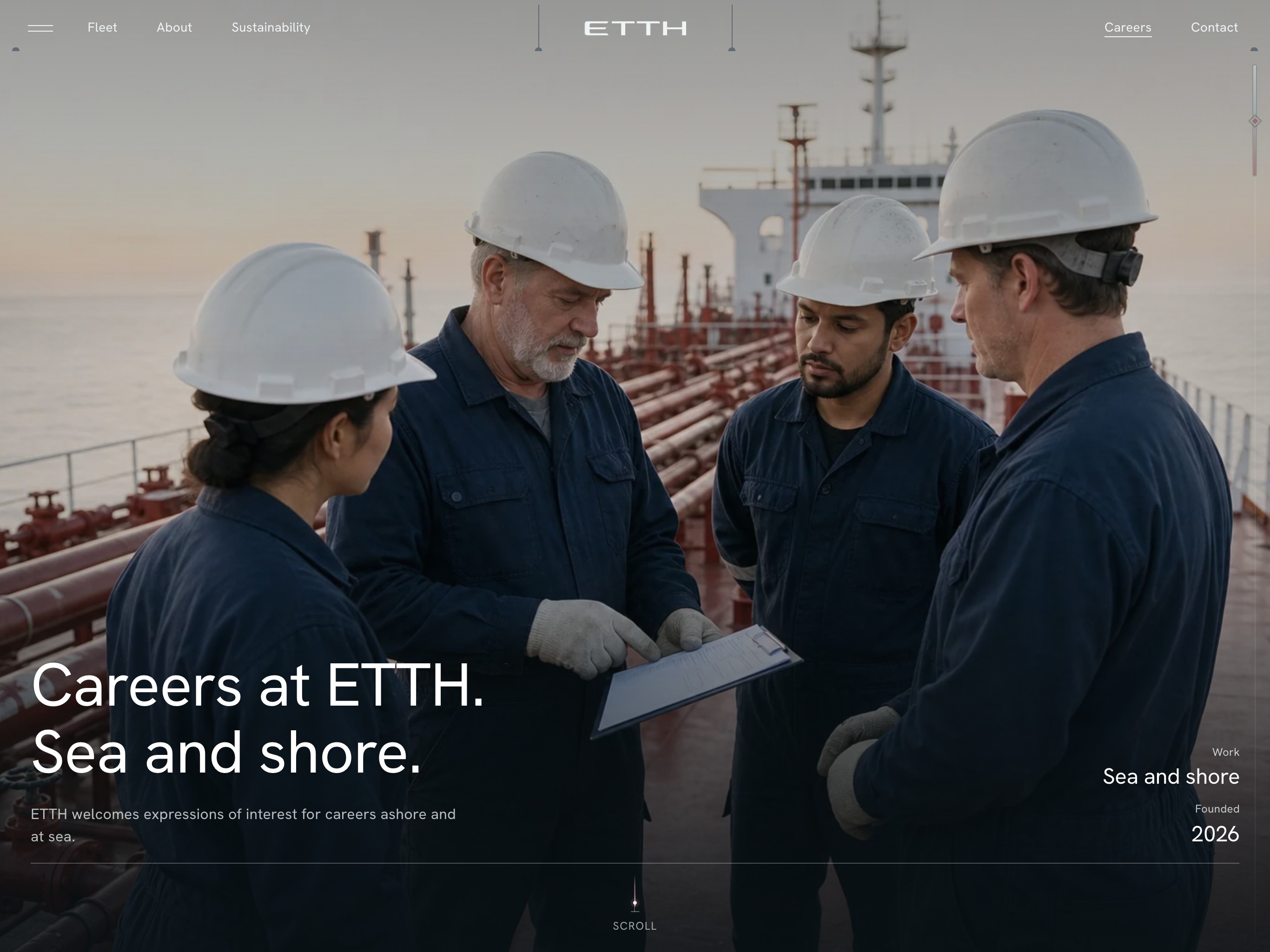
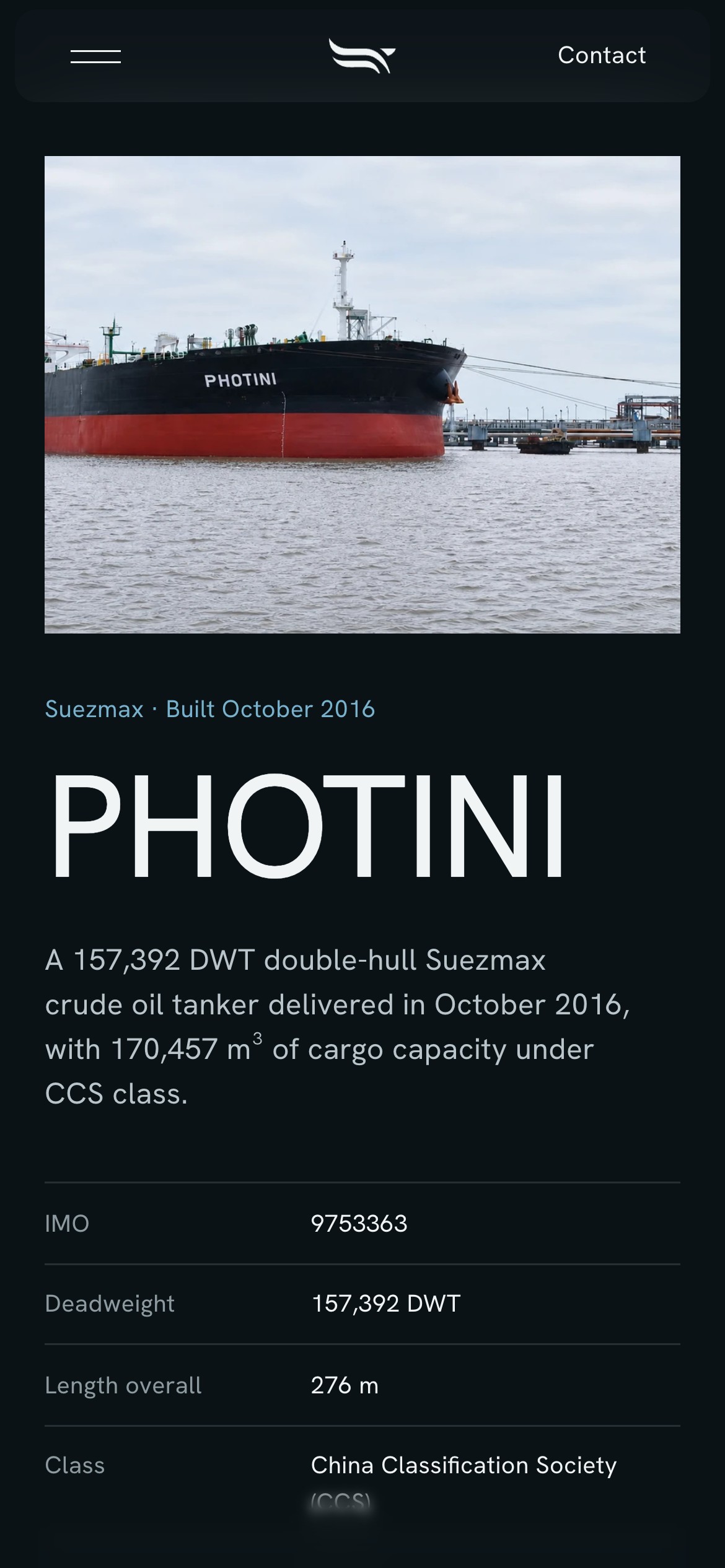
The people who assess a tanker (a charterer's desk, a broker, a bank) look for an IMO number, a deadweight, a class society and a build date before anything else. Fleet pages often give them a photograph and a paragraph. Every ETTH vessel has her own page: four figures first, then the principal particulars as a ruled ledger in six groups, from identity to class and machinery, with a dock that keeps Overview, Particulars, Gallery and Enquiries one press away.

Four ships, shown as four
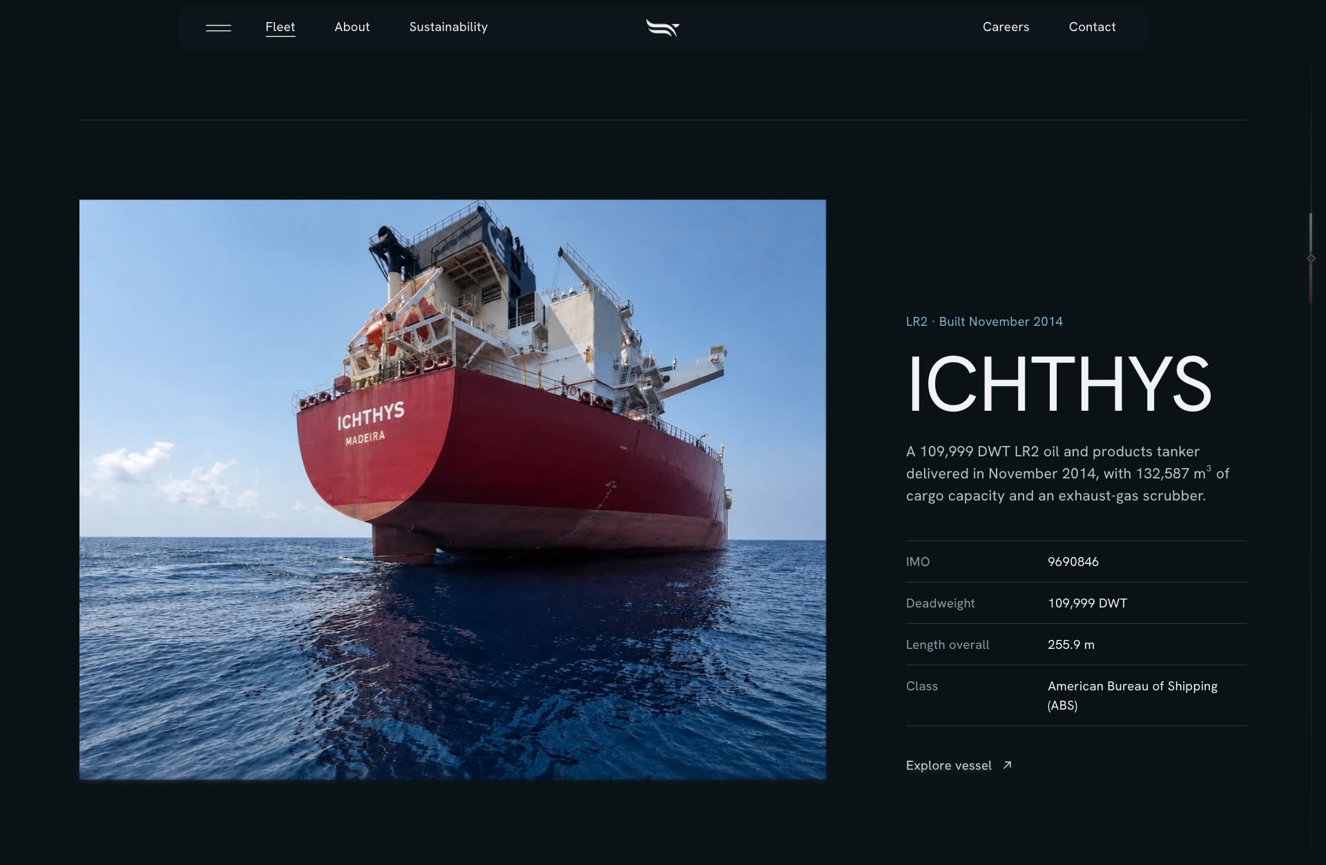
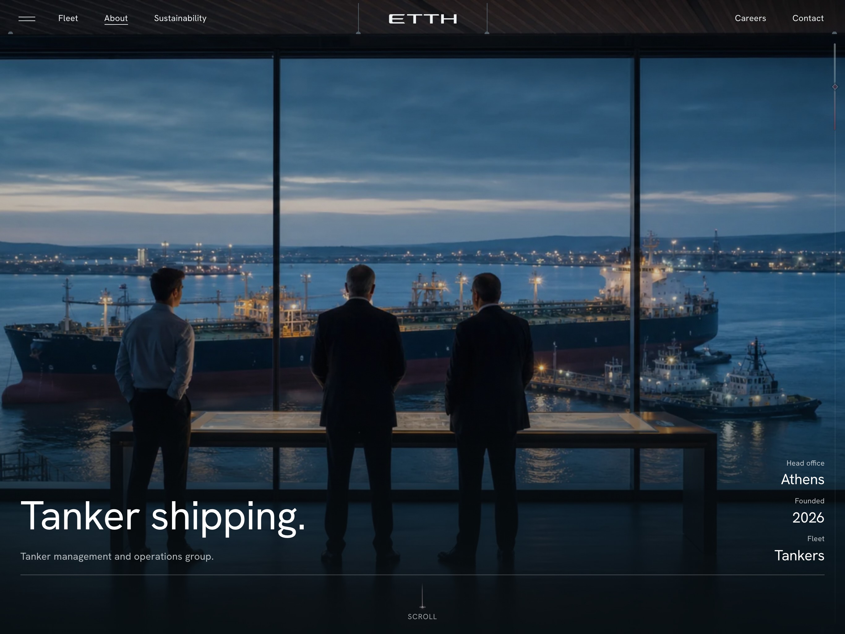
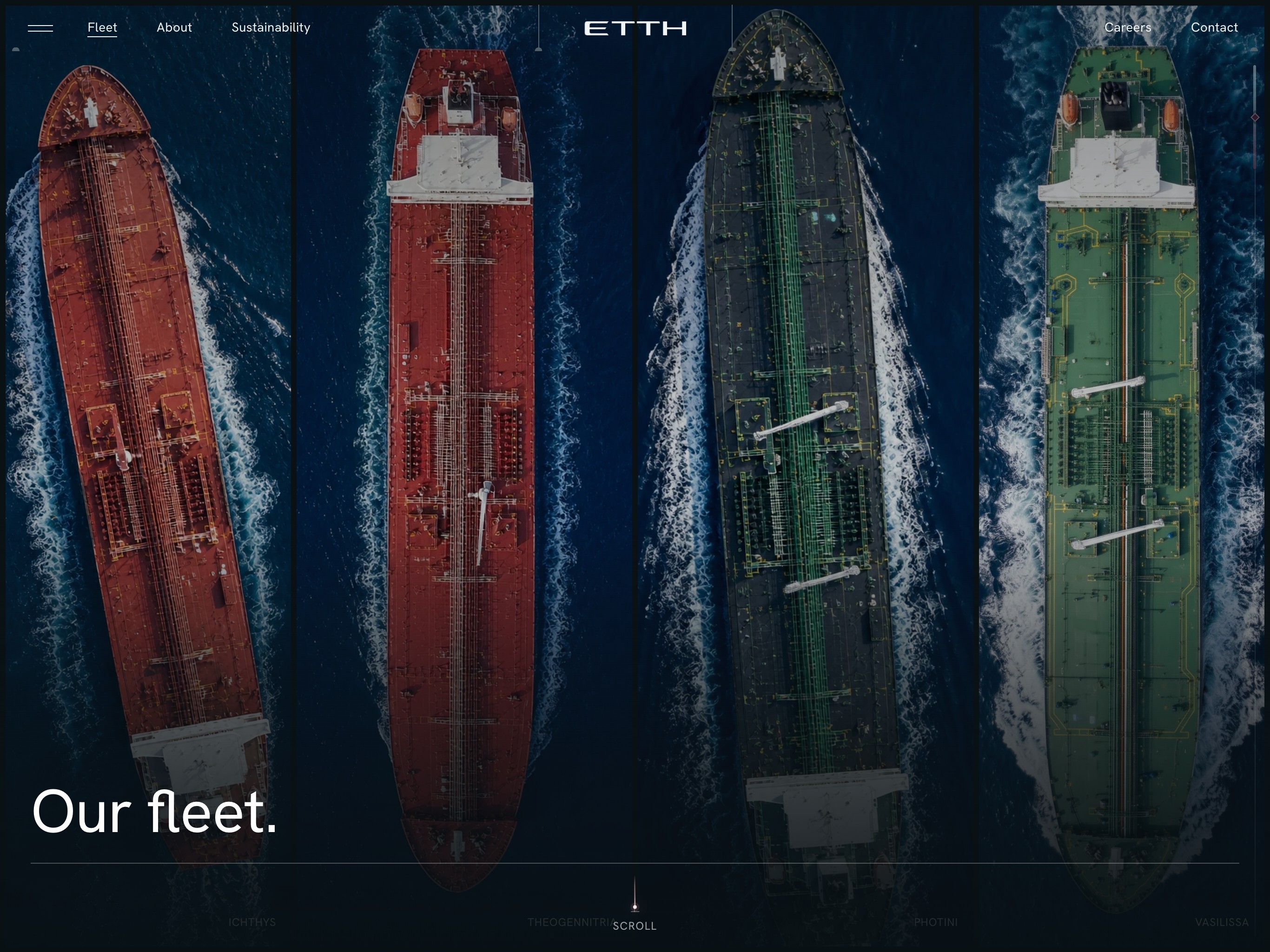
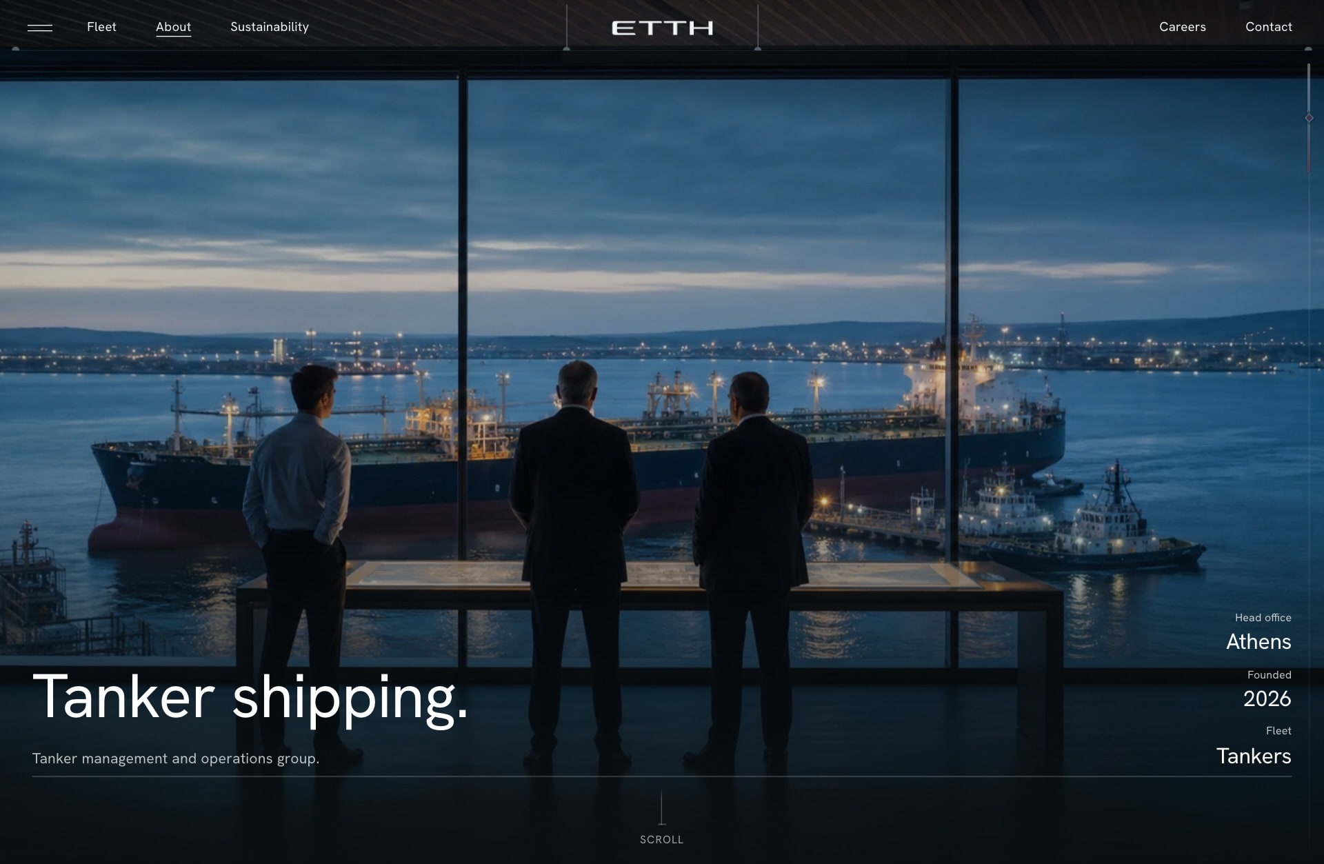
A young fleet invites padding: stock ships, round numbers, a map of the world. The register does the opposite. It shows the four vessels ETTH has, two LR2 and two Suezmax, each with her photograph, build date and class, and leaves room for the next entry to join in the same form. Every page opens the same way, on one picture and one short line, in dusk light for the company and working daylight for the ship, so the site reads as one record kept by one hand.
The form asks who is asking
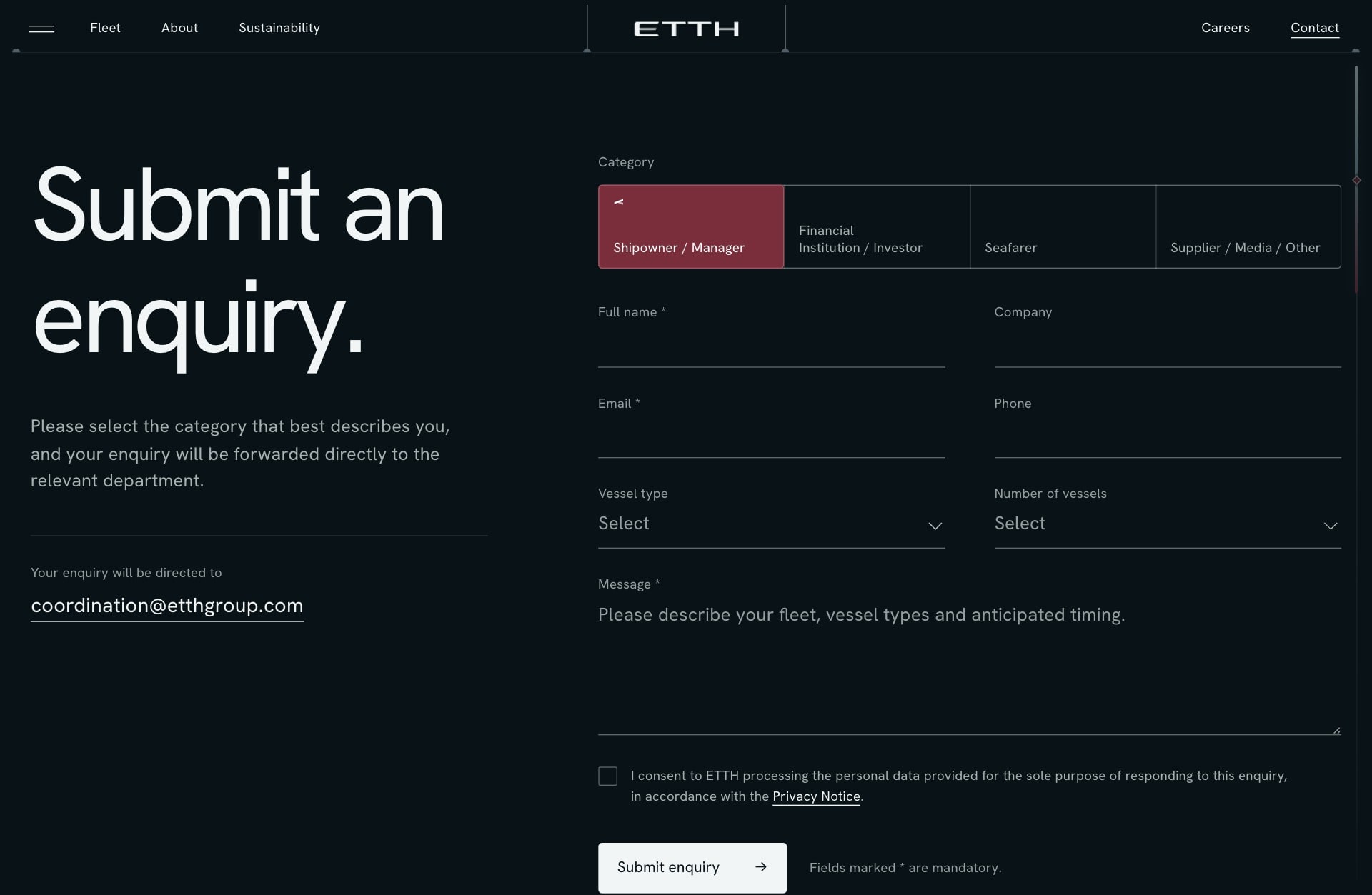
A shipowner, a financial institution, a seafarer and a supplier want different things from a tanker company, and a single contact form serves none of them well. The enquiry starts with who is writing and changes what it asks to suit: vessel type and number of vessels for an owner, a rank for a seafarer, with a pointer to the careers form for a CV. The site says where the enquiry goes before it is sent, so nobody writes into the dark.

The same sea in the hand
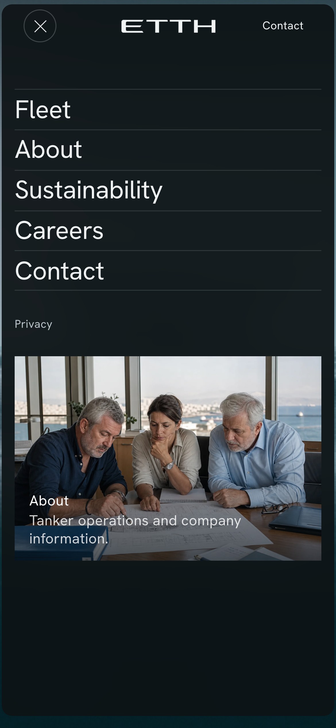
Much of shipping is read on a phone, between a terminal and a meeting. The opening scene is recomposed for a tall screen rather than cropped: the mark keeps its place over the water and the motto sets in two lines beneath it. A vessel's facts stay a ledger of label and value at any width, so a deadweight is as easy to find on a quay as at a desk.
The result
A tanker company that looks, from its first season, like one that has always been exact: a mark, a palette of petroleum, ocean and one burgundy accent, a plain voice and a website that puts the vessels and their particulars first. The system is written down, so the next vessel, page or document takes its place without a redesign.
Building something like this?
Start a project.