Sanar
Sanar brings doctors, nurses and lab tests to people’s homes in Saudi Arabia and puts a licensed doctor on video at any hour. Its app had grown one feature at a time, and the seams showed: low contrast, icons that changed style from screen to screen, payment spread across steps and bookings that lost track of who they were for.
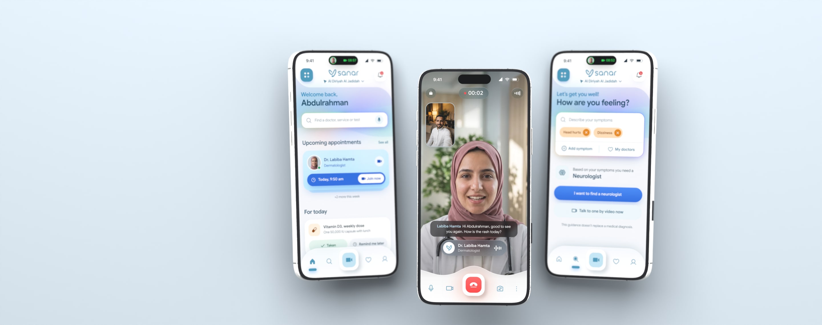
We redesigned the app from first principles and built it as a working product in English and Arabic: a calm visual language and the system behind it, a soft 3D illustration set, an assistant that reads symptoms in plain words, video visits with live captions and emergency help that only a deliberate hold can call.
Calm before clever
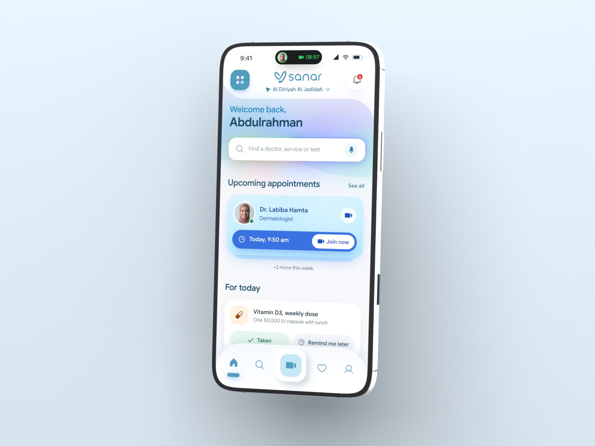
People open a health app when something is wrong, often on behalf of someone else. So every screen lowers the pulse before it asks for anything: a soft canvas, one primary action, sentence case throughout, nothing smaller than 12 pixels and contrast that passes WCAG AA, so parents and grandparents read it as easily as their children. Home leads with what matters this morning, the visit about to start and today’s dose, and keeps every service a flick away.
Plain words in, the right doctor out
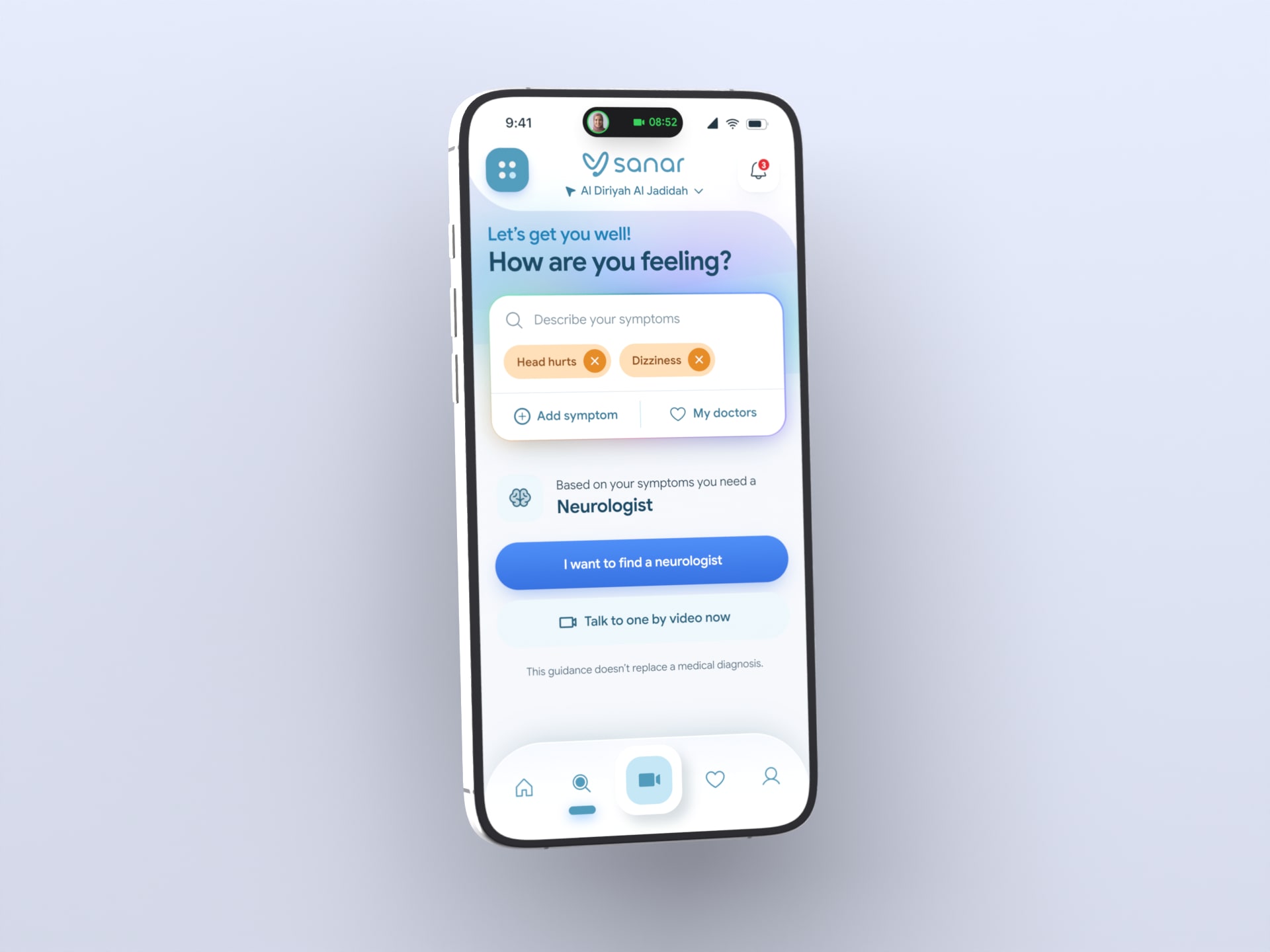
Patients know how they feel, not which specialist they need. So search takes symptoms the way people write them, in English or Arabic, and answers with the kind of doctor to see, a list to book from and a video visit now. Combinations that could be urgent, such as chest pain with shortness of breath, skip the list and go straight to emergency help. The assistant has no avatar and no name: colour moving softly behind the field is enough to say something is listening.
A doctor in minutes
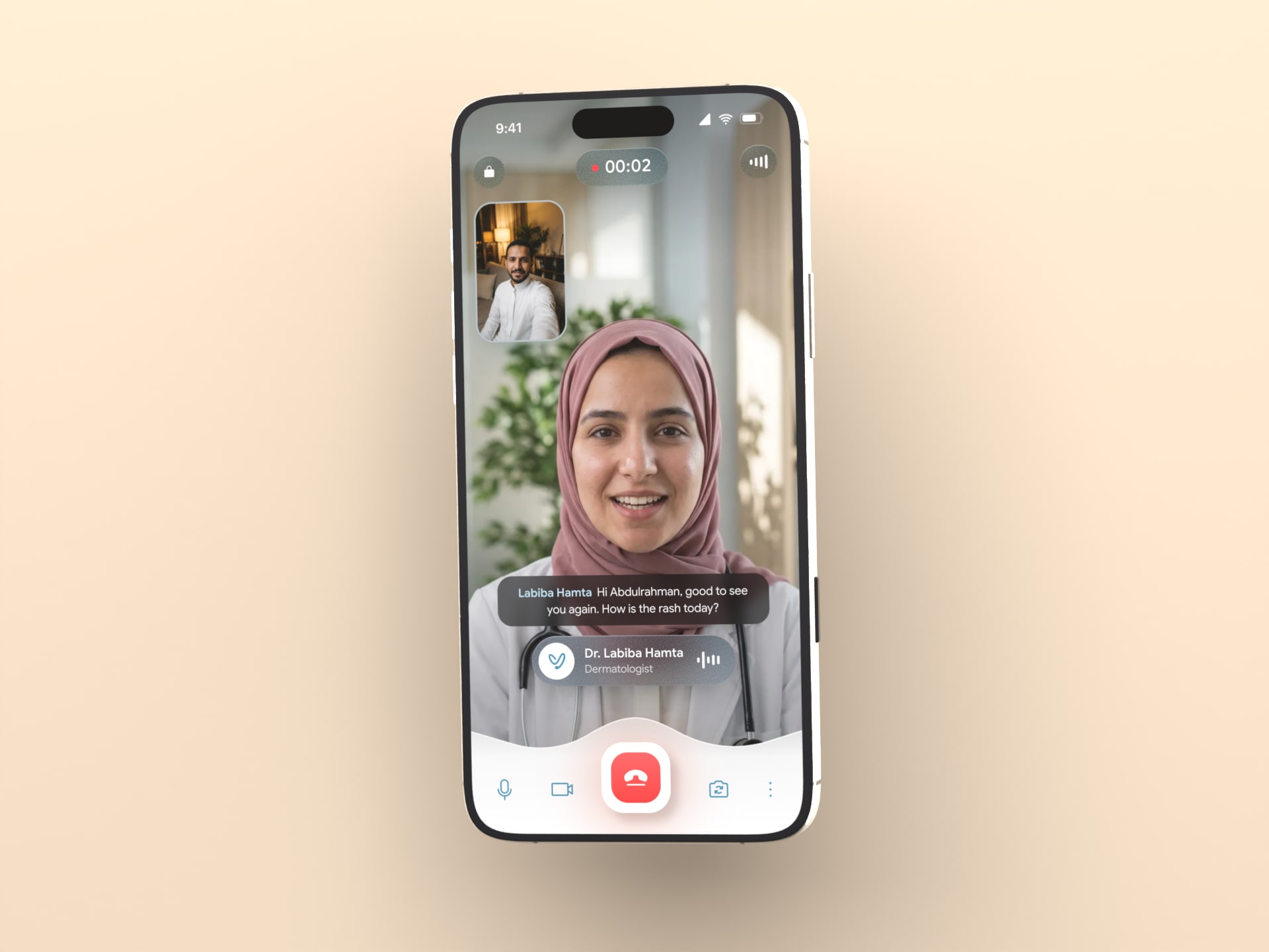
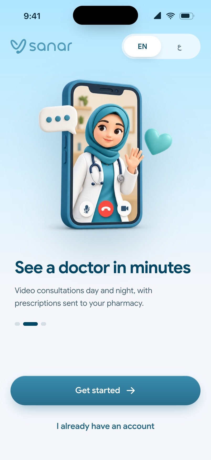
When something is wrong now, a booking calendar is the wrong answer. Consult now asks only who needs care and for what, states the average wait and matches the patient with a licensed doctor who is online. A waiting room checks the camera and microphone first, live captions run under the doctor for a noisy room or a second language, and the visit ends in writing: the assessment, the prescription already sent to the nearest pharmacy and when to follow up.

Asked once, paid on one screen
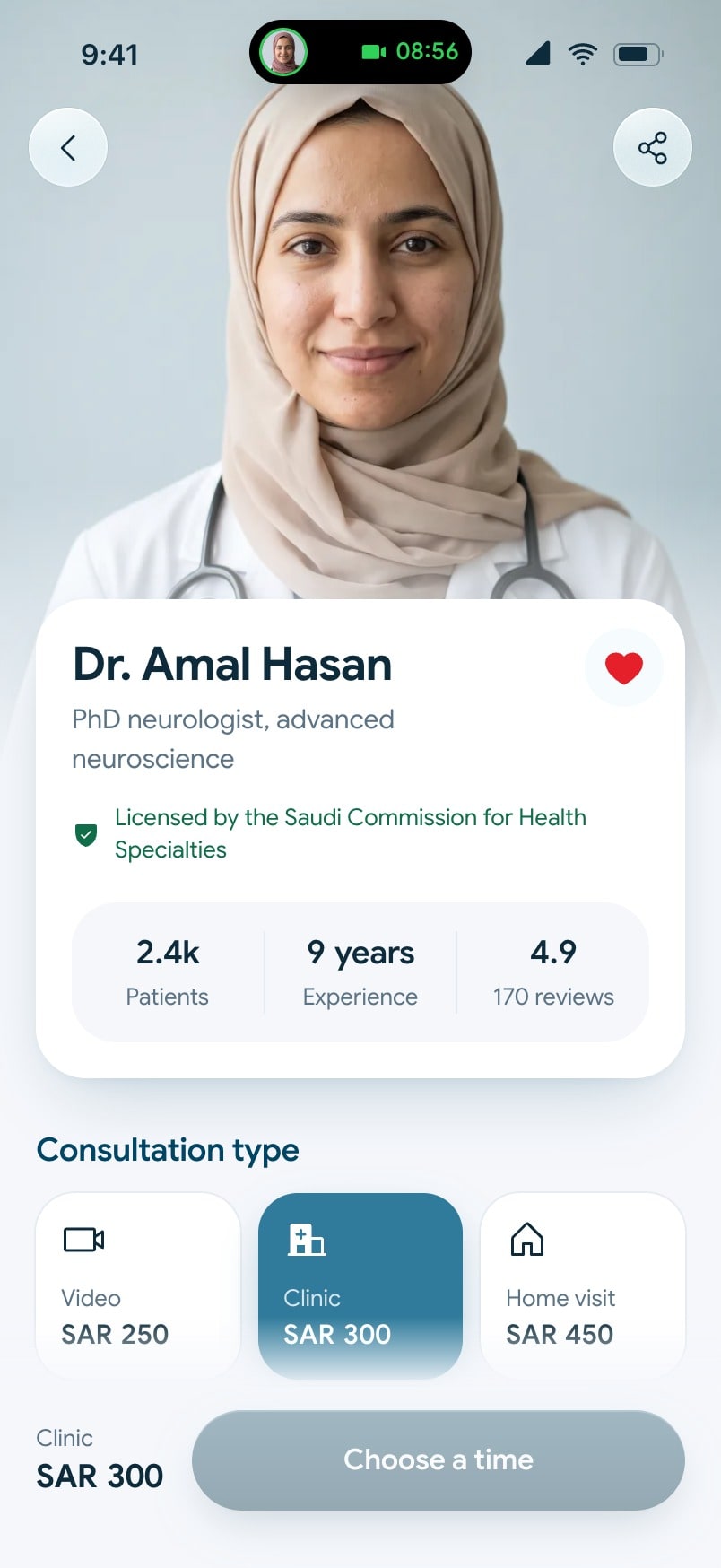
Booking used to spread its questions over several screens and could lose track of who the visit was for. Now the time is chosen on the doctor’s own profile, the patient is picked once from the family’s faces, and insurance cover, a promo code, VAT and payment share a single review. Apple Pay confirms with Face ID in the sheet people already trust, and the flow ends on a confirmation with the doctor, the time and the patient, a screen the old app never had.


Hold to call, never by accident
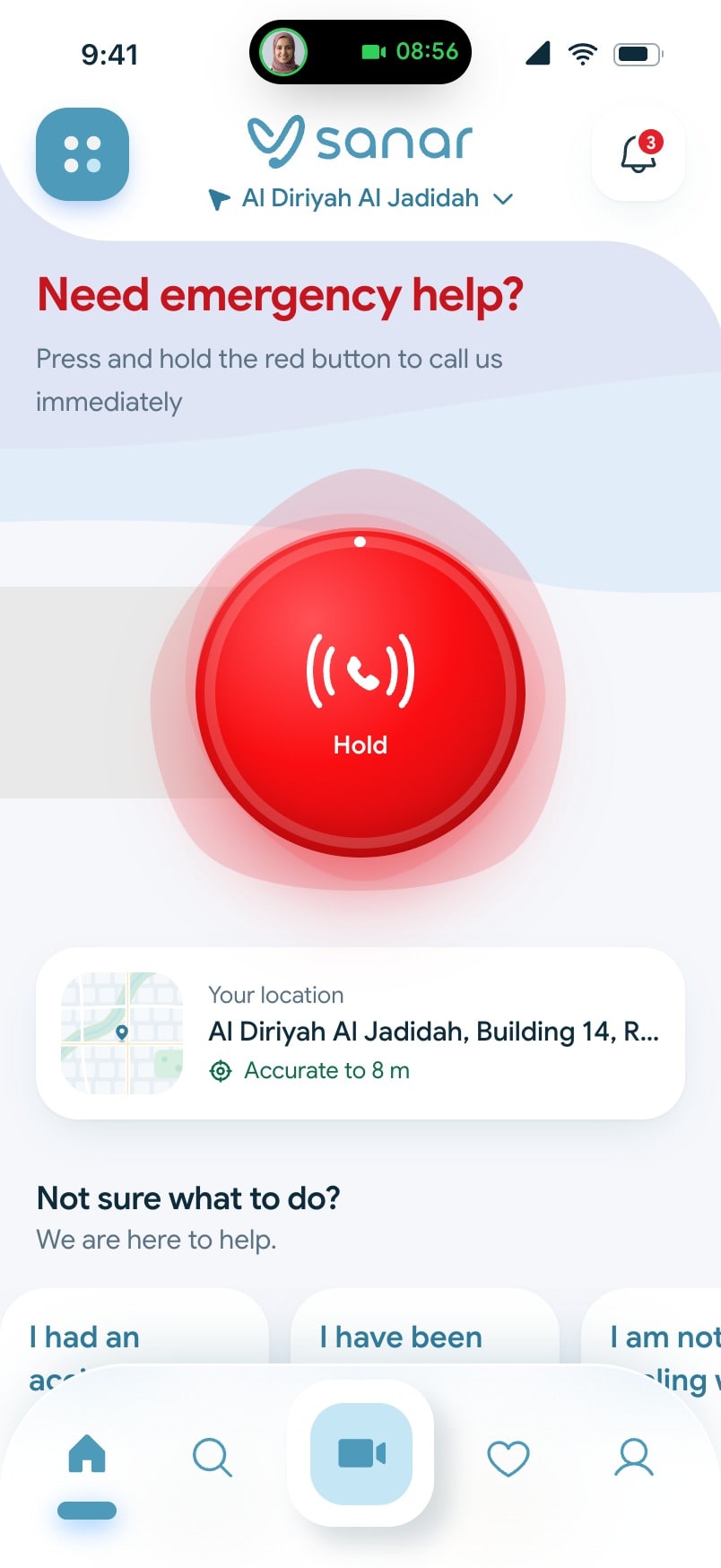
An emergency button that answers a single tap gets pressed in a pocket. Sanar’s has to be pressed and held: a track fills while the finger stays, the button swells and pulses, and only a full hold calls. Then the screen does the reassuring: the dispatcher’s name once connected, the ambulance moving on a map with its arrival time, the paramedic a tap away and what to do while you wait. The Saudi Red Crescent’s 997 stays in view for anything life threatening.
Arabic is not a translation
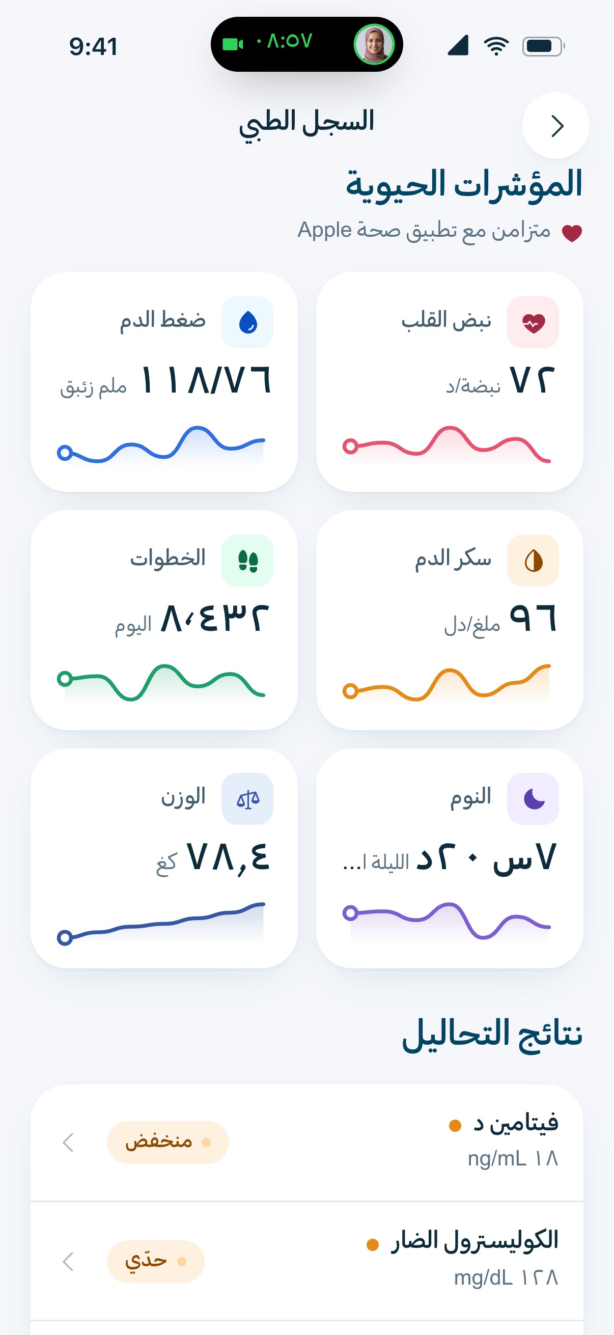
In Saudi Arabia Arabic comes first, so it was designed as a first language rather than exported from English. Every layout and every motion mirrors, the tab bar included; numerals turn Arabic-Indic while dates stay Gregorian; plurals take all six Arabic forms and titles follow the doctor’s gender; and the Arabic type is paired with the Latin by design. A patient can switch from the very first screen, and nothing falls out of place.
The result
Sanar’s app, redesigned from first principles and built end to end: 34 screens in English and Arabic, every flow working from a symptom to a booked doctor, a video visit and its summary, an assistant that listens without getting in the way, and the system behind it all, ready for what Sanar builds next.
Building something like this?
Start a project.