Mind The Hack
Mind The Hack is an offensive security company from Athens. Its platform tests an organisation the way an attacker would, proves which weaknesses can really be exploited and names what to fix first. Security tools rarely lack data; they produce more than anyone can read, for people who range from the analyst to the CISO.
We designed the brand, the website and the platform's experience as one language: a mark built from cubes, a site that explains the product before the demo, and an interface organised around decisions rather than lists.

Cubes, not padlocks
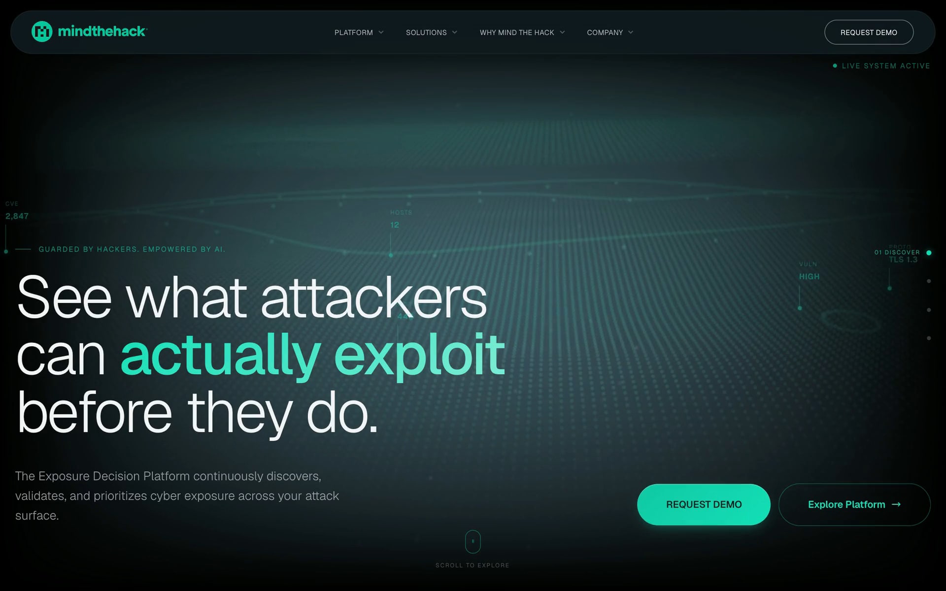
Security brands tend to reach for shields, padlocks and alarm red, the language of threat. Mind The Hack's mark is drawn from plain cubes set inside a circle: they build the M, and the T and H are held in the negative space between them. One vivid green carries it on dark grounds, a deliberate restraint, because in a product full of alerts, colour has to mean something. It reads as engineering rather than fear.

The method before the demo
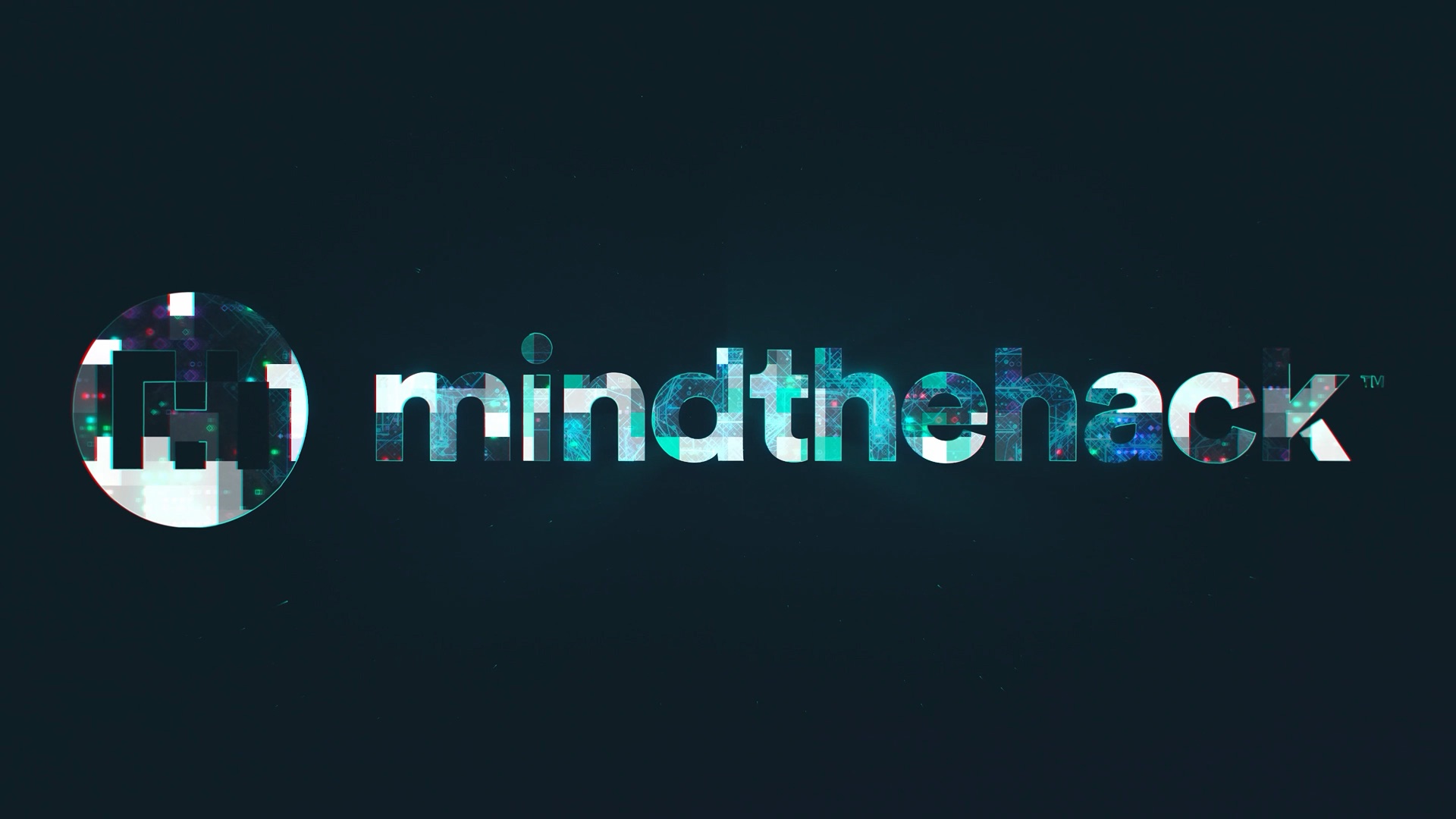
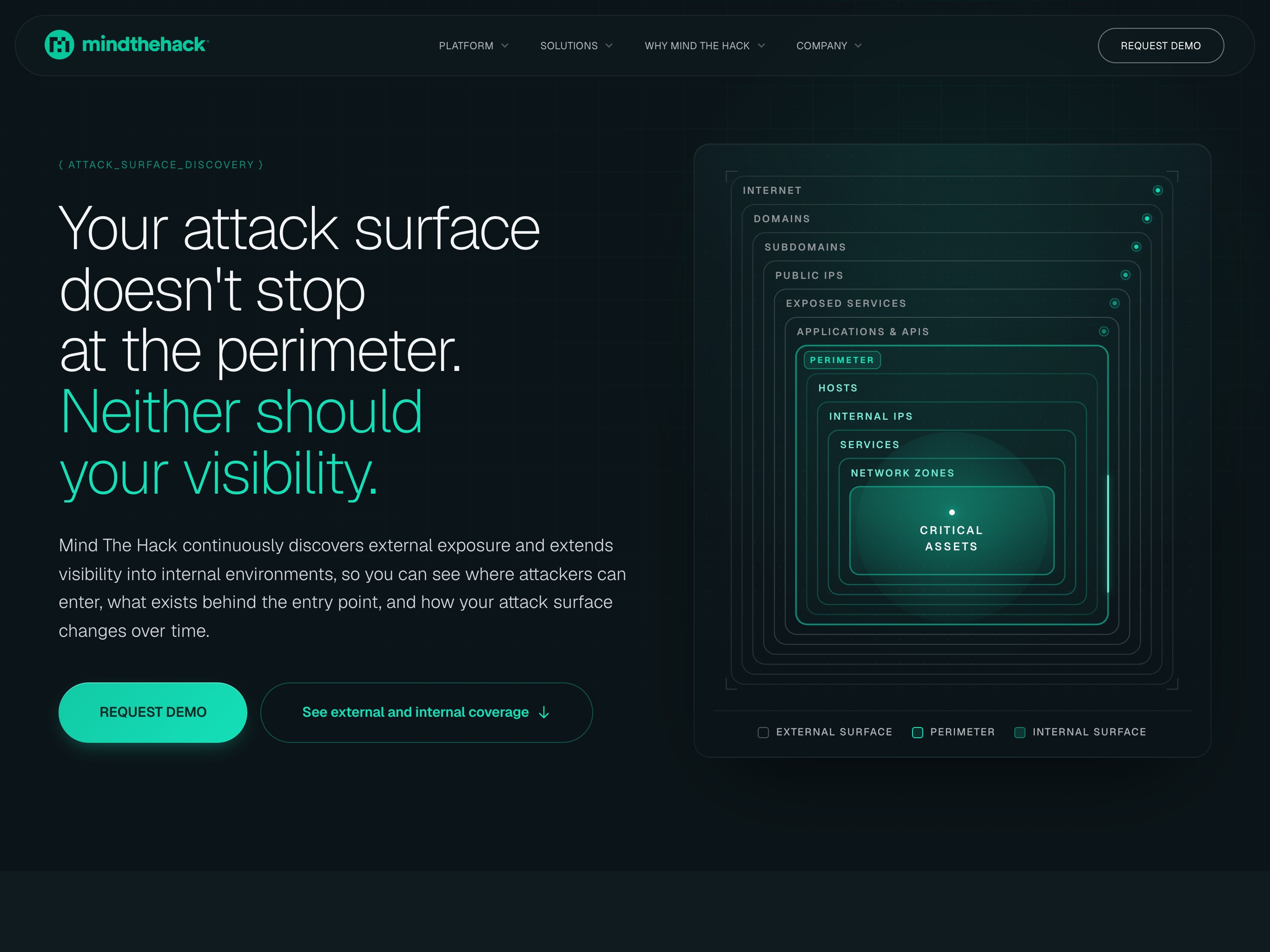
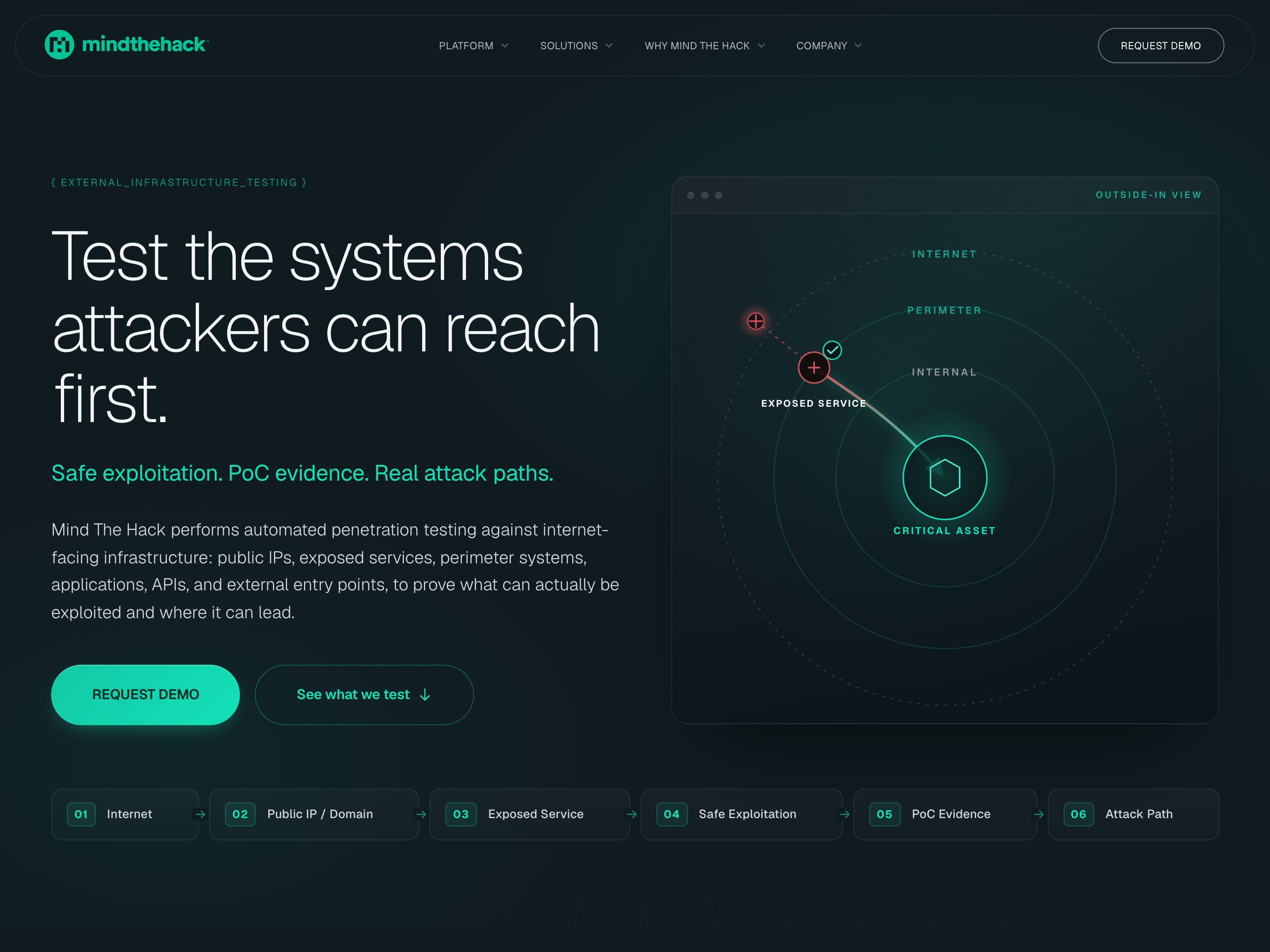
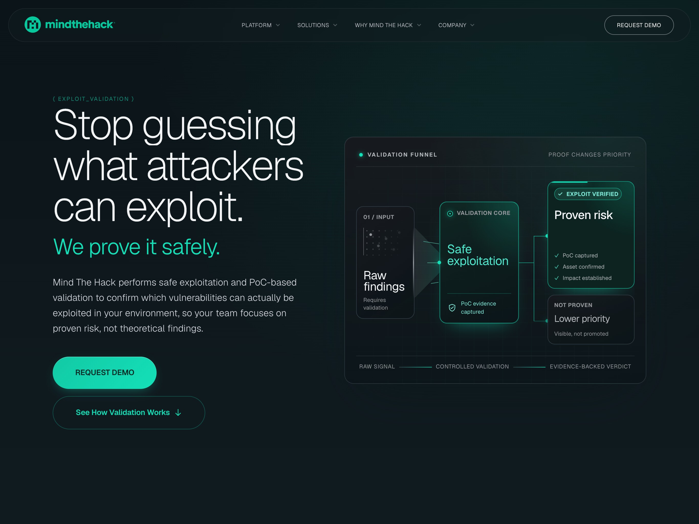
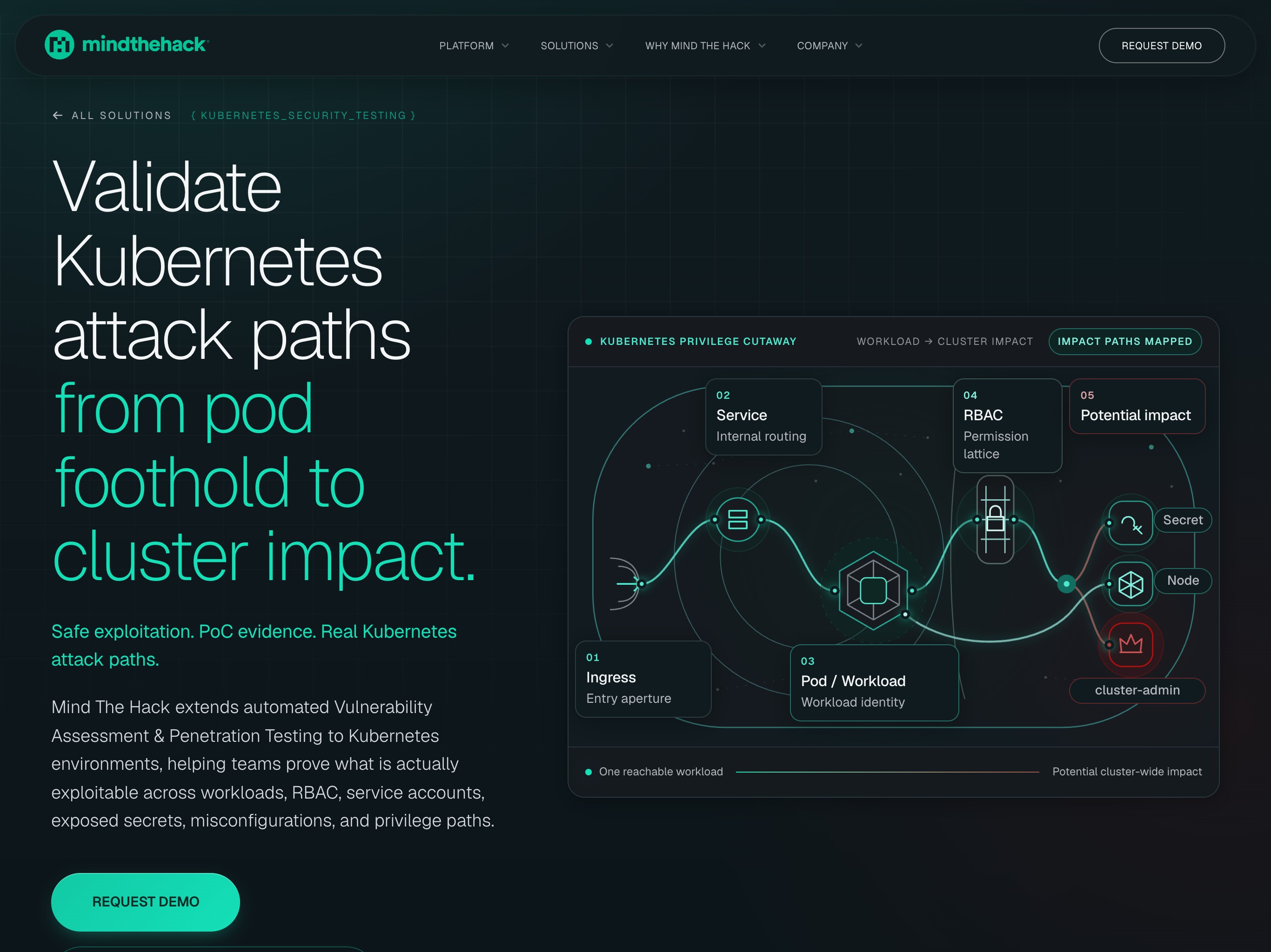
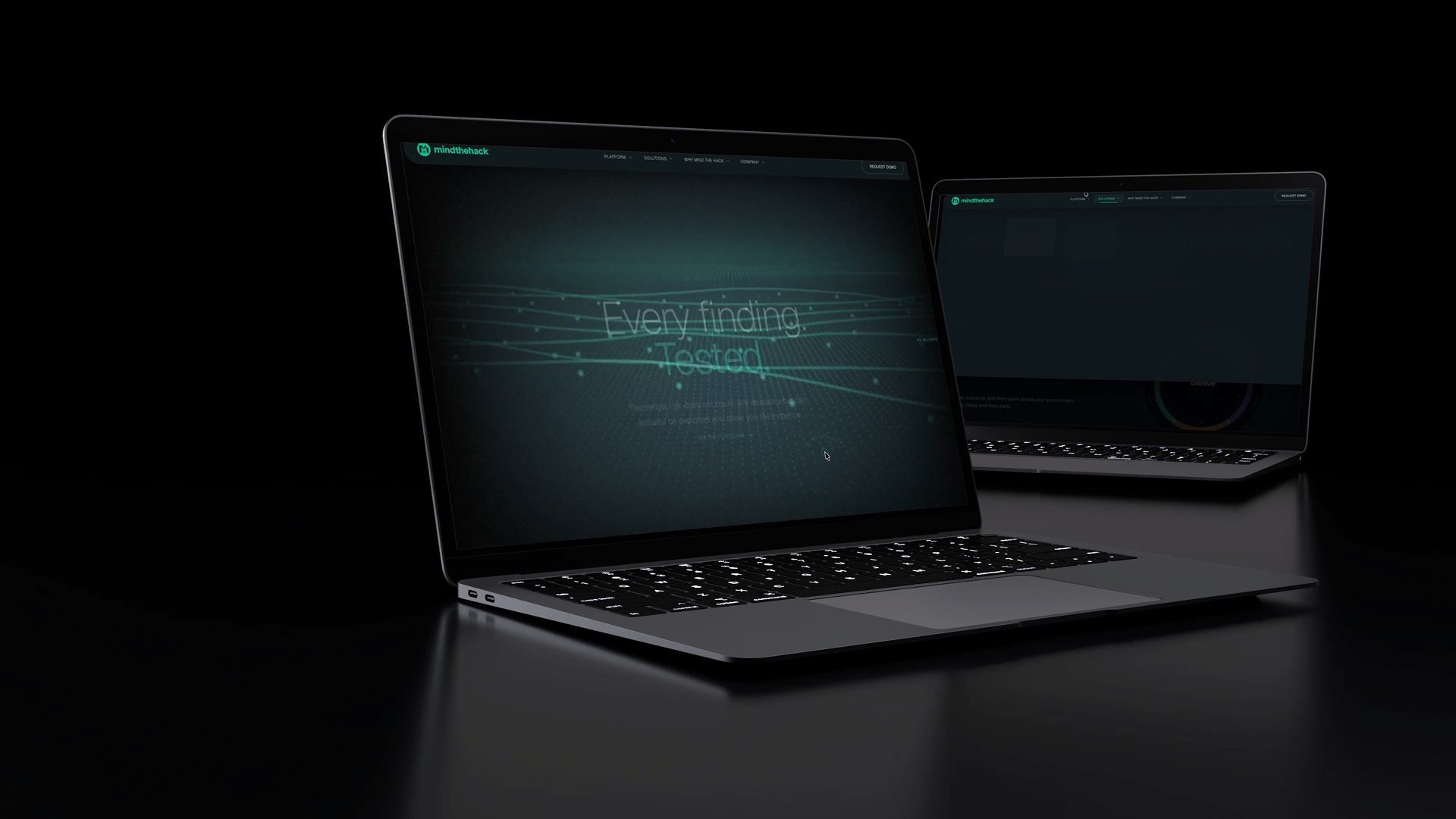
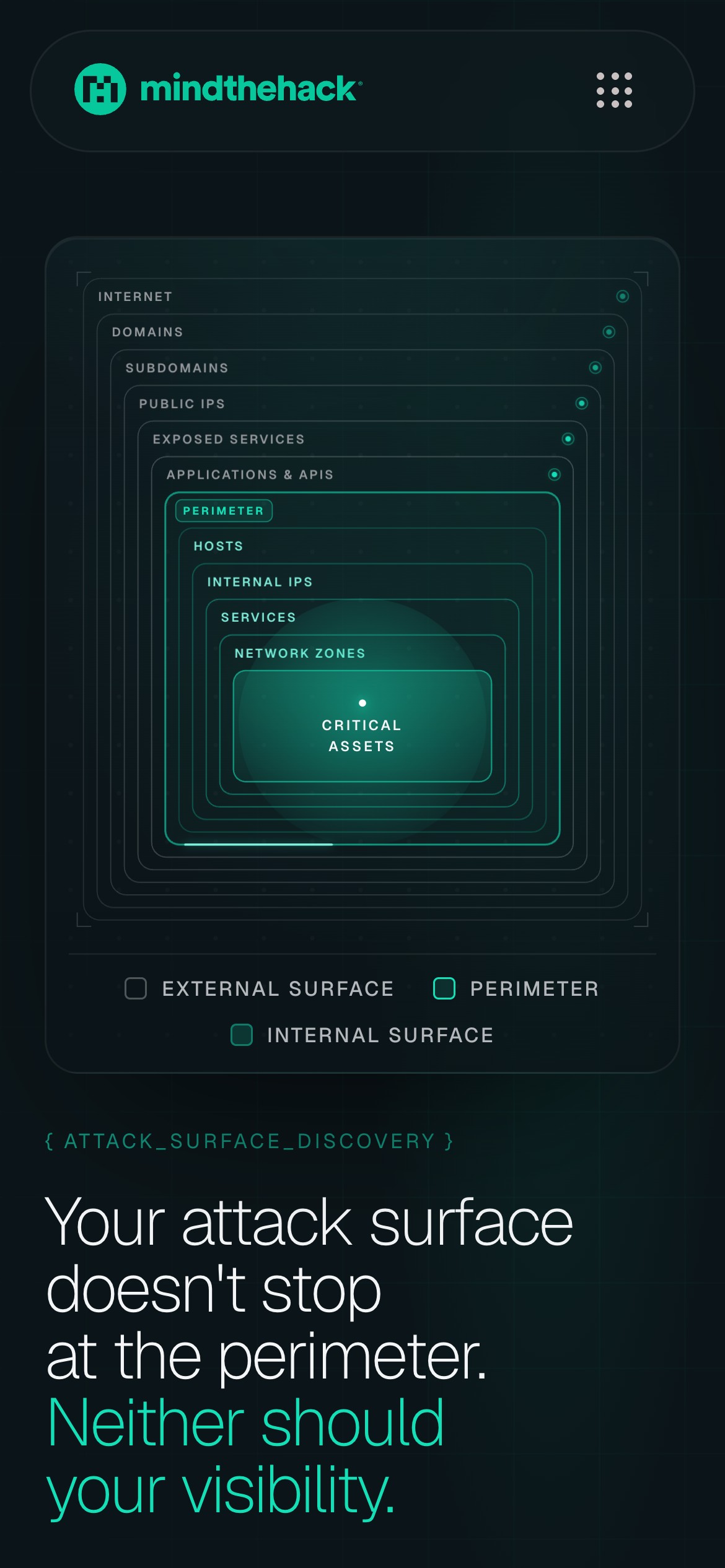
Alarm is the easy opening for a security website. This one opens on a promise, then states the method in three short beats: every finding tested, real risk ranked, the first fix named, the order the platform itself works in. The solution pages open on a drawing of their reach, from the internet to an exposed service, from a first foothold to a critical system, from a pod to cluster admin, so a buyer sees what is covered before asking for a demo.
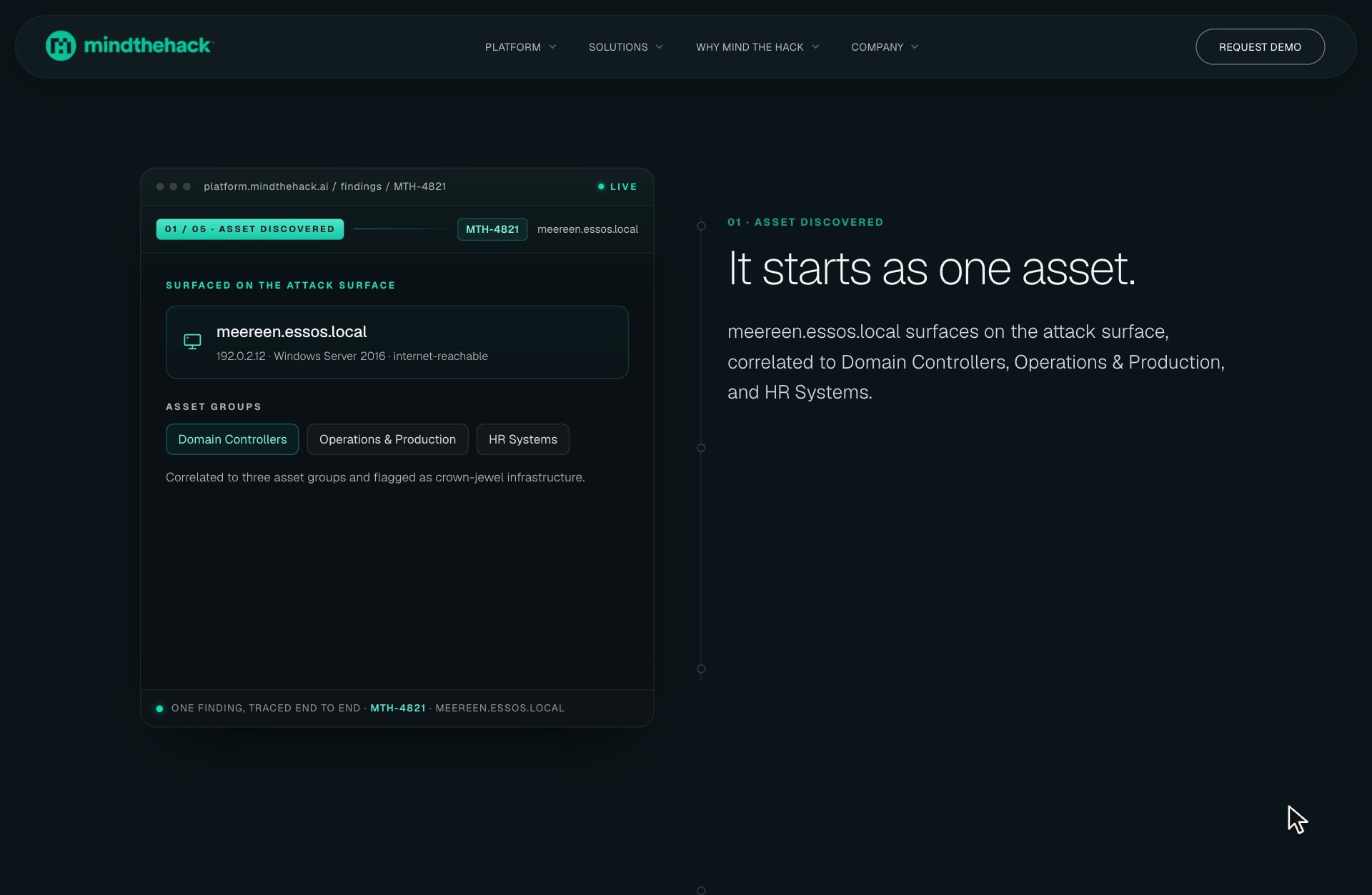
A finding keeps its thread
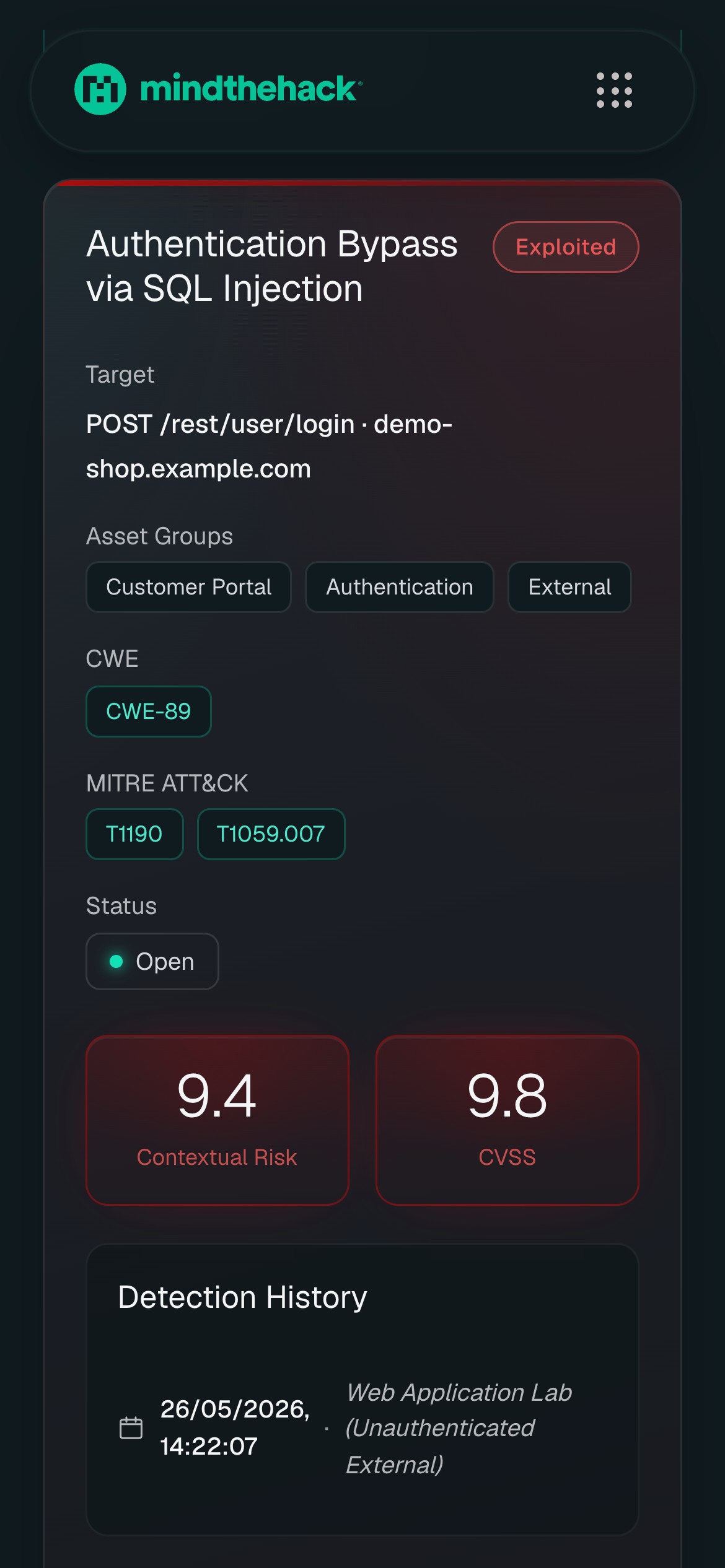
A finding is usually scattered across tools: the asset sits in an inventory, the proof in a report, the fix in a ticket, and whoever picks it up has to rebuild the story. Here one window follows a single finding from the asset where it surfaced to the exploit that proves it, the route it opens, the rank it earns and the risk its fix removes, so the evidence and the decision are never apart.
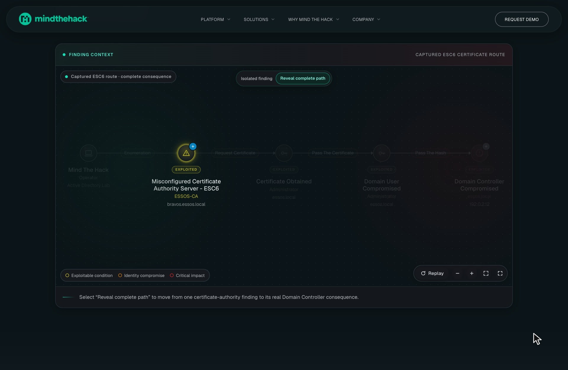
Risk lives in the route
Judged alone, a misconfigured certificate server is one more line in a long list of findings. Drawn as a route, it becomes the first step towards the domain controller, with every technique and account on the way named and the danger rising in colour from yellow to red. The graph also marks the link worth breaking, and removing it shows the path stopping short, so the work shifts from patching everything to cutting one link.

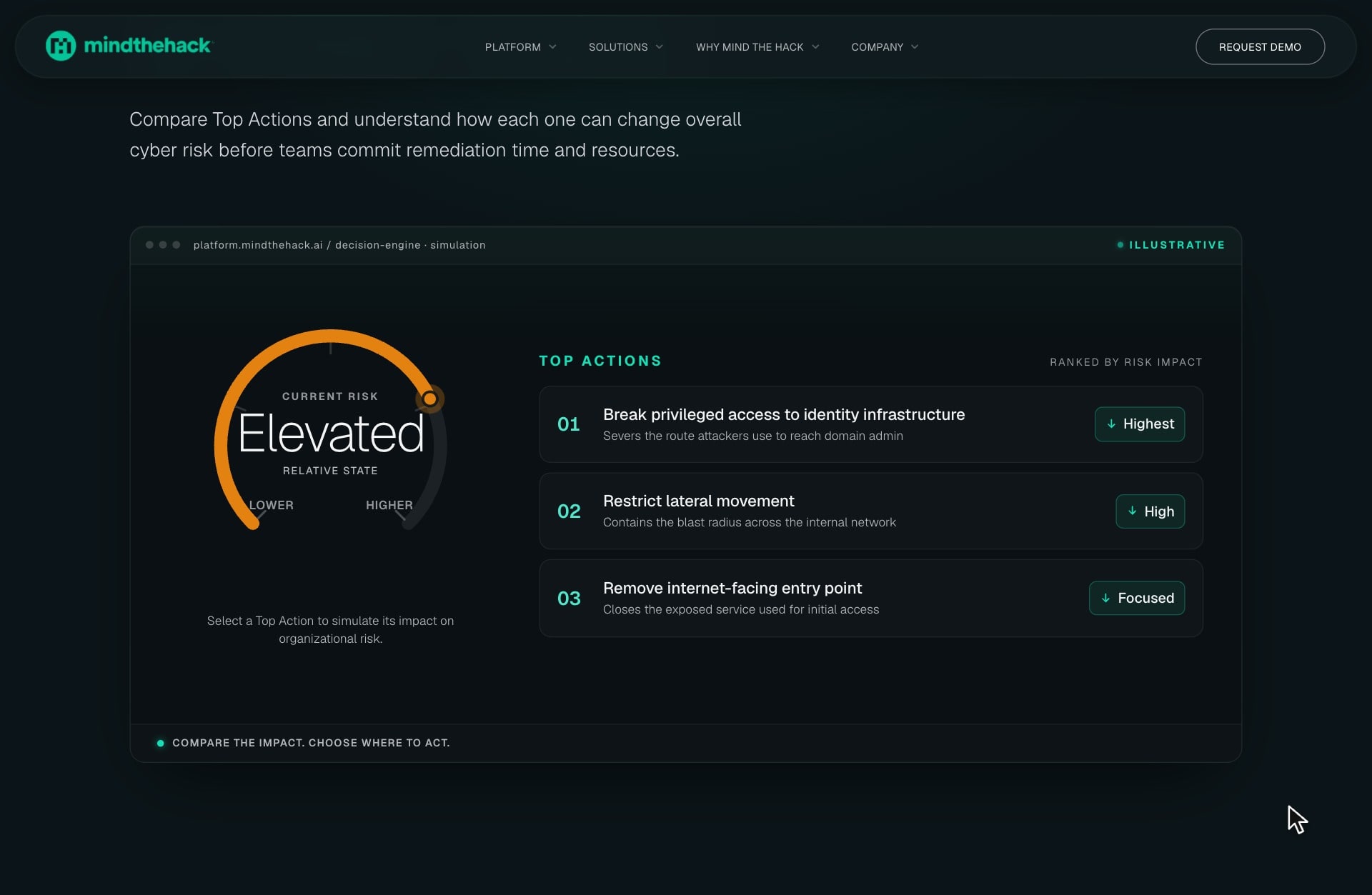
Remedies compared while they cost nothing
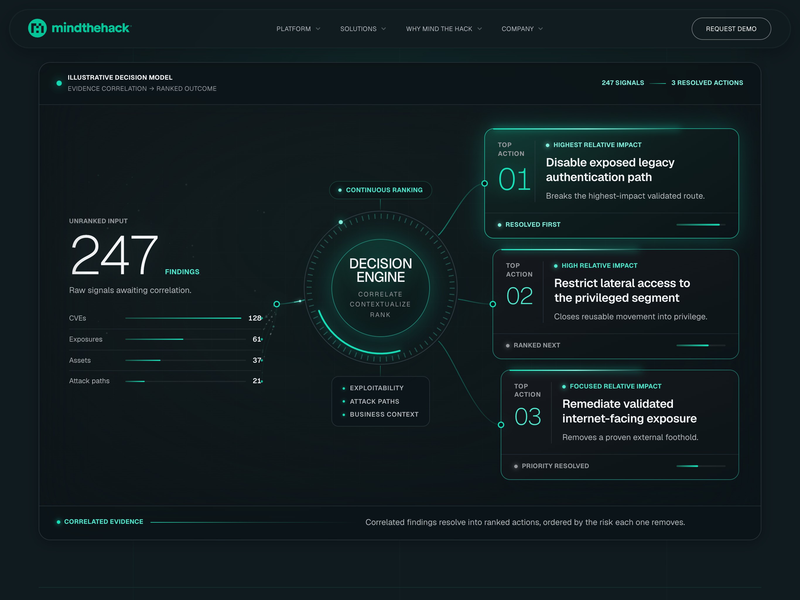
Every fix costs engineering time, so choosing one deserves a preview. Pressing a Top Action shows where the organisation's risk would settle before any work is scheduled, and pressing the next one compares it. The gauge speaks in plain states, elevated, lower, lowest, rather than in decimals that would need explaining to leadership, and each action carries its relative effect, so the case for a fix arrives with it.

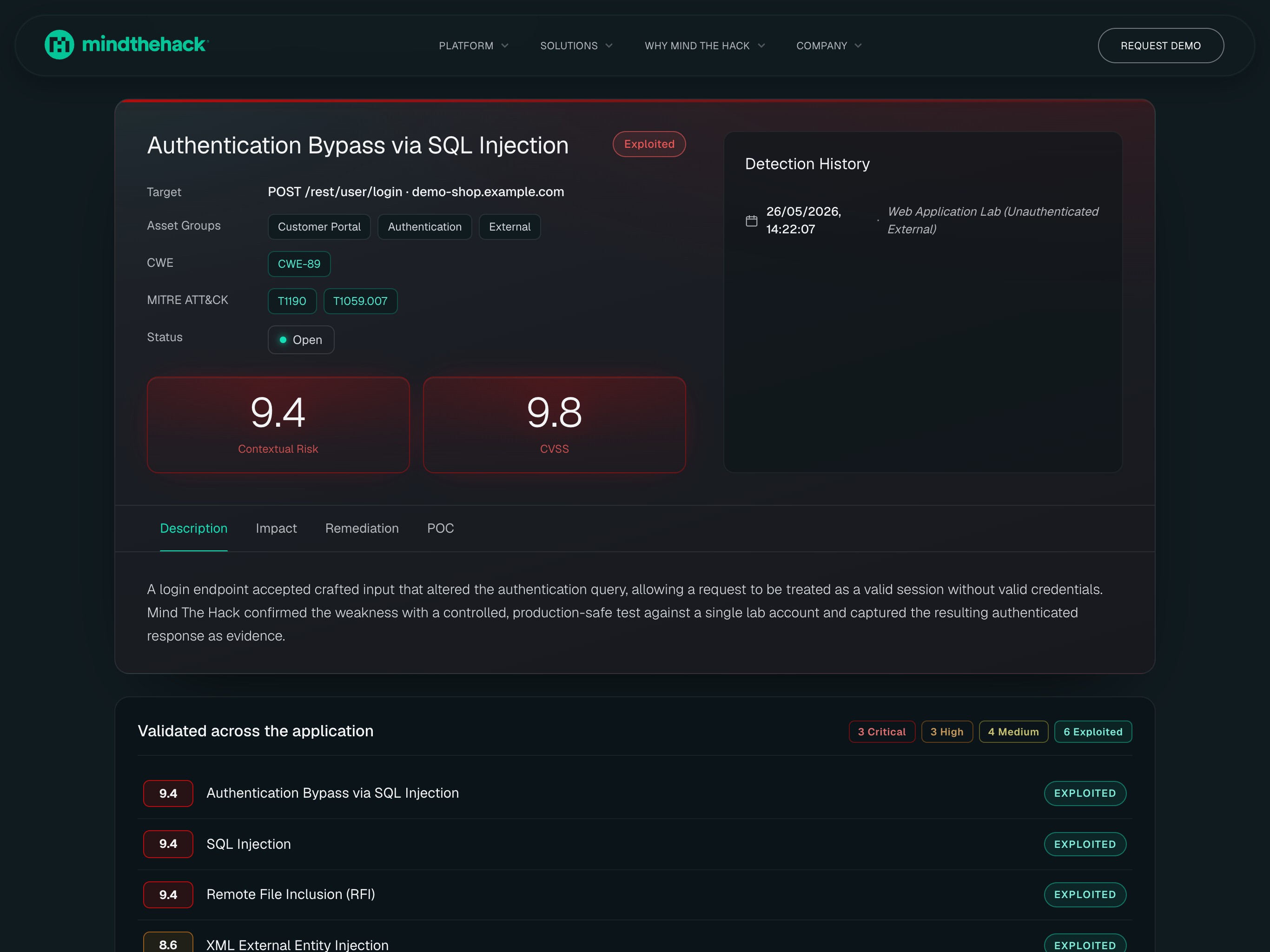
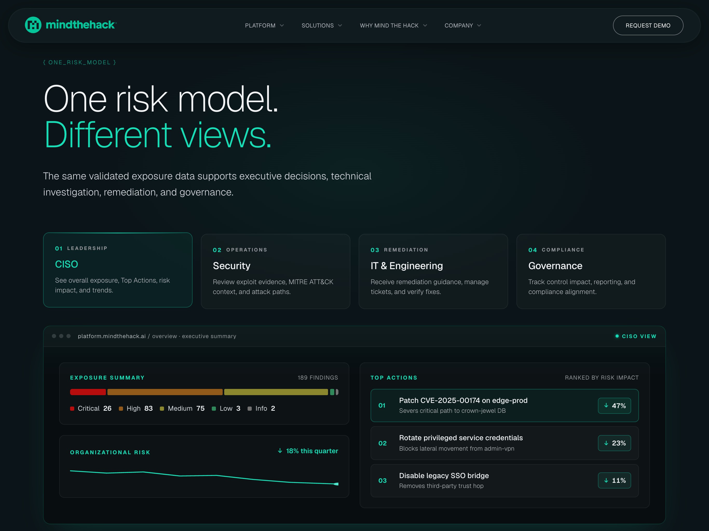
Everyone argues from one model
A CISO, an analyst, an engineer and an auditor ask different questions, and separate tools hand them different numbers. The information architecture keeps one risk model underneath and gives each role its own view, so the summary leadership reads rests on the evidence security works from. The report keeps CVSS, the standard auditors already speak, and sets Contextual Risk beside it rather than in its place, so a difference can be explained instead of defended.
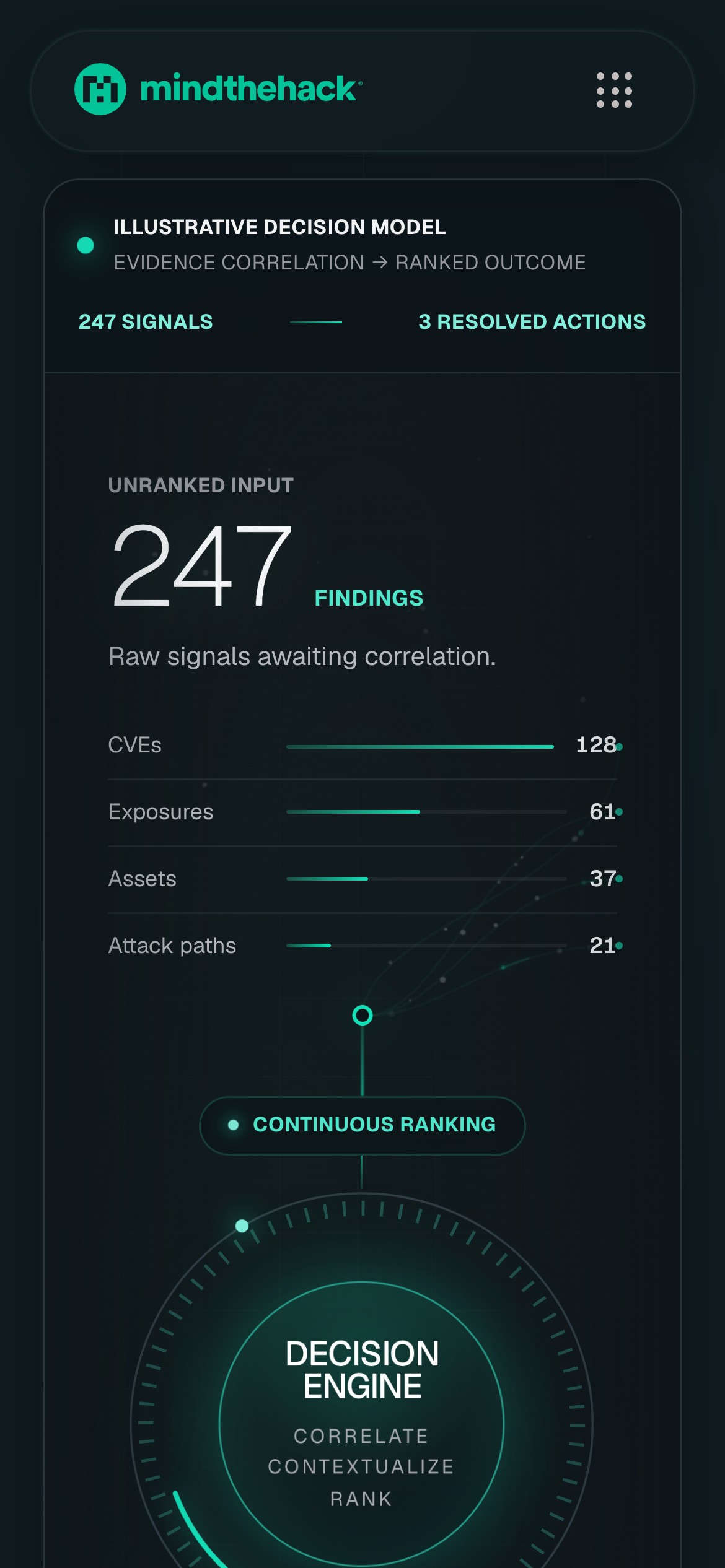
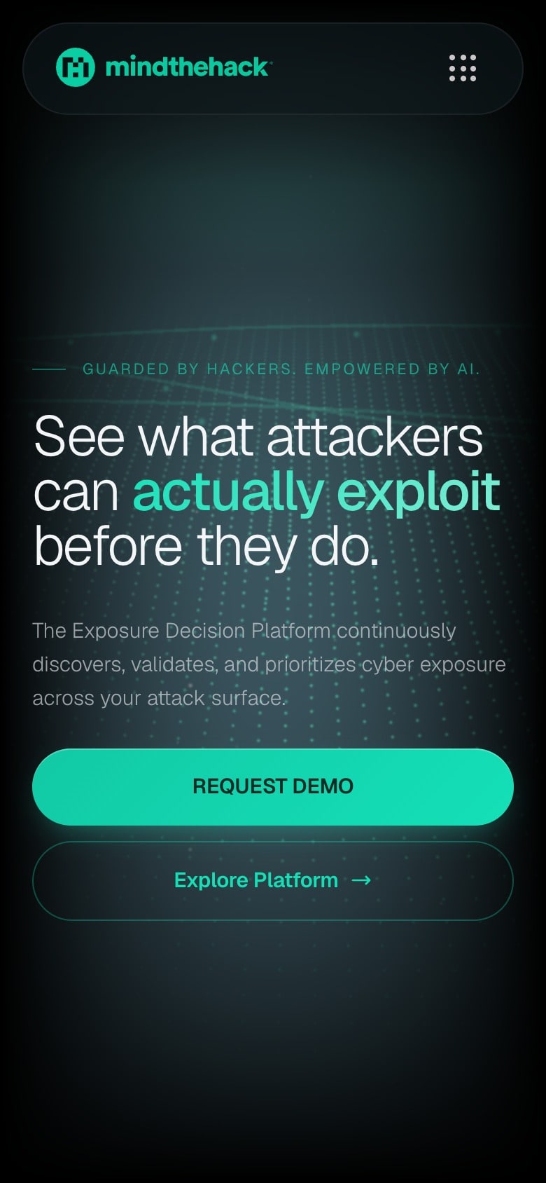
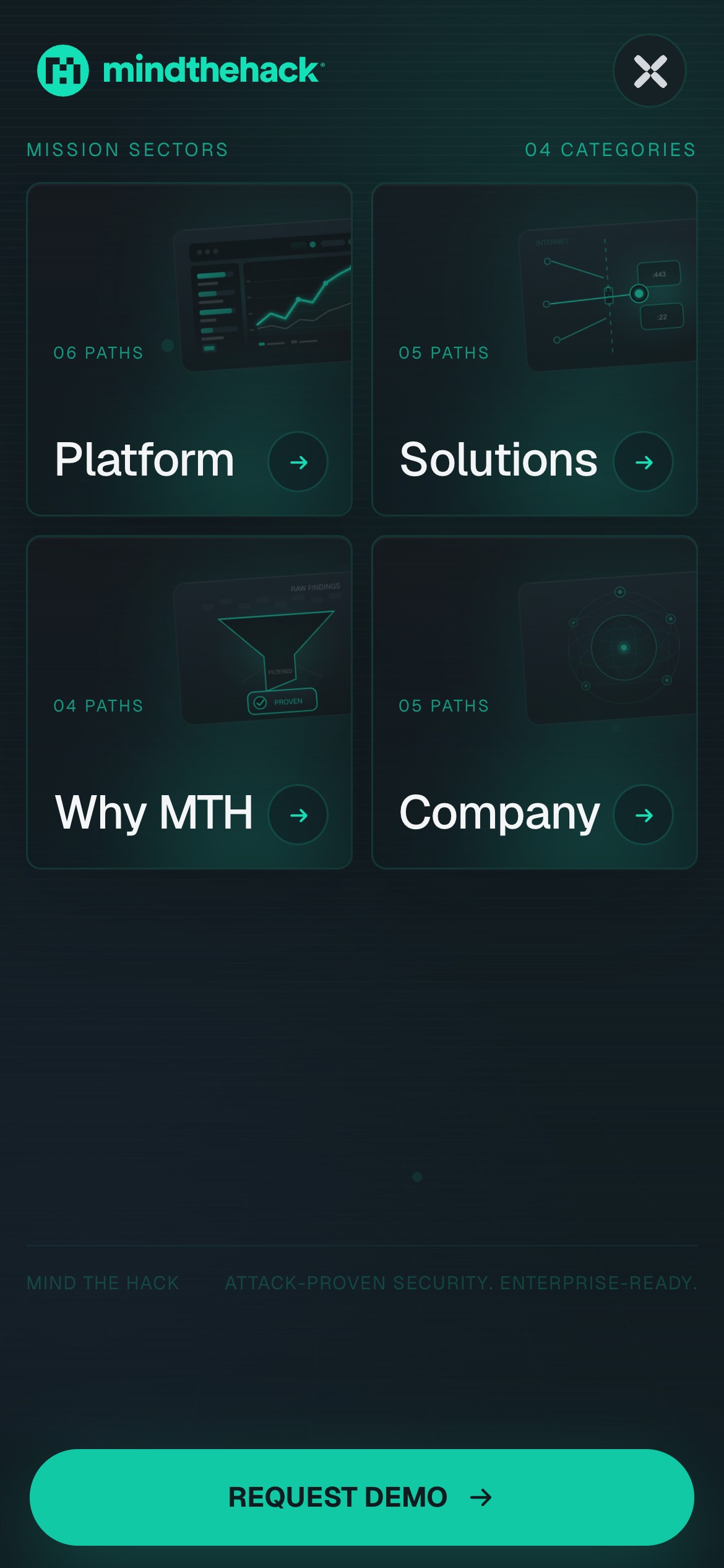
Recomposed for the hand
Squeezed into one column, a layered argument loses its layers. On a phone the diagrams are redrawn rather than shrunk: the Decision Engine stands as a column, findings above and the engine below, the attack surface keeps its nesting and the report keeps its two scores side by side. The menu becomes four sectors, each with a page of its own, so a buyer reading on the move still gets the whole argument.
The result
A mark, a website and a platform designed as one language. Mind The Hack's security technology is its own; how people see it, understand it and work with it is our design, so the product a buyer meets on the website looks and reads like the one their team will work in.
Building something like this?
Start a project.